PID – Prague and the Central Bohemian Region Public Transport
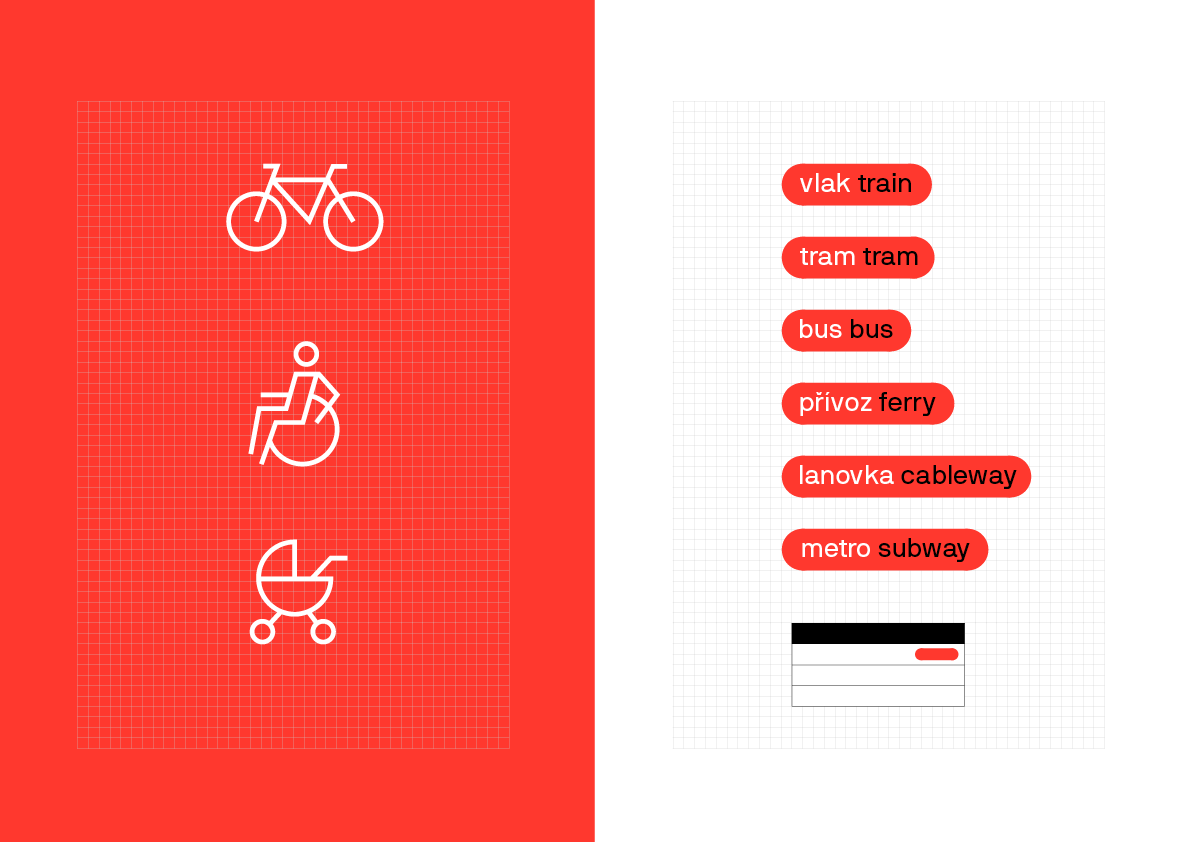
Public transit as a modern but above all comprehensible and coherent system for the 21st century. Facilitating travel orientation so that passengers always find all the information they need intuitively in the same or similar places, on all types of transport and regardless of the carrier.
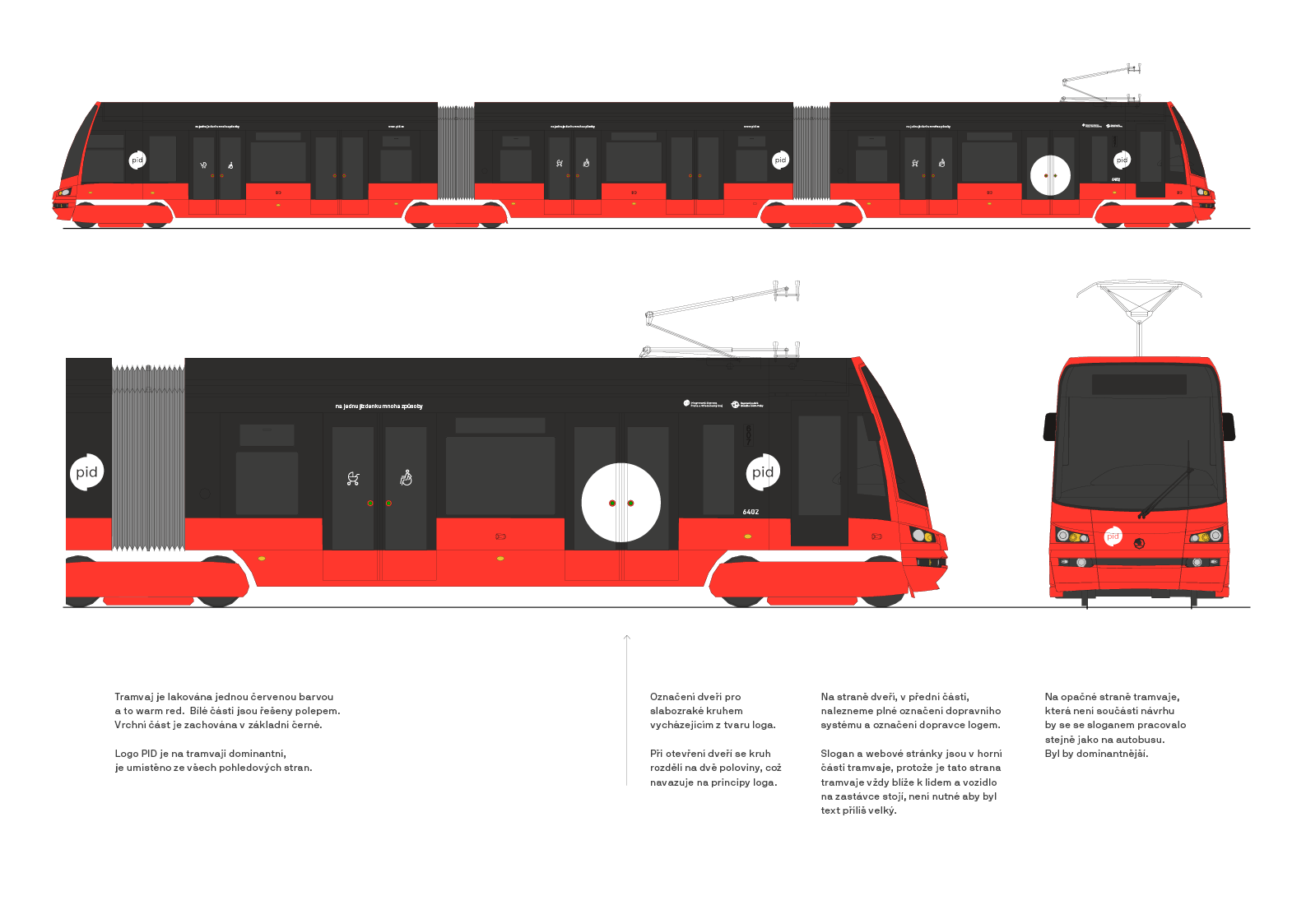
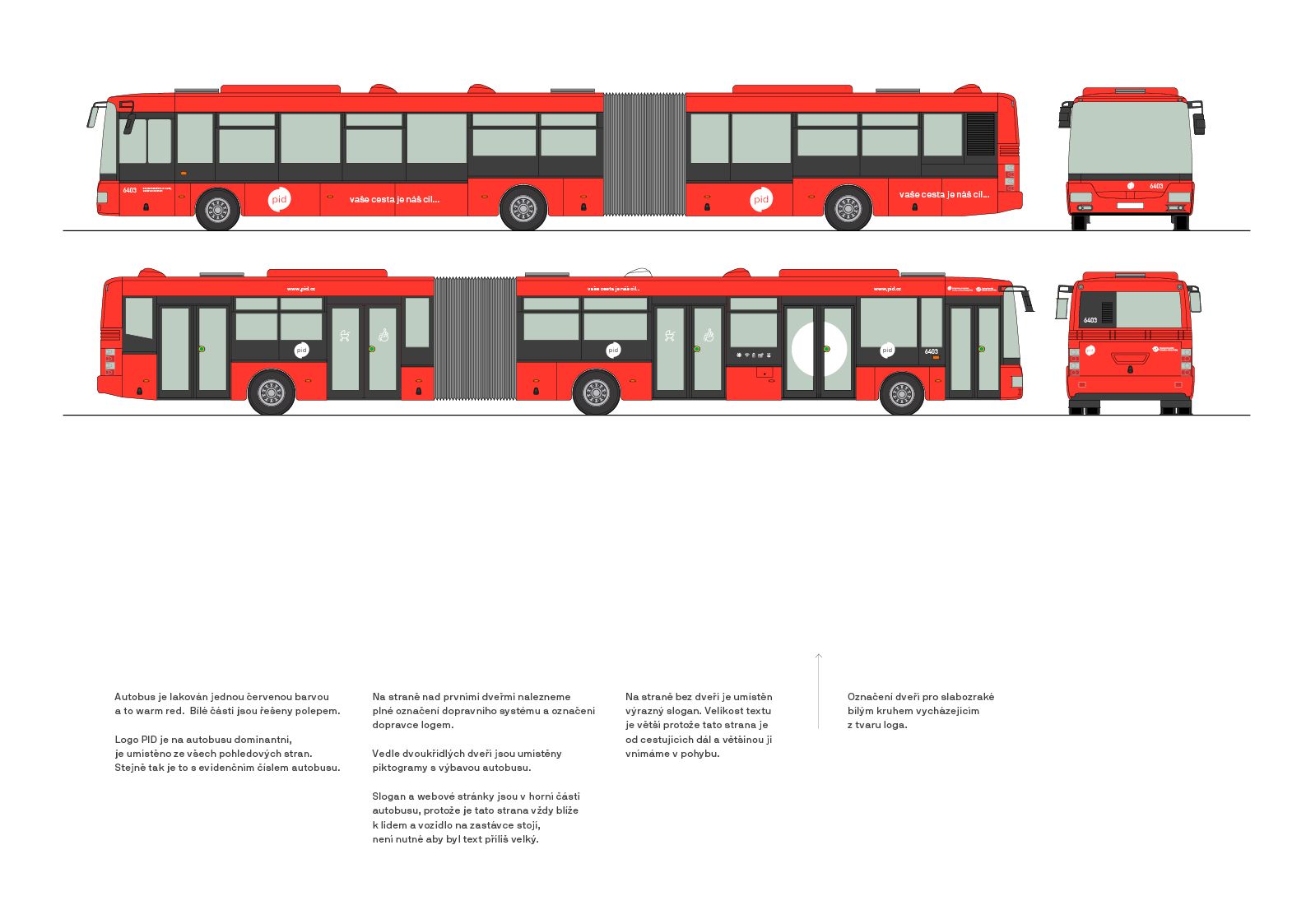
Until now, there has been a different graphic manual for urban and suburban buses, while no unifying style has been applied to trains, trams and subways.
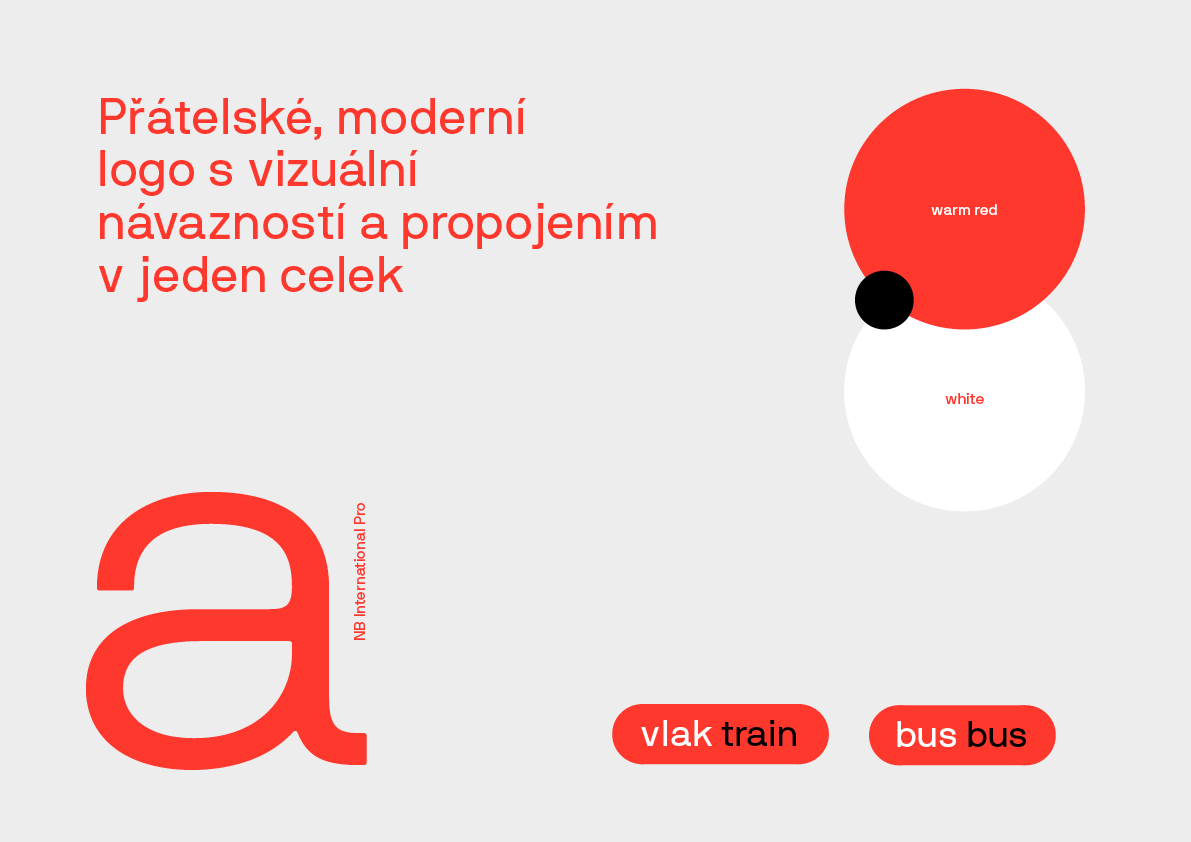
The wheel, which is the shape basis of the logo, is divided into two halves symbolizing the connection between Prague and the Central Bohemian Region.
NB International's typeface is pleasantly grotesque with slightly rounded details. The font is accessible and positive. The logos for the public transport organisers "ropid" and "idsk" are just a spin on the parent PID logo. The hierarchy within the group is supported by the font sizes.


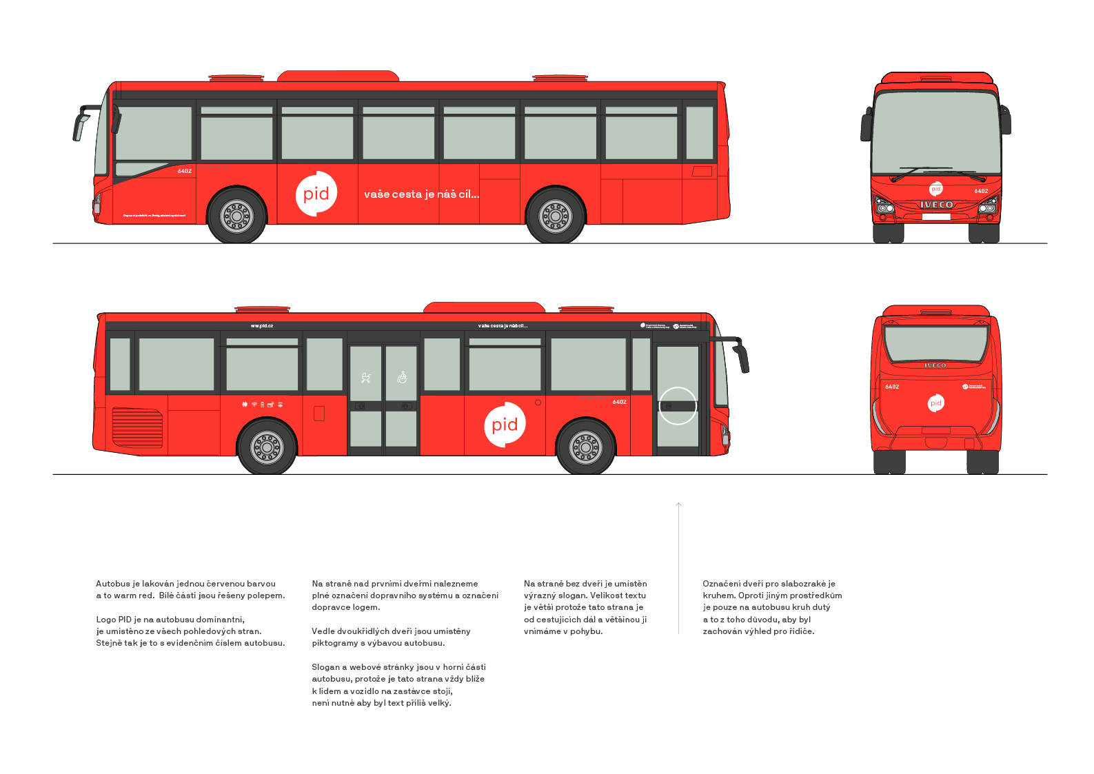
Visual style is very simple. The trams and buses are painted in one red colour ("warm red"), with only white foil.
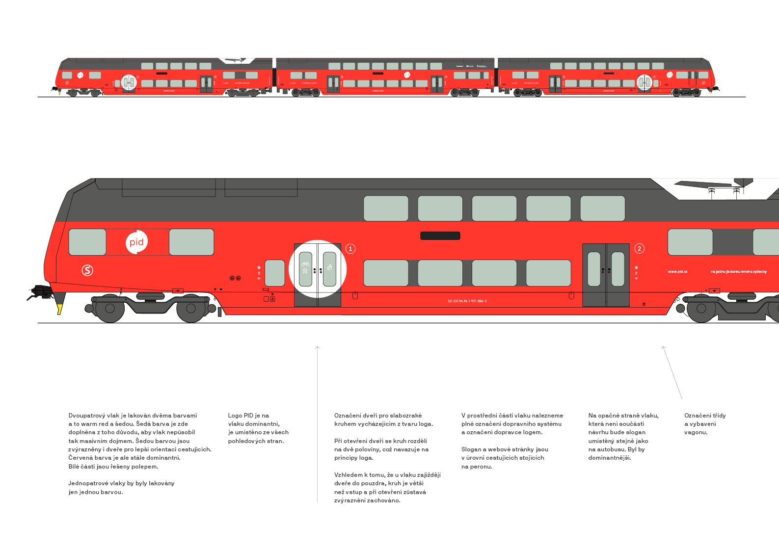
The double-decker trains are complemented by a neutral grey colour to soften the large mass of the vehicle and to highlight the entrances. The marking of the doors for the visually impaired with a white circle, which follows the morphology of the logo, is also essential.

CREDITS
Client – PID
Creative Concept – Markéta Steinert, Adam Uchytil
Visual Identity – Markéta Steinert, Adam Uchytil
Motion design – Martin Pokorný
Study for PID
CONTACT
Markéta Steinert
marketa@mrsteinert.com
00420 731 154 774
STUDIO
Markéta Steinert Studio
Kamenická 5
Letná, Praha 7
COMPANY
Mr. Steinert s.r.o.
Pražského 636/34, Praha
IČO 04873084