Proud will be proud
The building stands at the confluence of the Mže and Radbuza rivers, at the place where the Berounka River is formed. From there it was a step to the name Proud. "This name links both the location of the brewery and the former use of the building as a power station. Moreover, there is movement, direction, but also a focus on something (a stream of ideas, a main stream, a new stream...). If we look at the name from an English point of view, we have pride - pride of origin, of experience...,".
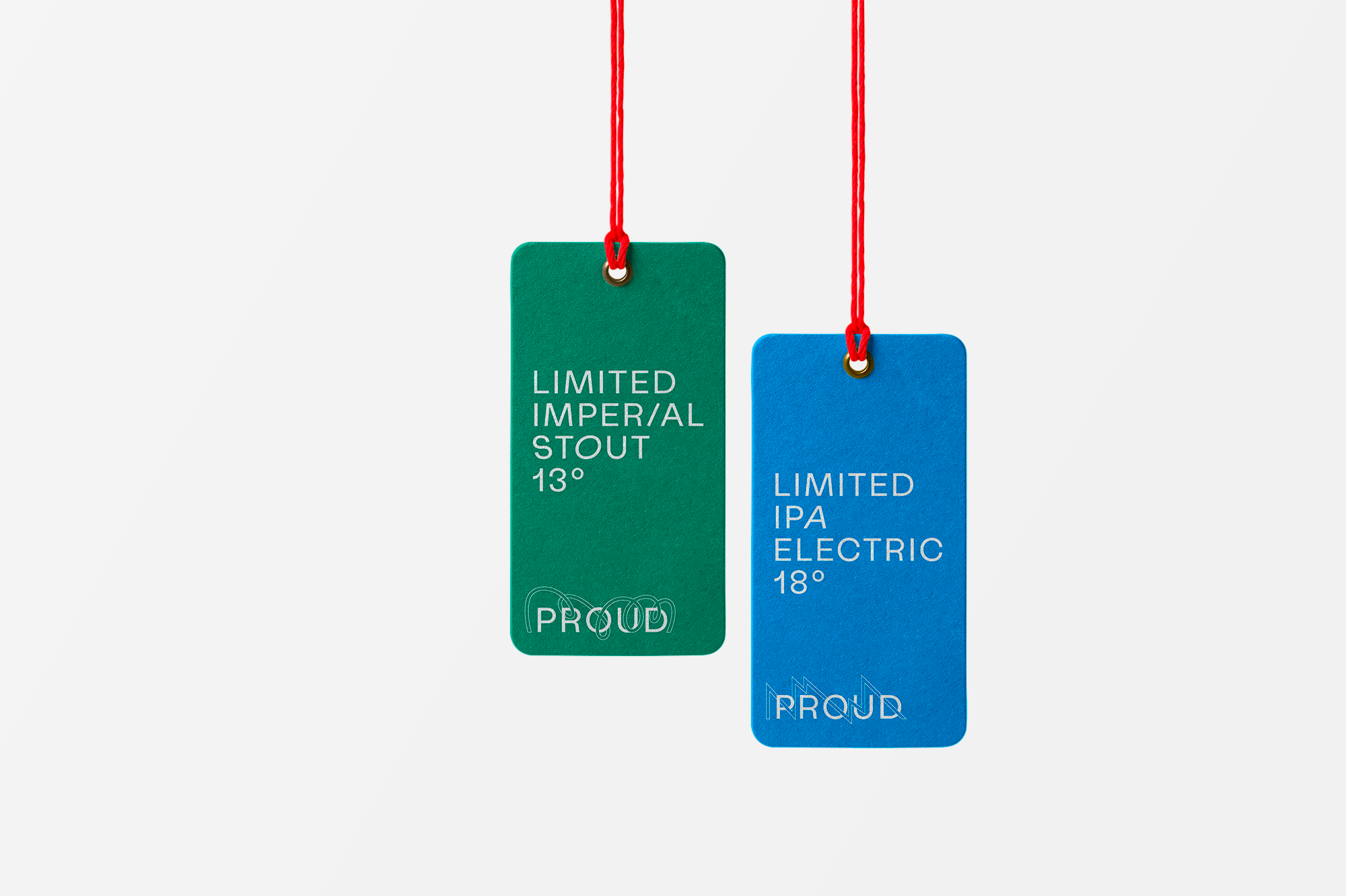
Visual identity works with the connection of water and electricity.
Lightning and waves.
Two variants of the logo.
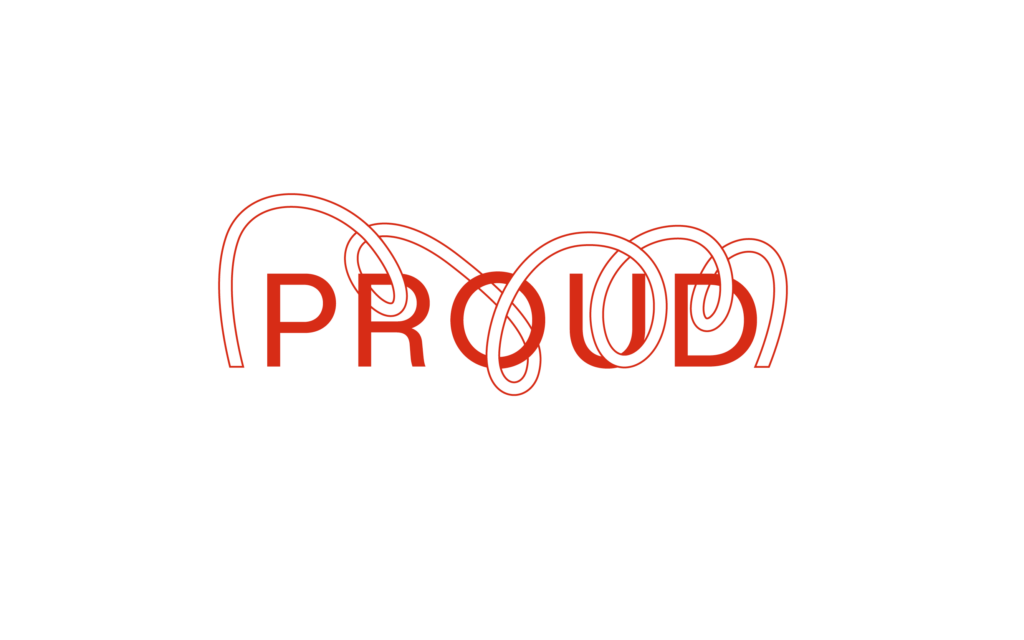
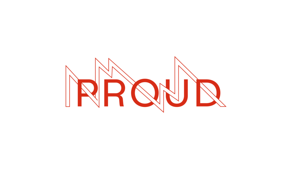
The new visual identity was to be based on three core values – collaboration, experimentation and playfulness. The logo itself was to be young, modern, progressive, but at the same time friendly and warm.
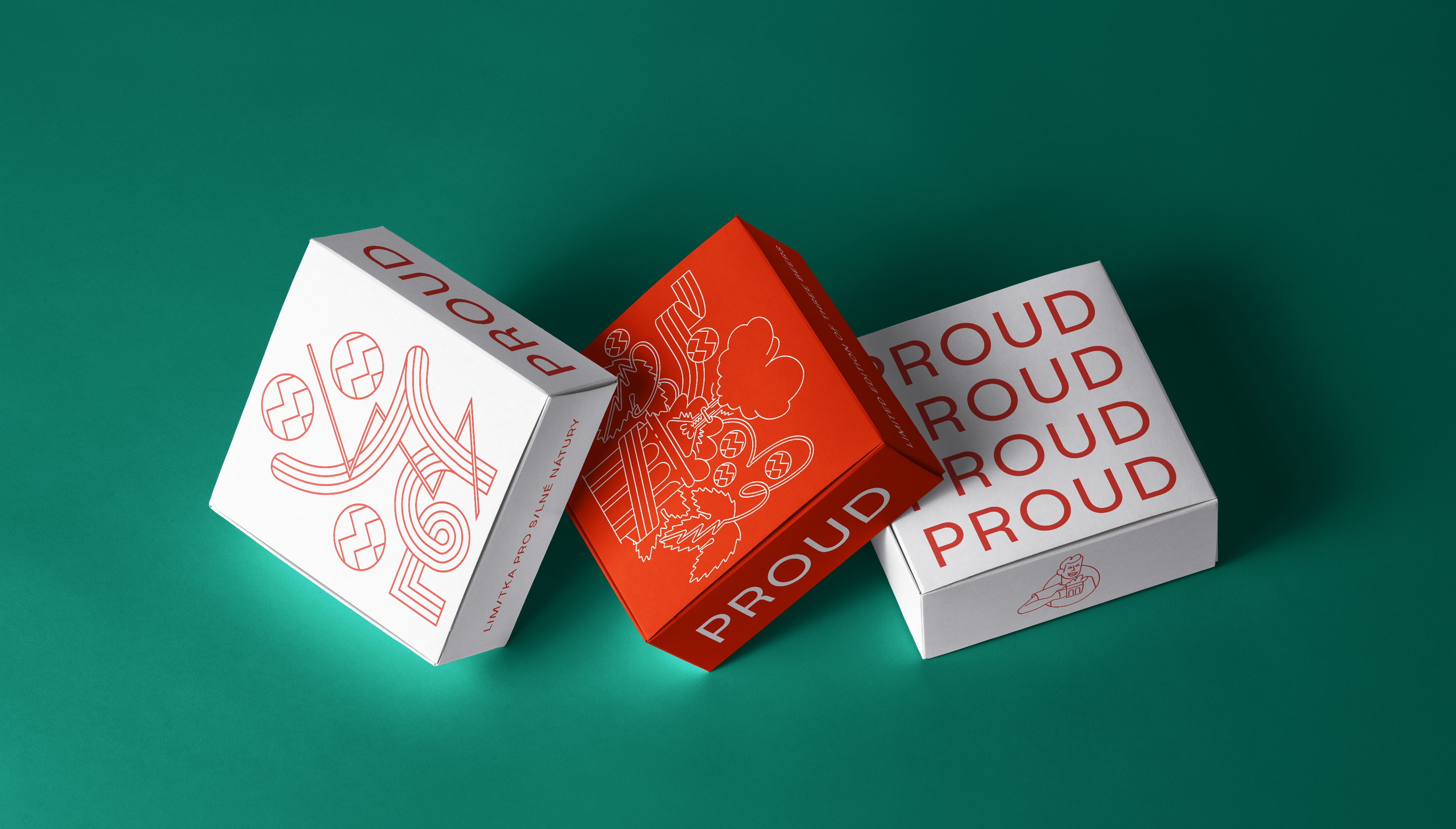

Prazdroj's new microbrewery will focus on experimenting with beer styles, raw materials and technological processes. At the same time, it should become a meeting place for Czech and foreign brewers, academics, beer experts and beer lovers.
The chosen font, Labil Grotesk, is equally experimental. Like the logo, has two variants.



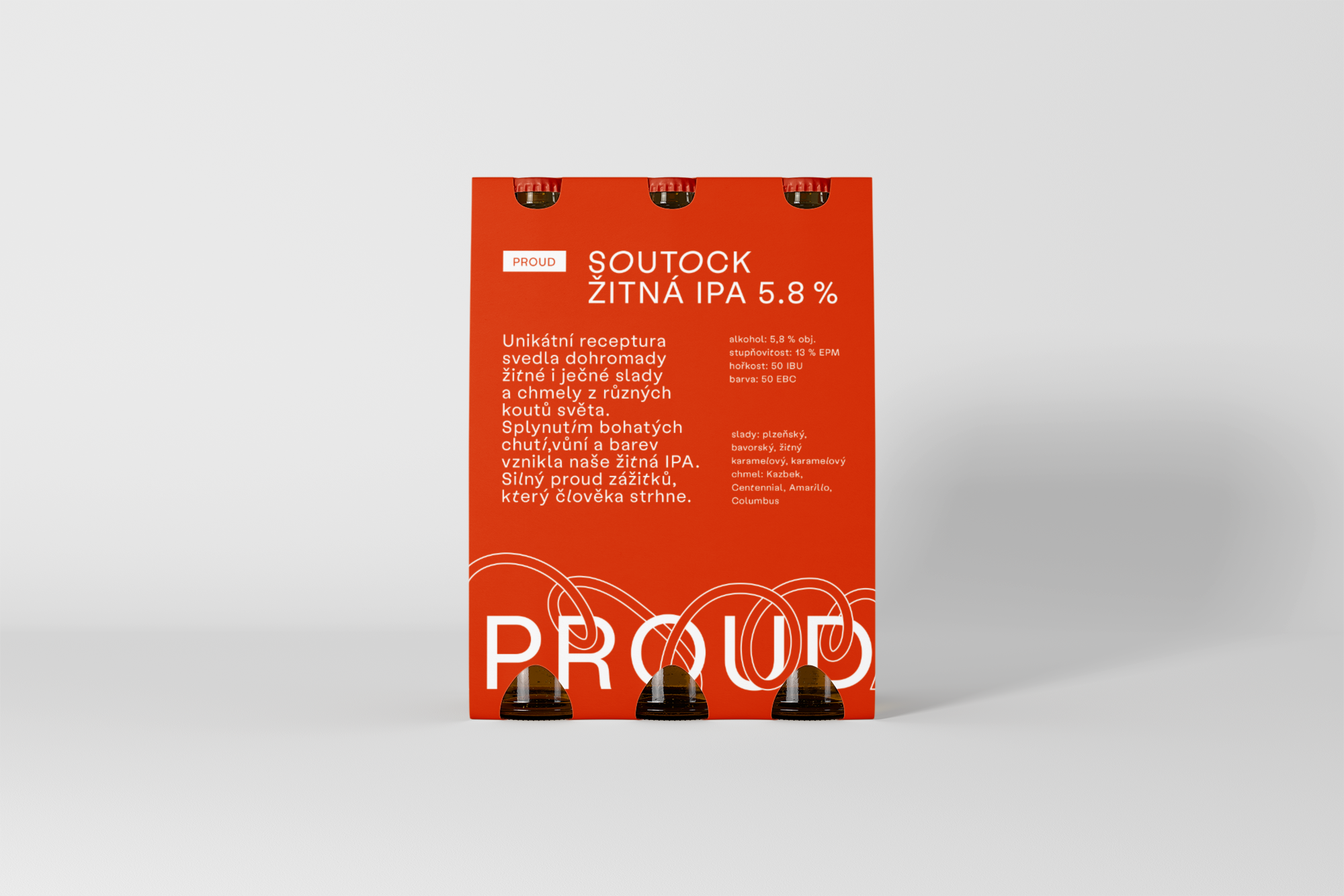
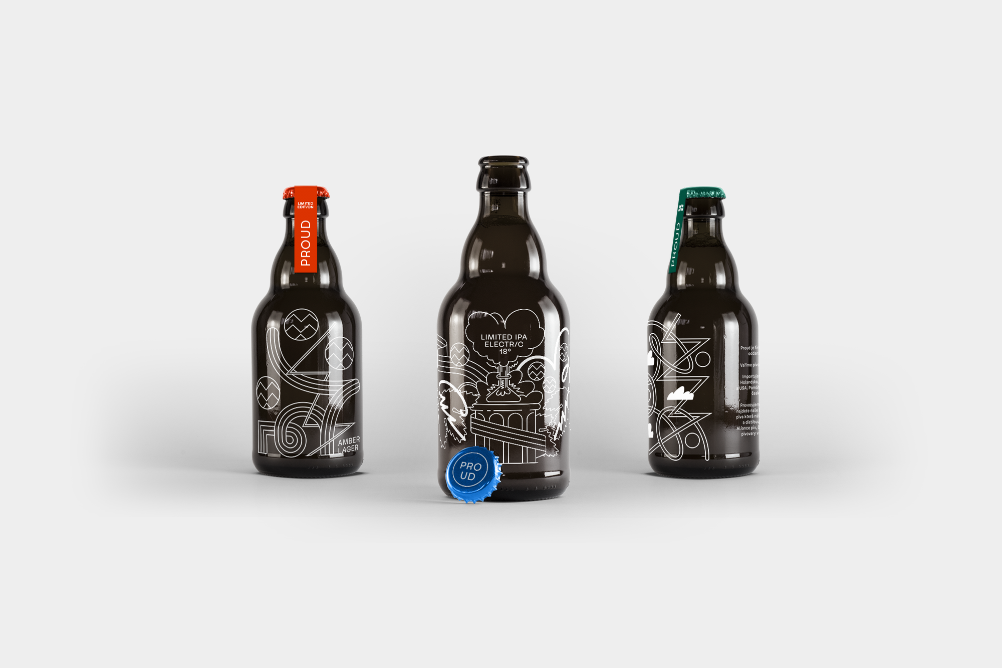
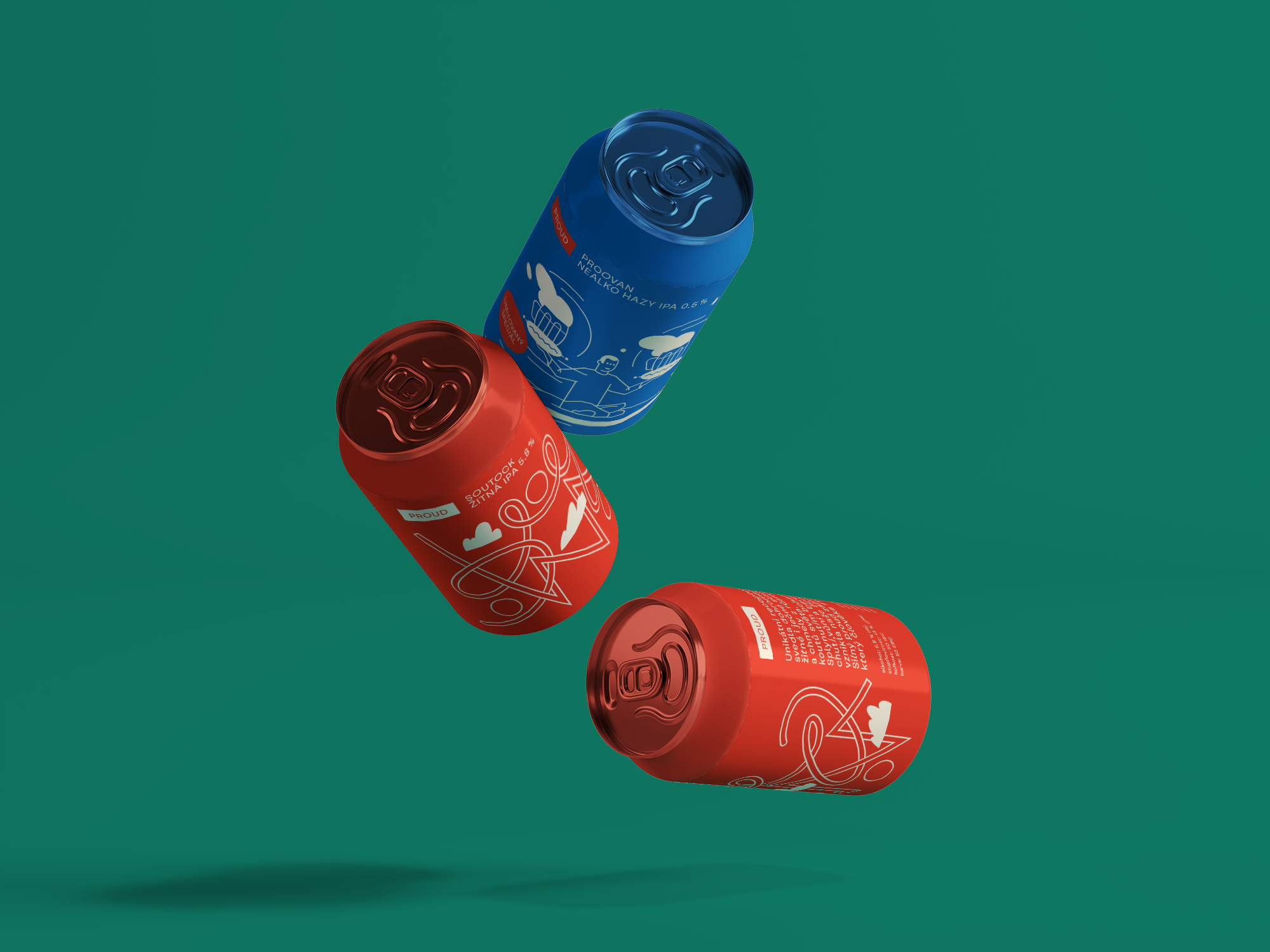

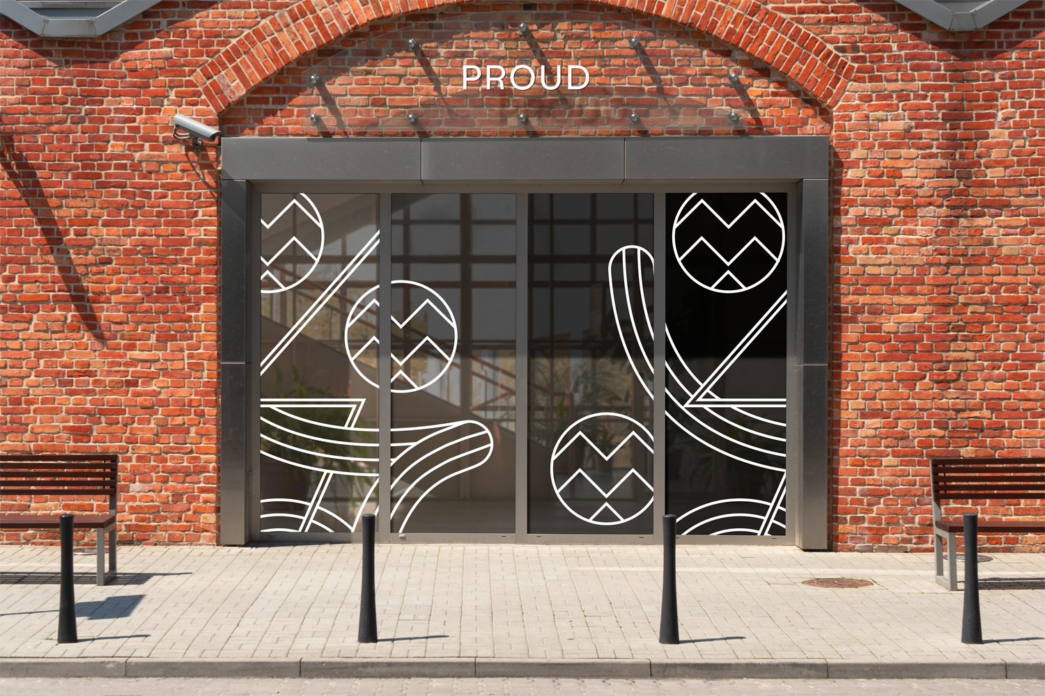
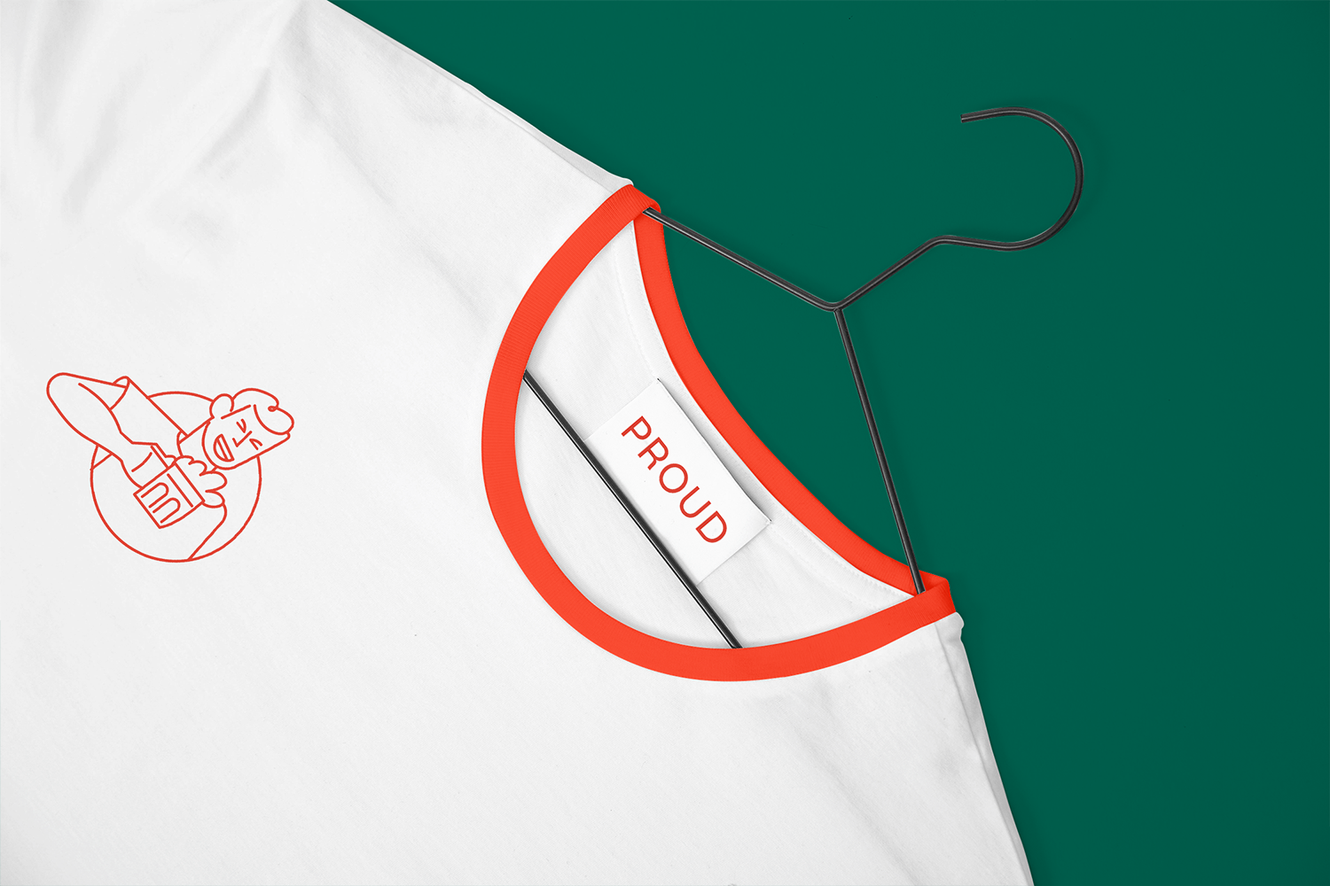
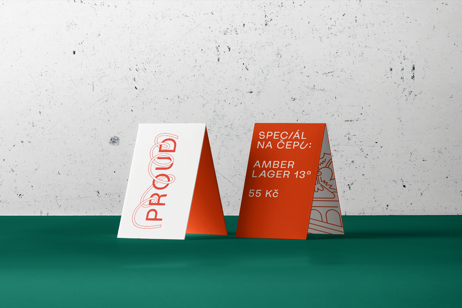

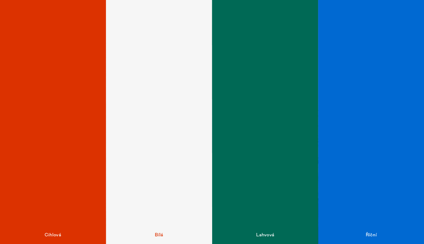
The colour in the identity comes from the environment around the brewery. Red brick, white plaster, bottle colour and water.

CREDITS
Creative Concept – Markéta Steinert
Visual identity – Markéta Steinert, Marek Ehrenberger
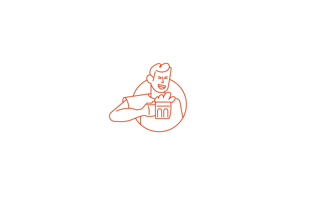
Illustrations – Marek Ehrenberger
Study for Prazdroj
CONTACT
Markéta Steinert
marketa@mrsteinert.com
00420 731 154 774
STUDIO
Markéta Steinert Studio
Kamenická 5
Letná, Praha 7
COMPANY
Mr. Steinert s.r.o.
Pražského 636/34, Praha
IČO 04873084