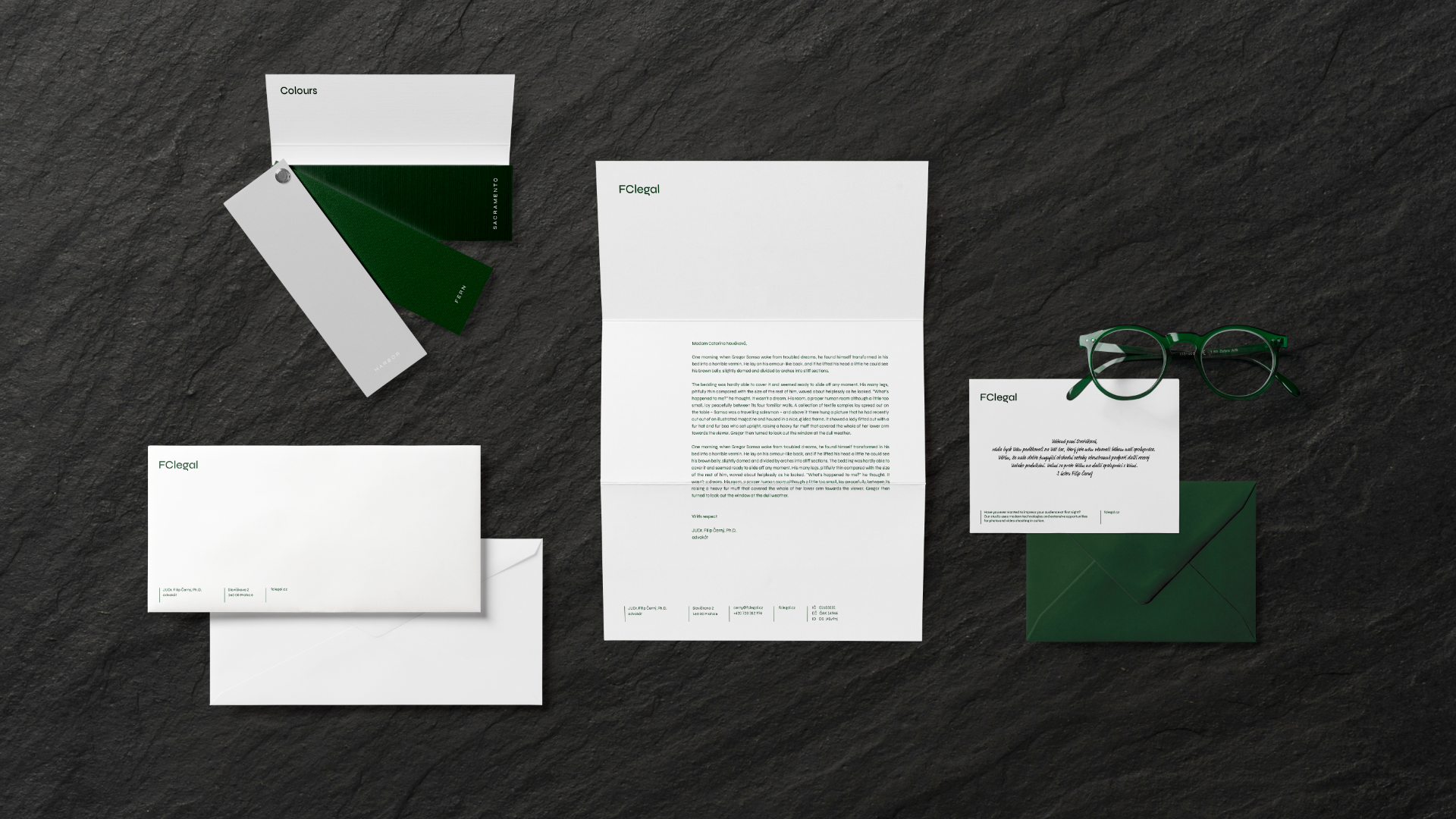
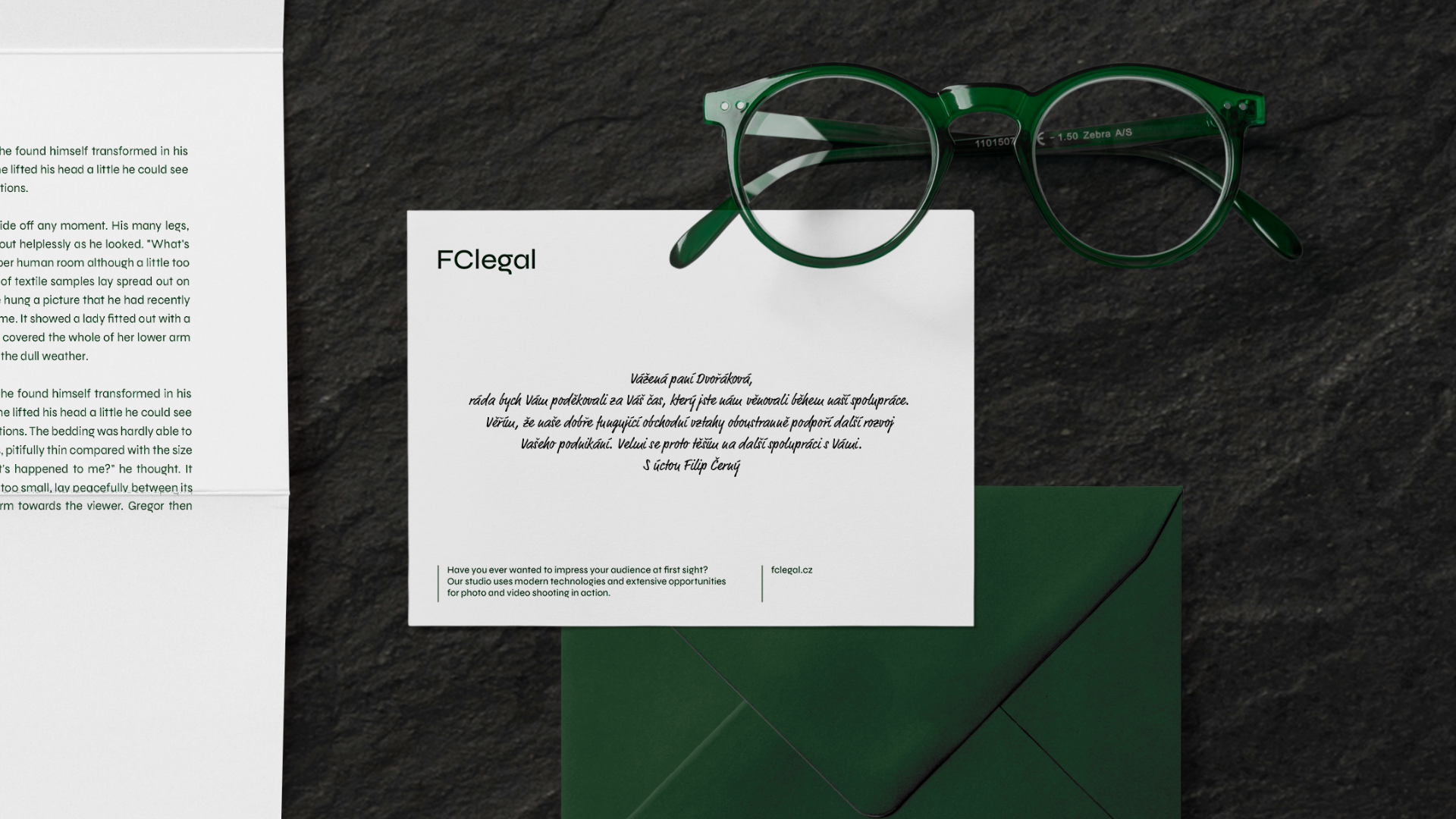
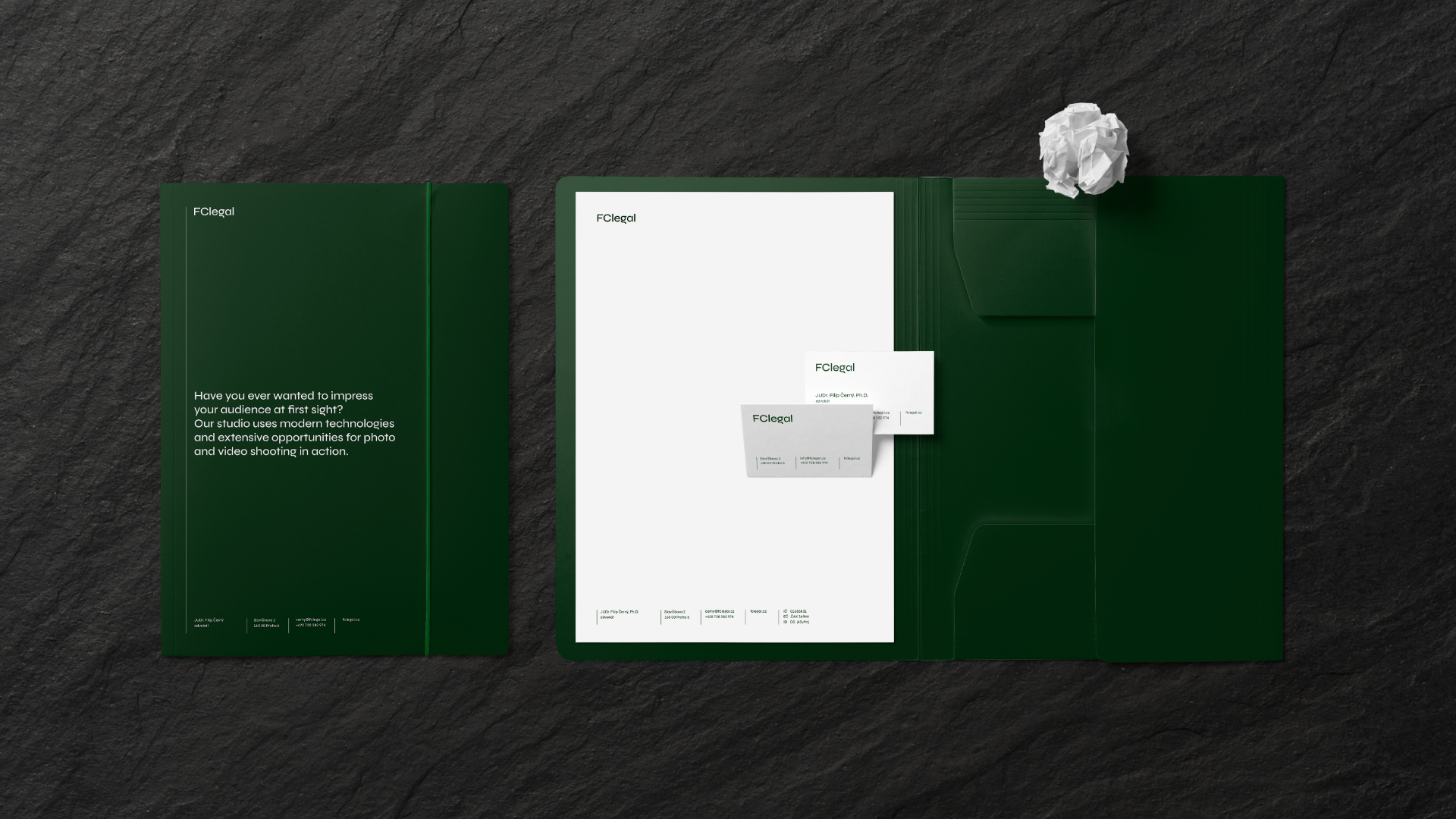
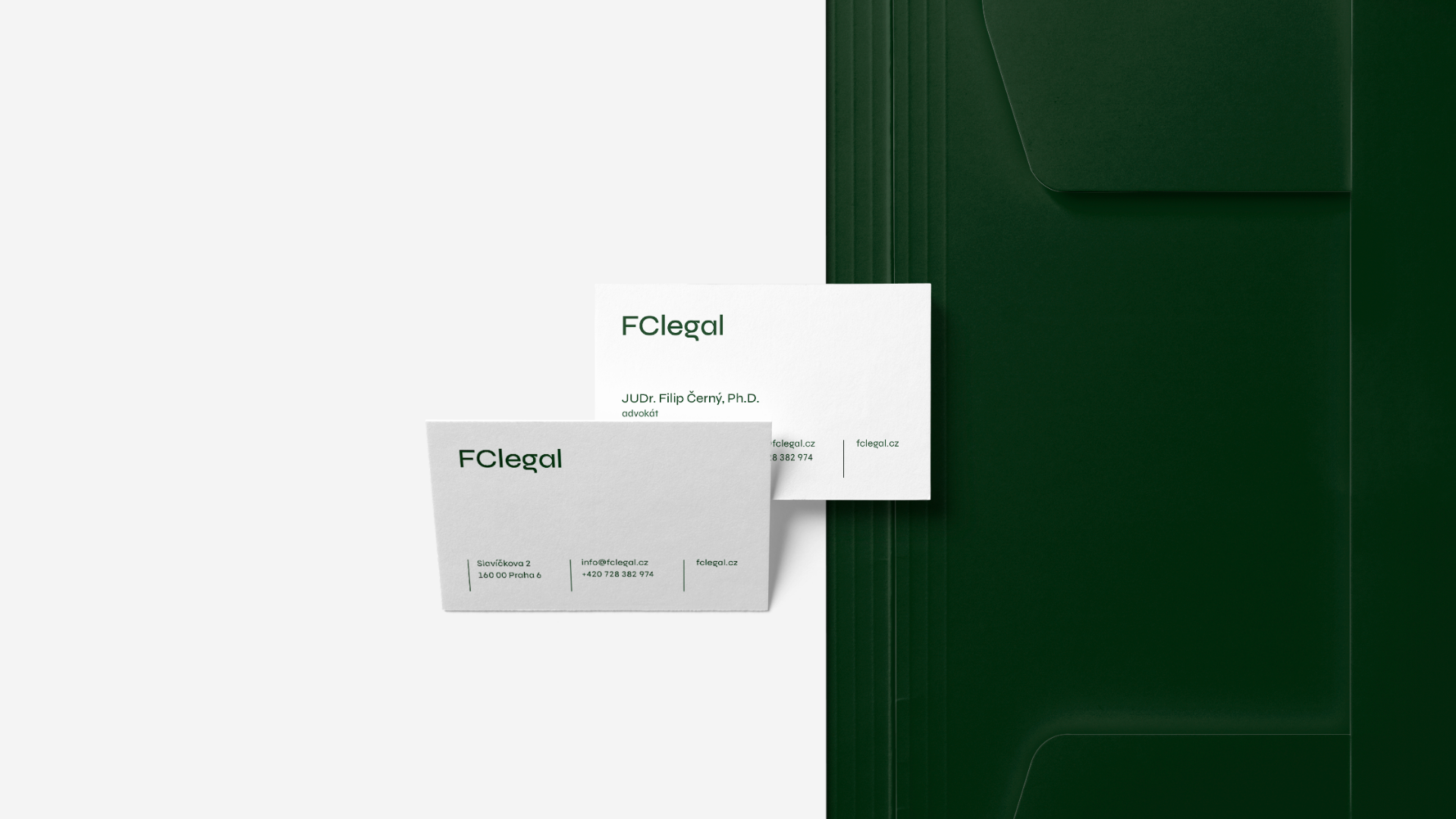
FClegal
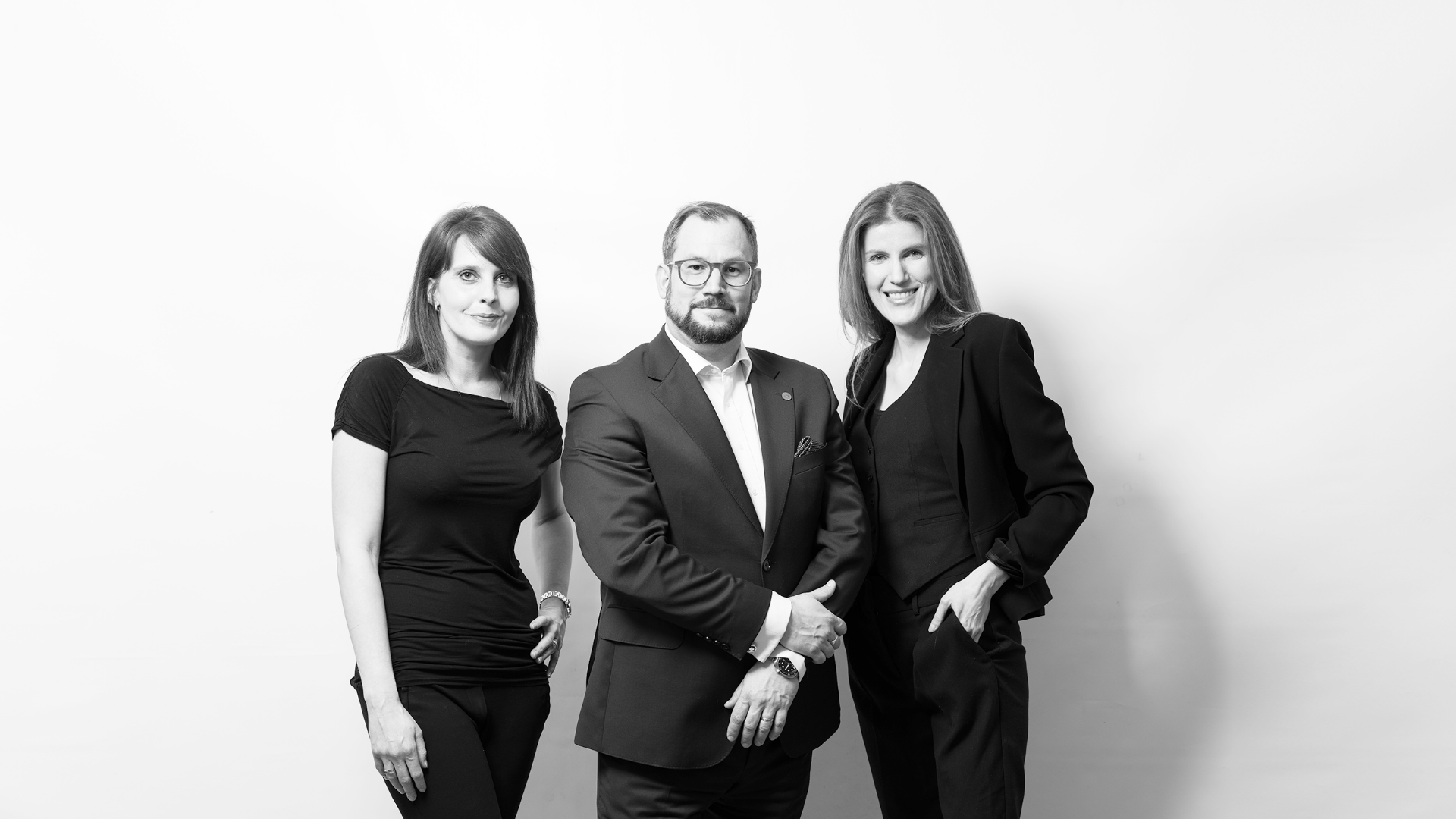
“A personal and individual approach is key for us. We emphasize professionalism and quality of our work, precision and attention to detail, which we consider to be key, regardless of the nature or complexity of the case.”
Filip Černý
CREDITS
Client – FClegal
Creative Concept – Markéta Steinert




Klenota
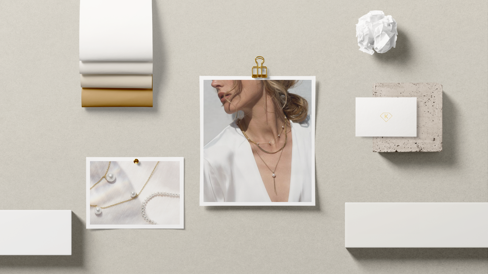
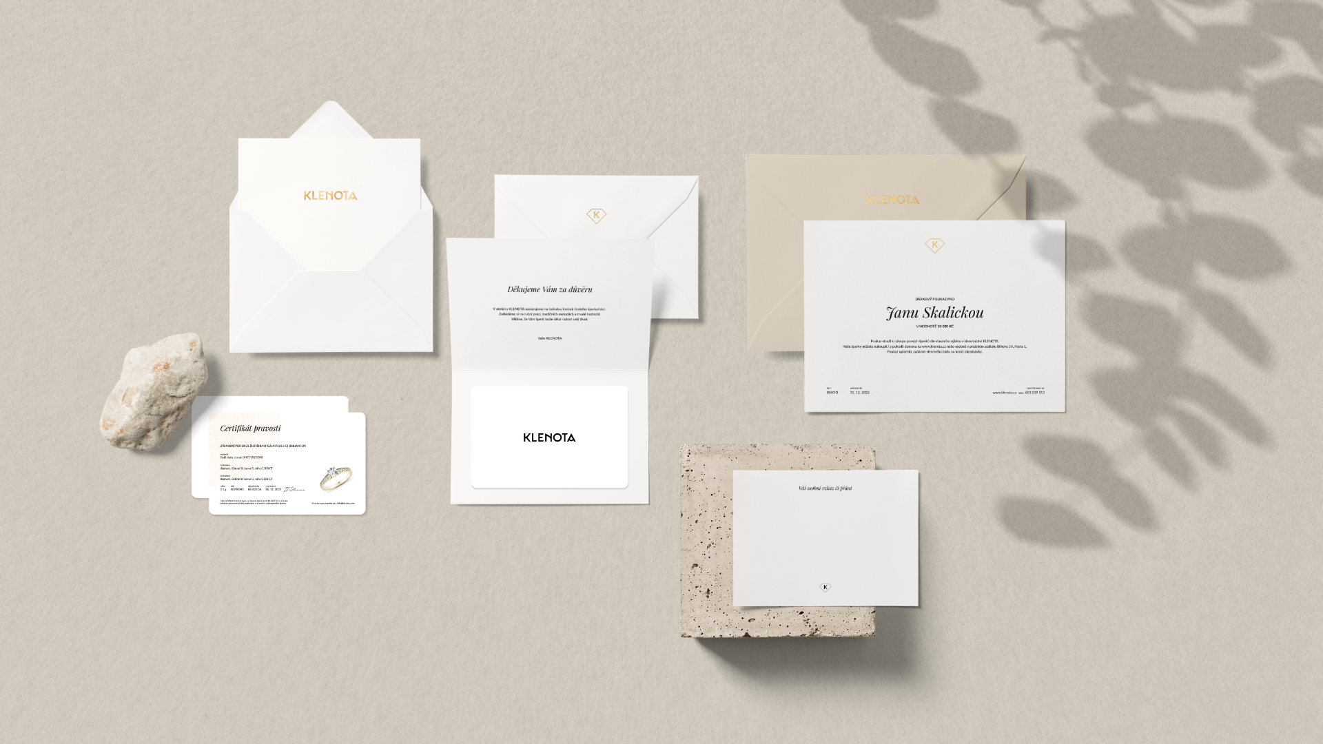
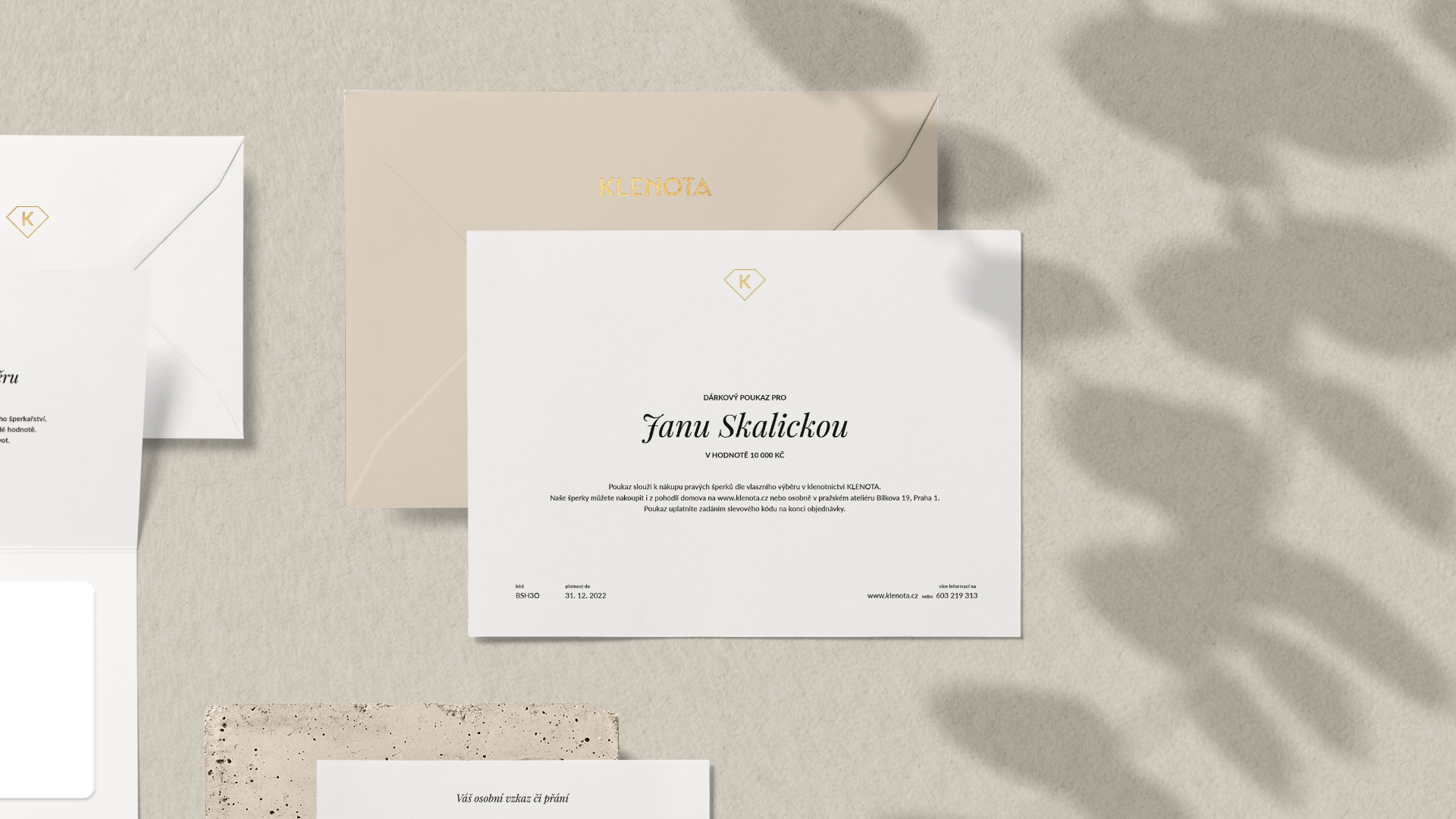
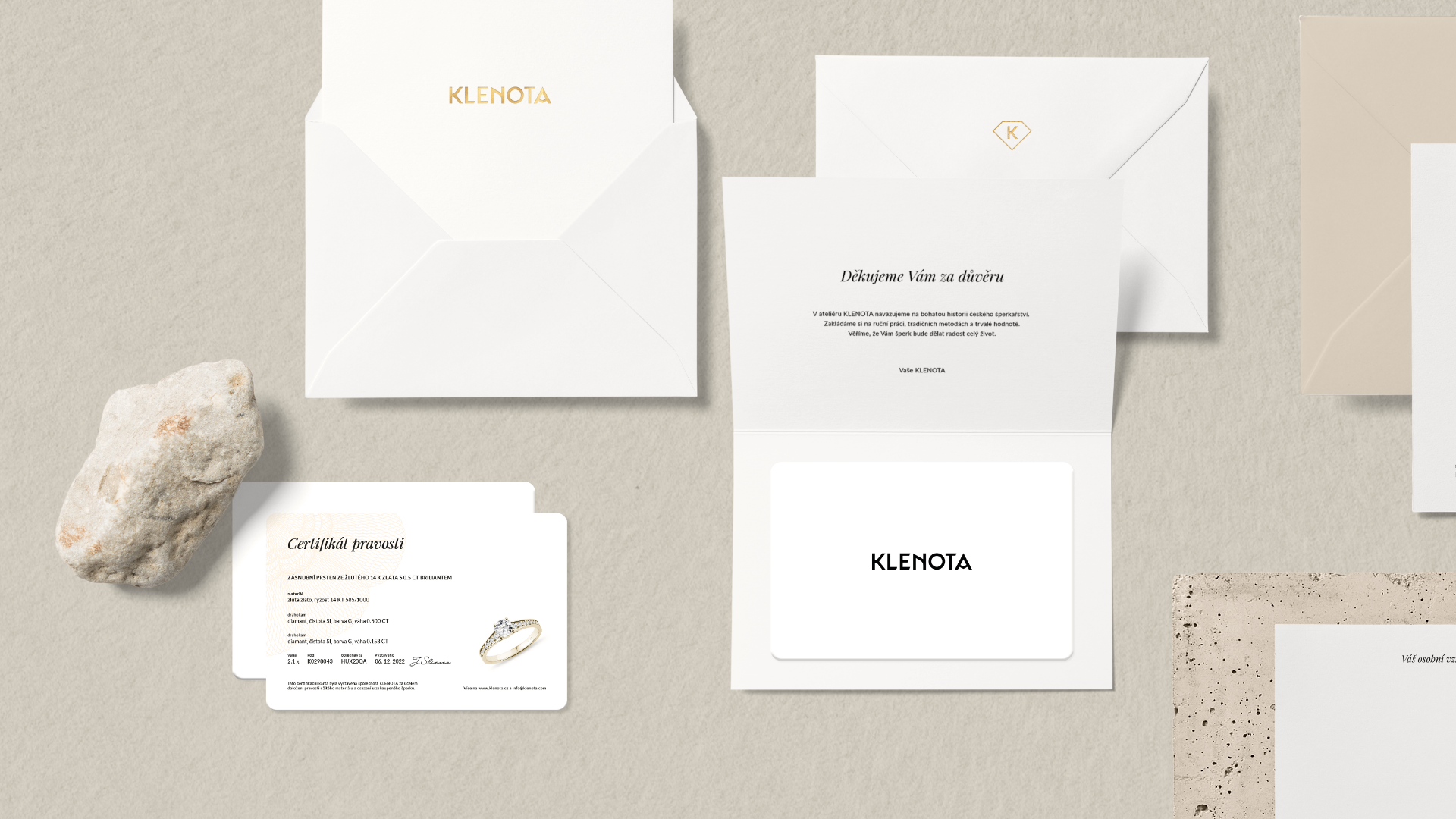
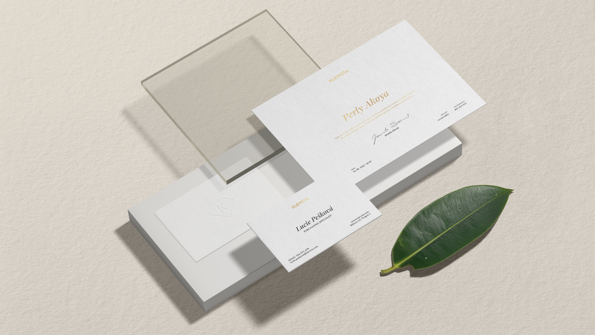
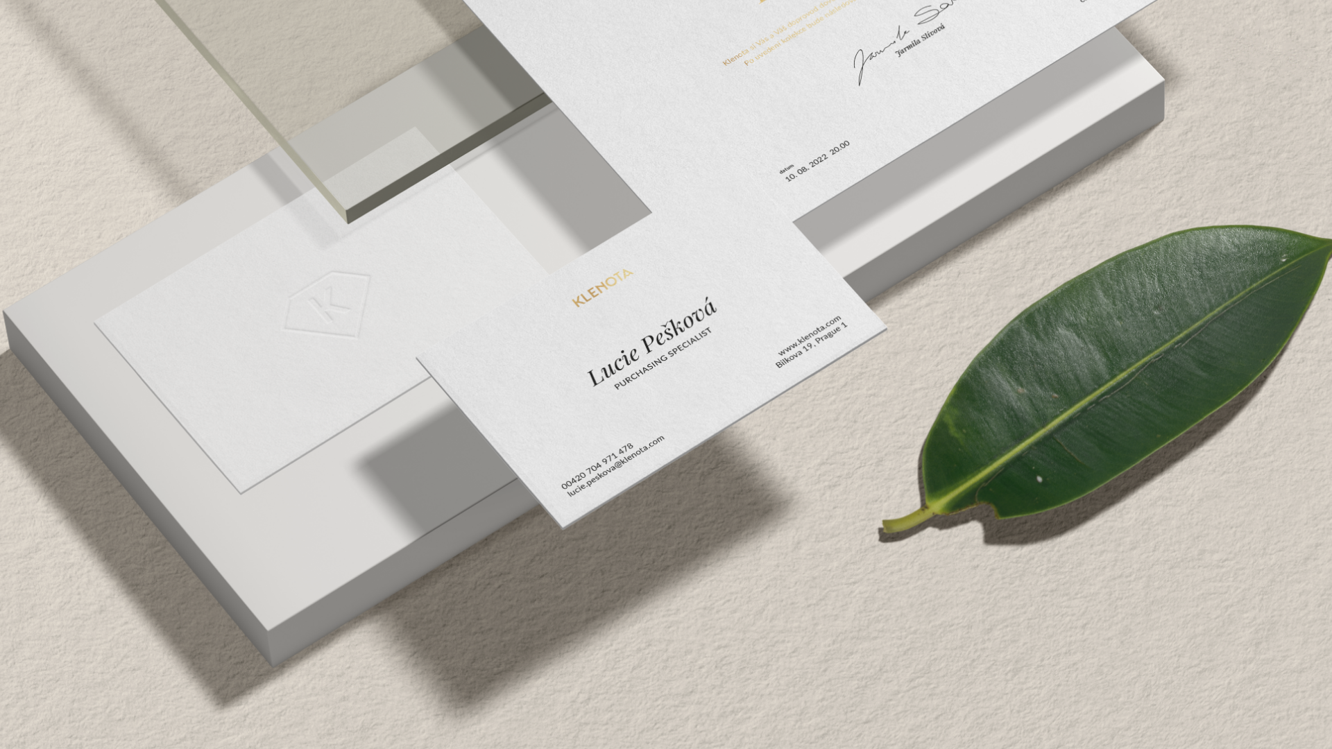
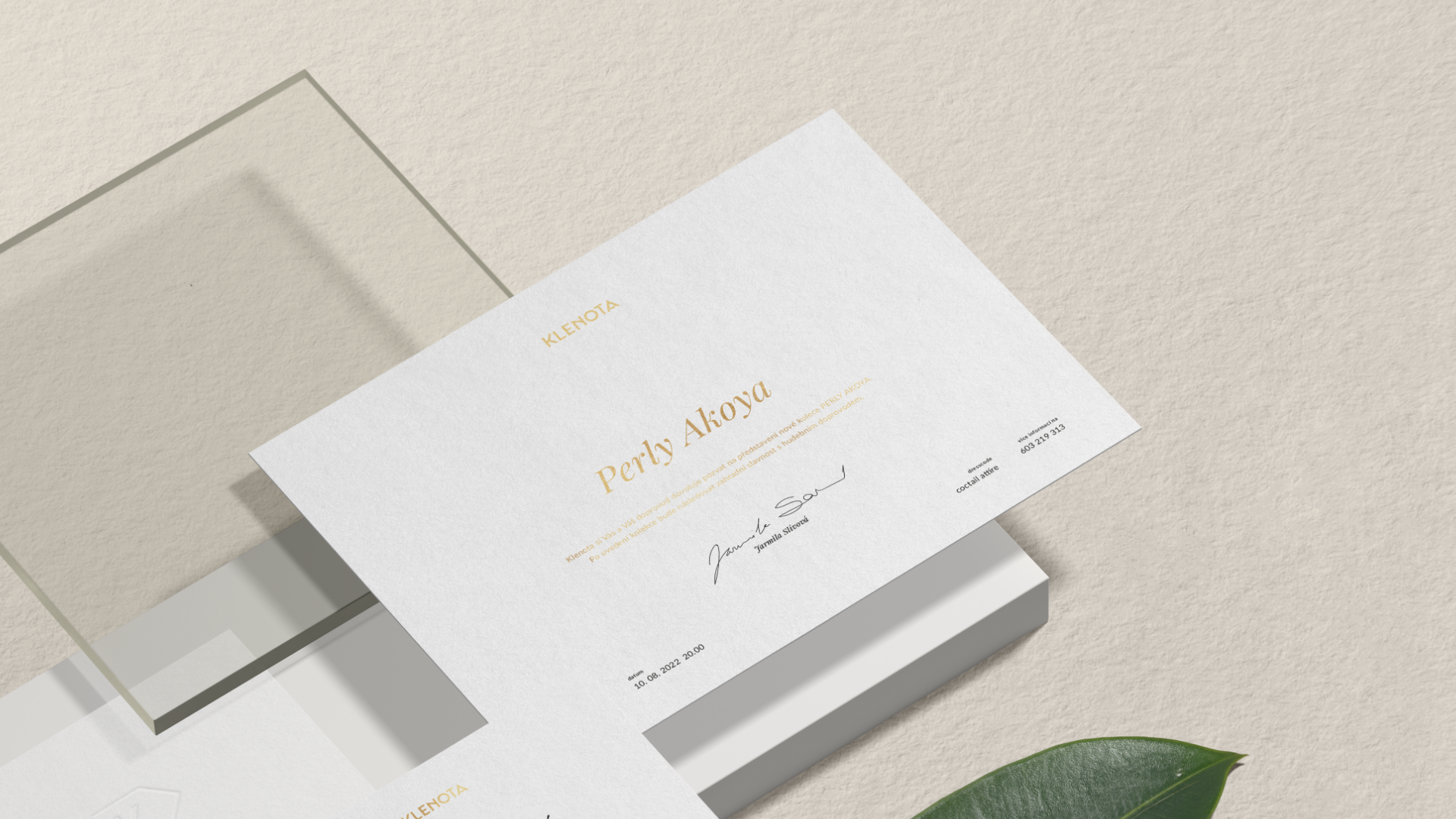
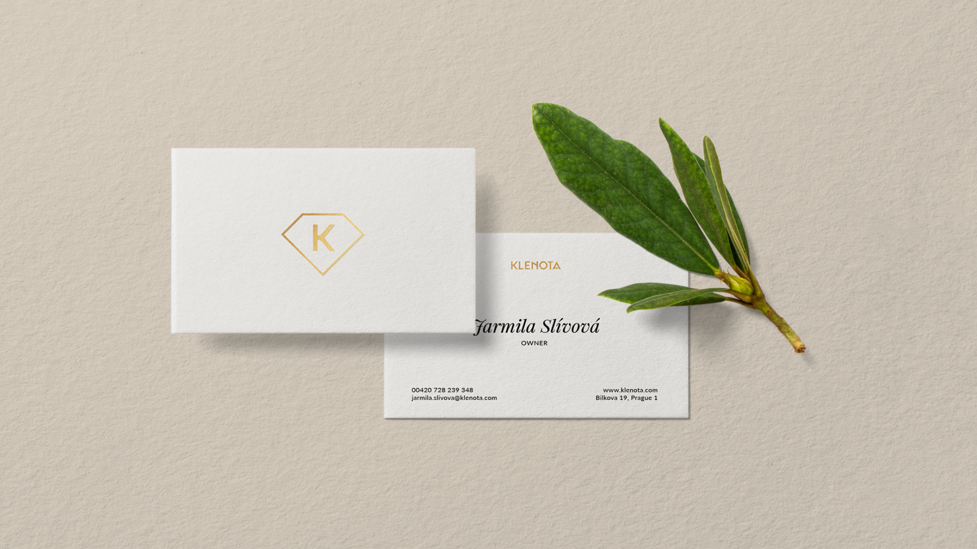
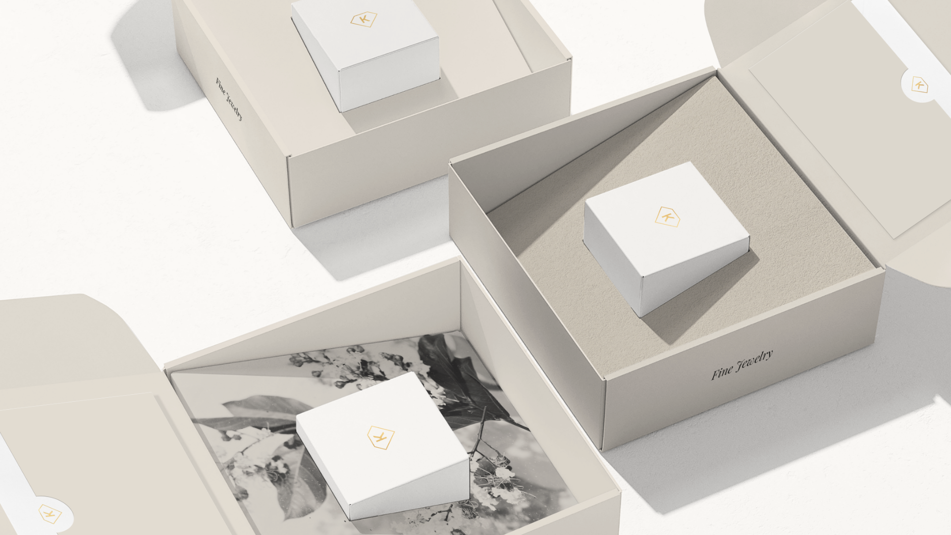
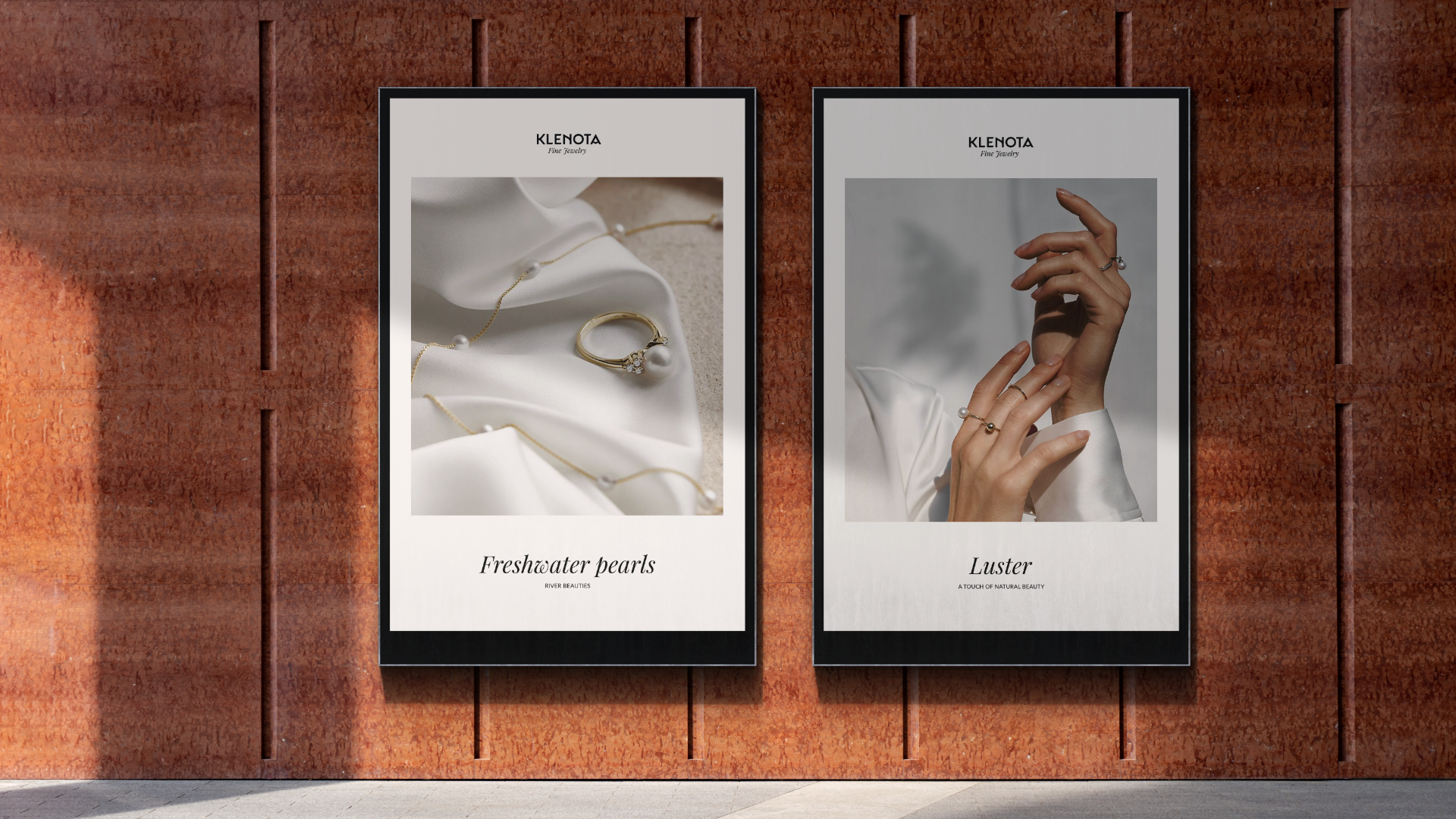
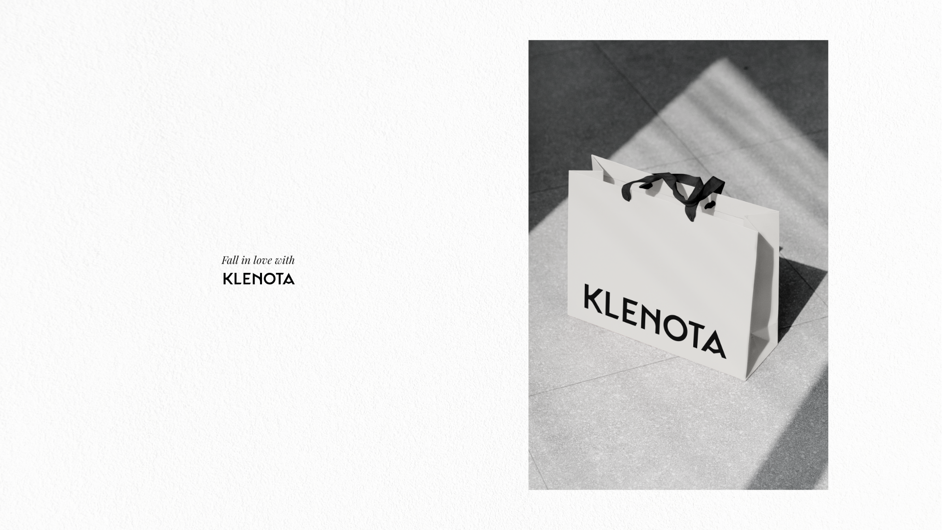
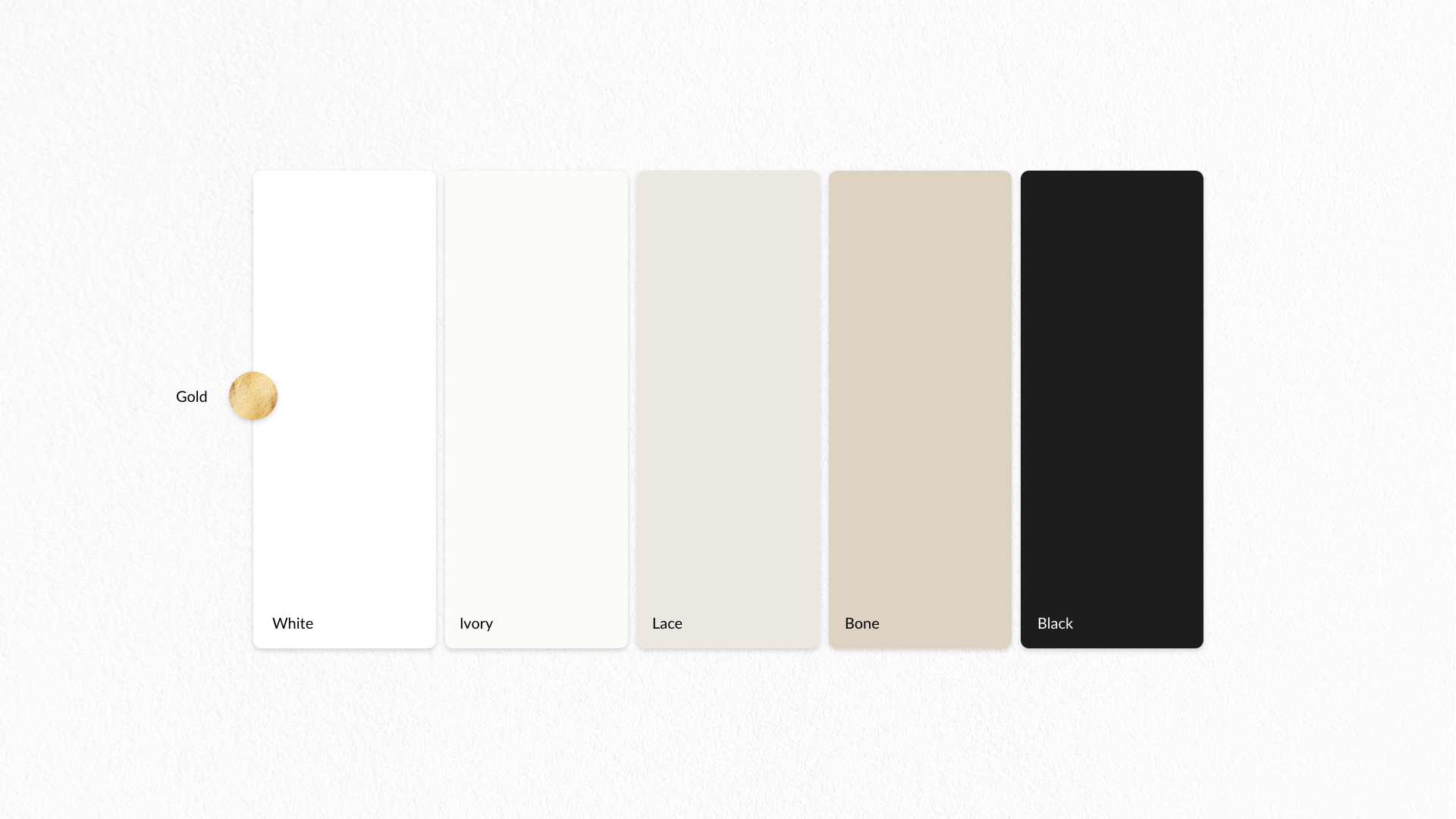
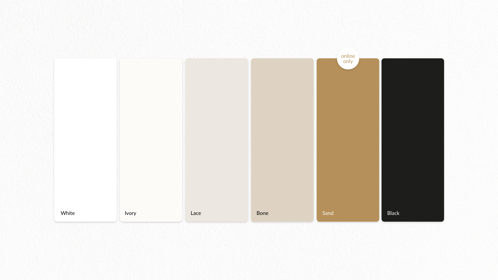
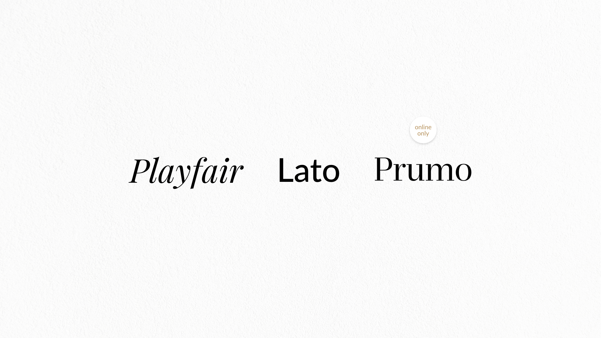
KLENOTA is a young, purely Czech brand that was founded in 2008 out of love for real jewelry. It is based on the rich Czech history of handmade goldsmithing and jewelry making. It holds on to values proven by centuries: it believes in handmade, traditional methods and quality jewelry. The atelier is located in the historical centre of the city, near Old Town Square, which has been the centre of Prague's gold and jewelry industry for centuries.
CREDITS
Client – Klenota
Creative Concept – Markéta Steinert
Logo – Klenota
Concept
Svitavy
The pun "a vy" (and you), which the name of the city contains, communicates that the city will always be shaped primarily by its inhabitants. The conjunction 'and' can be followed by any text in the context of the message. This opens up a variable space for playfulness, creativity, and or formality.
The whole communication is directed inwards - towards the inhabitants of Svitavy. This fact is supported by the primary colours that underline the energy of the city. Ultramarine blue symbolizes harmony, solidarity and the desire to fulfill future plans. Forest Green illustrates the surrounding greenery and beautiful nature.
Given the typographic nature of the identity, the typeface serves as one of the primary means of a unified visual style. The basic typeface is Eina 01 typeface Linotype.
CREDITS
Client – Svitavy City
Creative Concept – Markéta Steinert, Jakub Gruber
Visual identity – Markéta Steinert, Jakub Gruber
Motion Design – Jakub Gruber
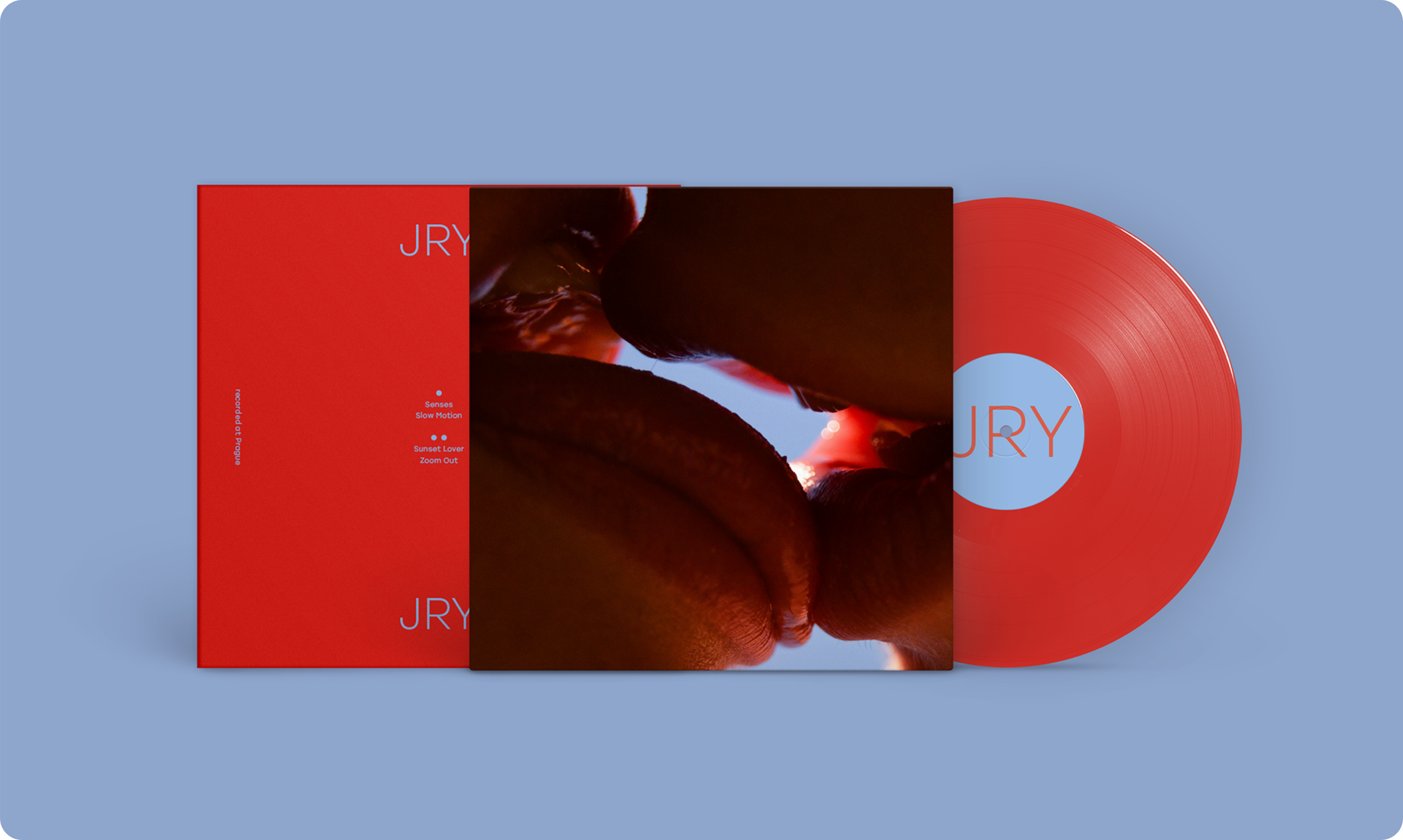
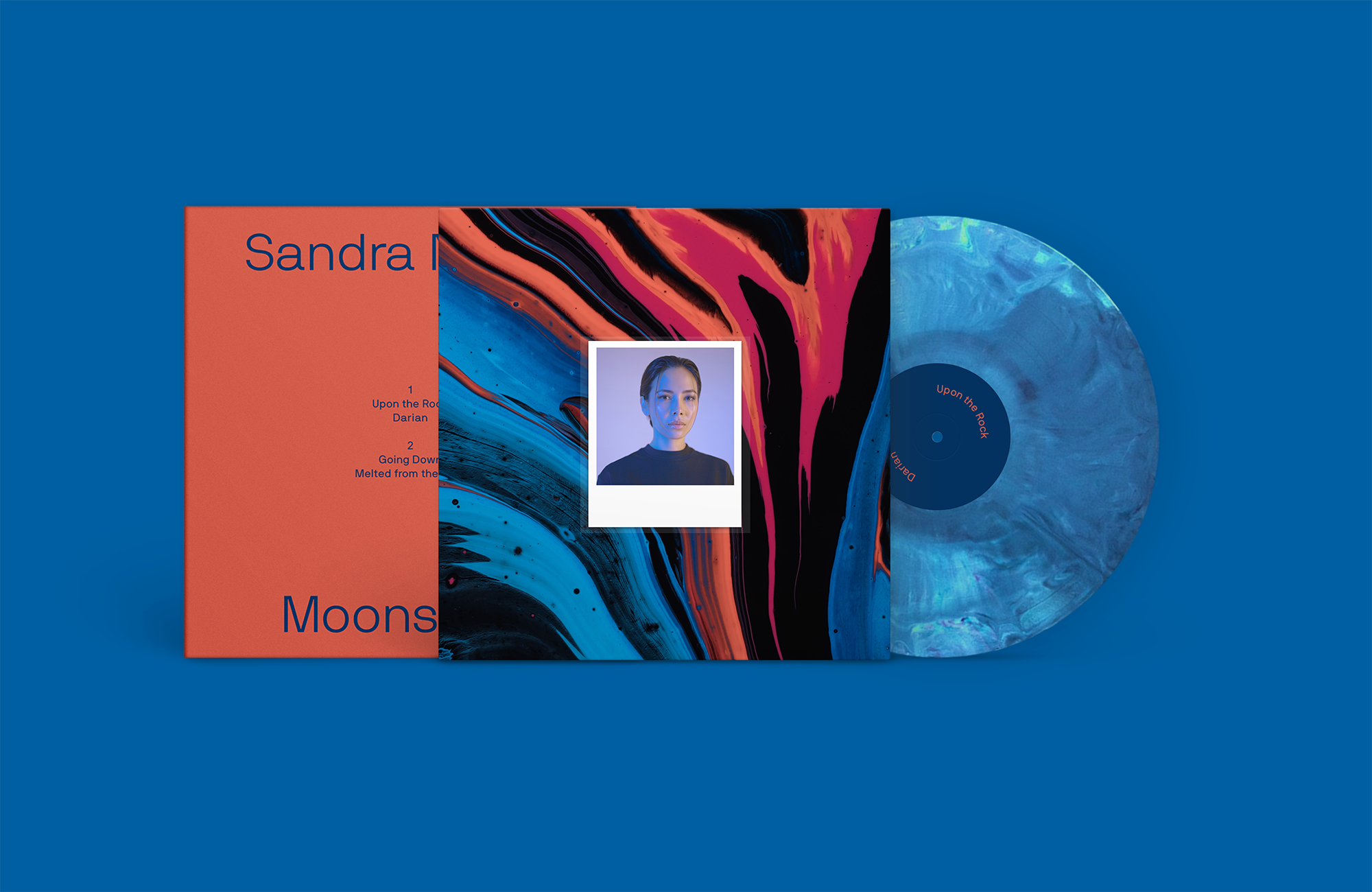
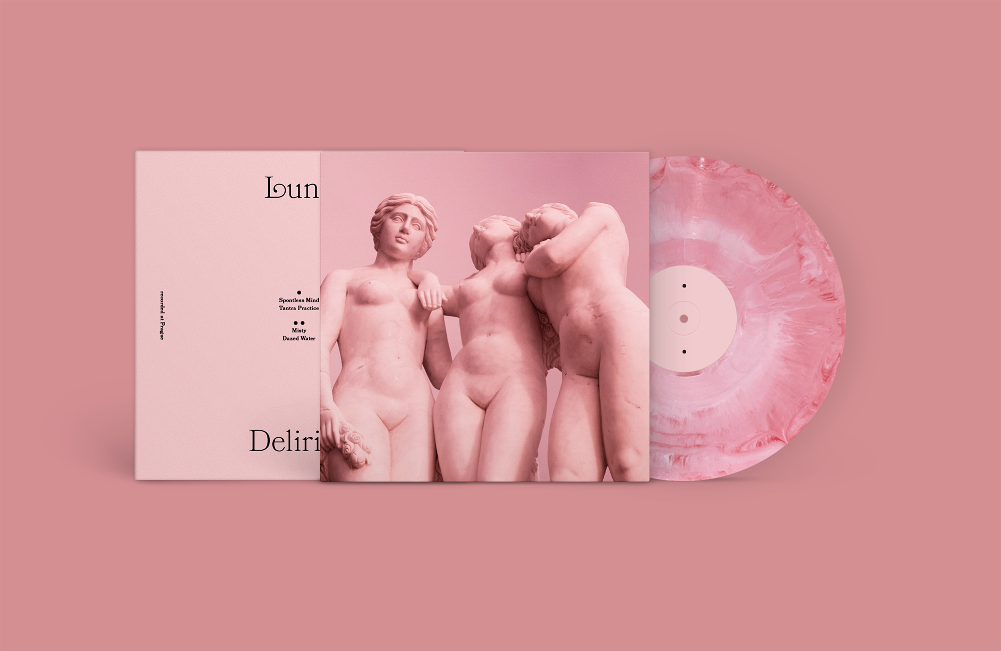
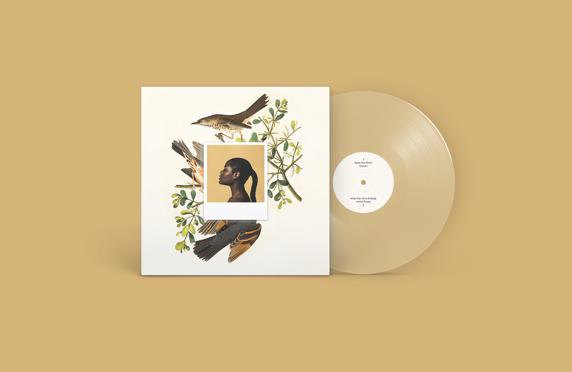
Prague Sirens
Prague Sirens is a music school in Prague Letná. Their singing lessons take place in rooms that transport you to another world. The lavish style of the original 19th century architecture is combined with modern industrial design.
CREDITS
Client – Prague Sirens
Design – Markéta Steinert
National Gallery Praha
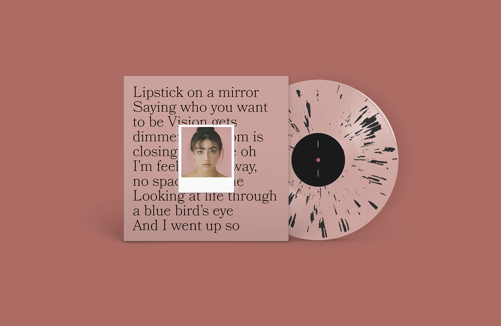
We share the vision of NGP as an open and friendly institution. We see NGP as a brand with a clear symbol and identity. The story is important and NGP does not have to invent anything compared to other "brands" – it has hundreds of wonderful stories of images and their authors. Let the gallery do the talking! The graphic design of the logo is purely typographic. Thus, it is not bound by the font in its conceptual level. For the basic communication of NGP we chose the Mabry font from London-based Colophon Foundry.
CREDITS
Client – NGP
Creatiive Concept – Markéta Steinert, Adam Uchytil
Motion Design – Martin Pokorný
Concept
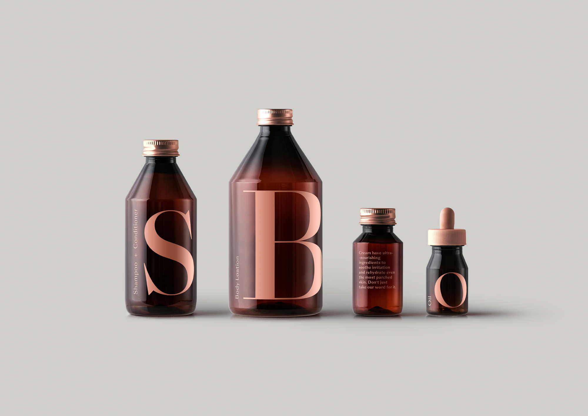
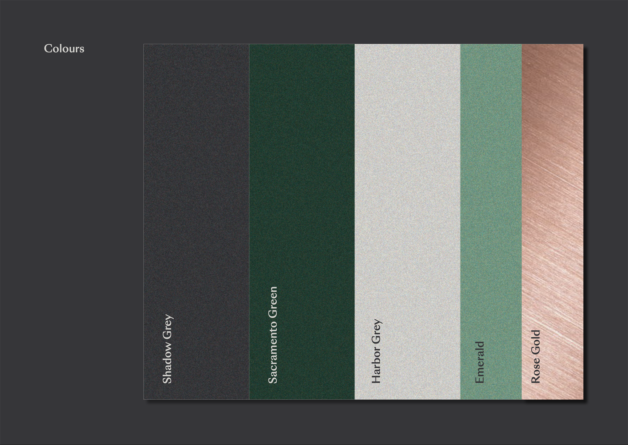
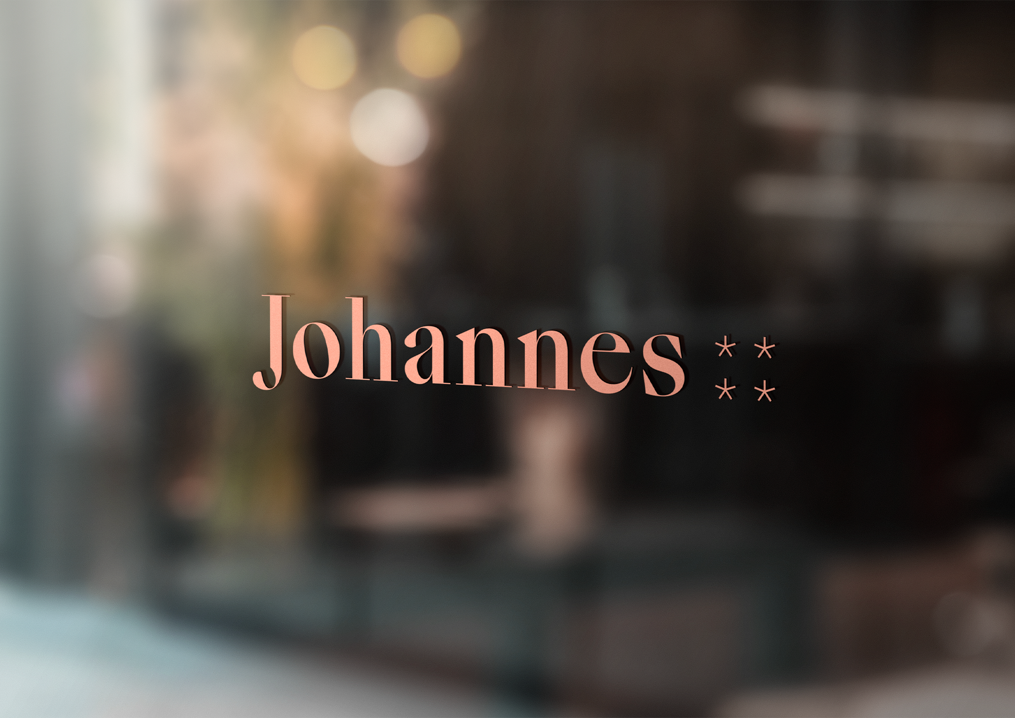
Hotel Johaness ****
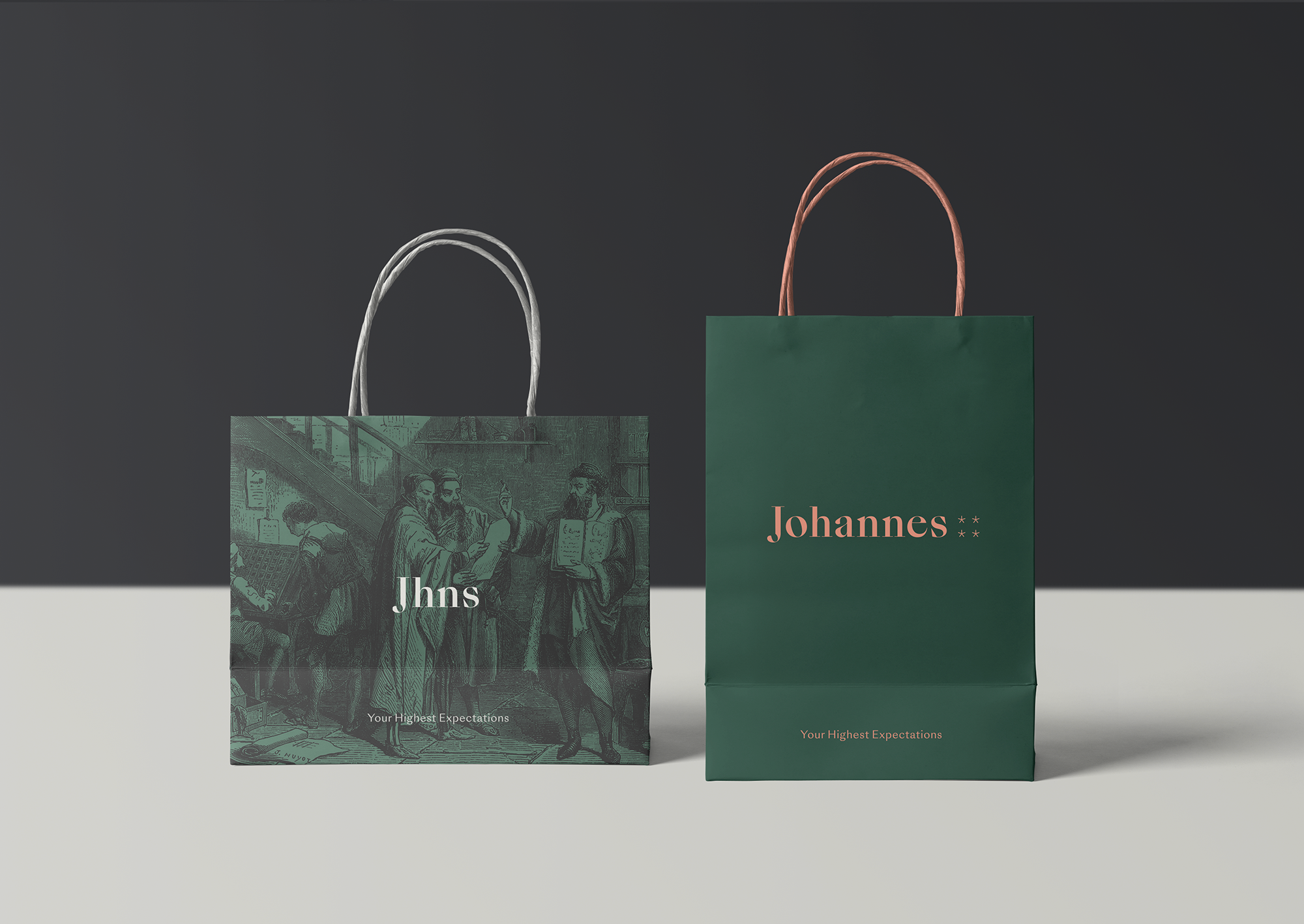
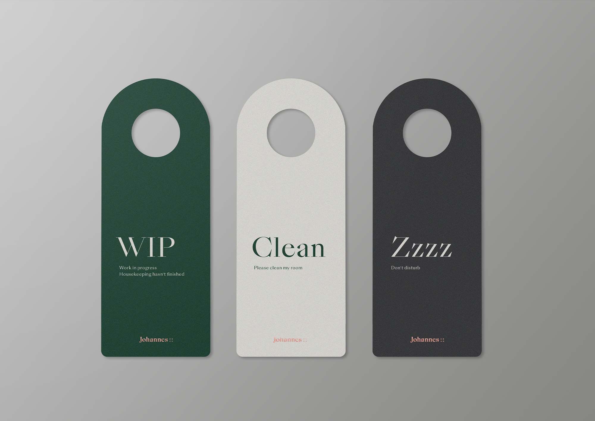
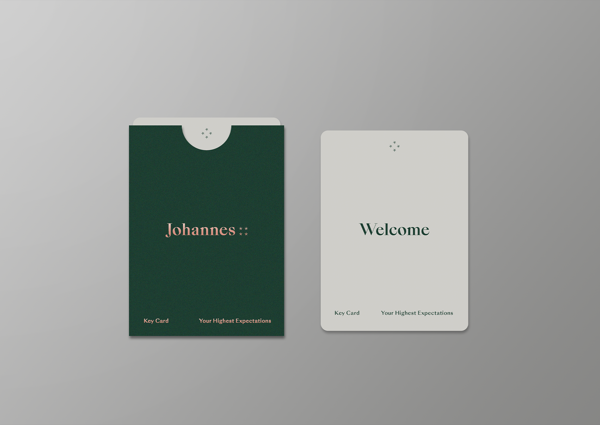
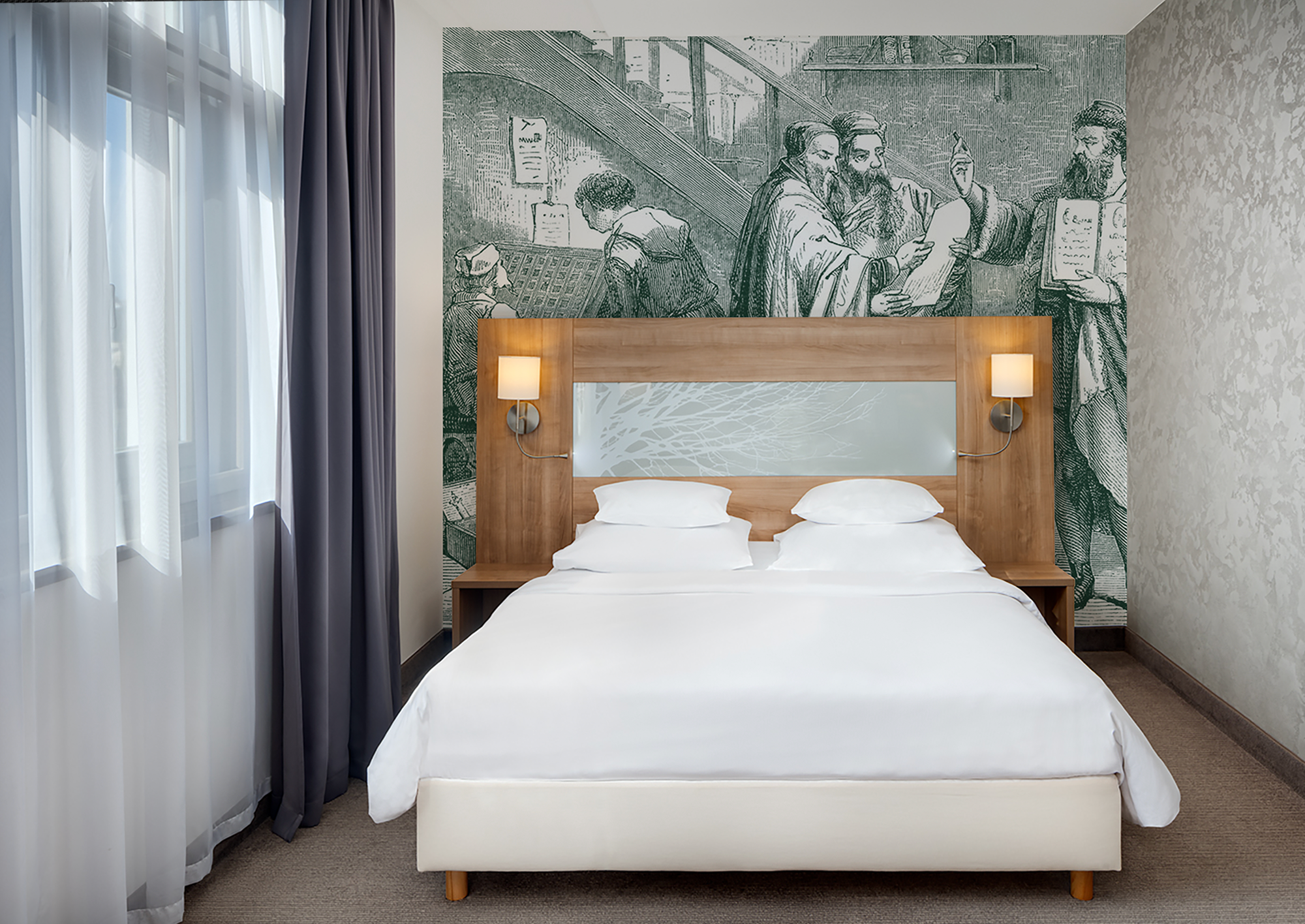
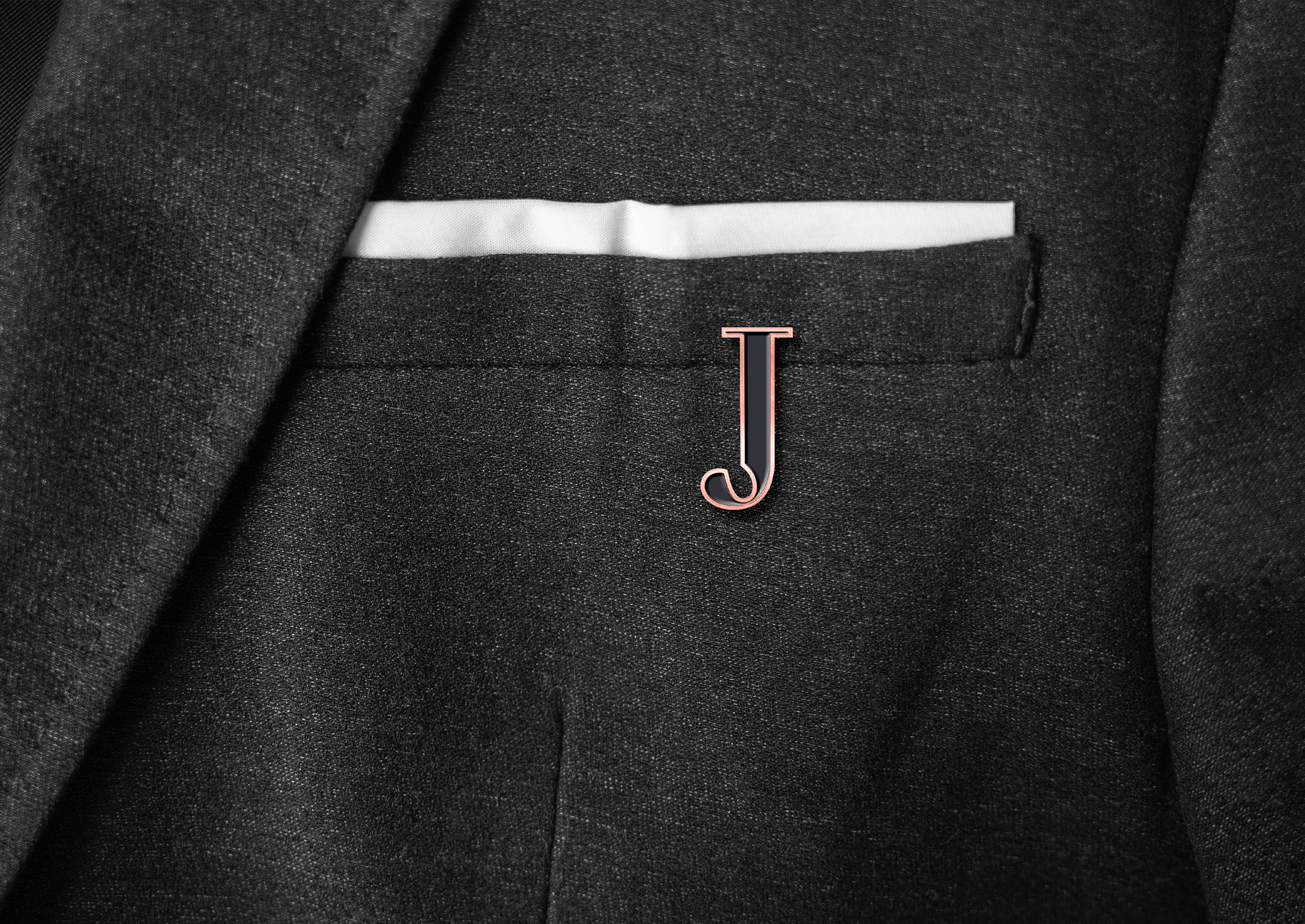
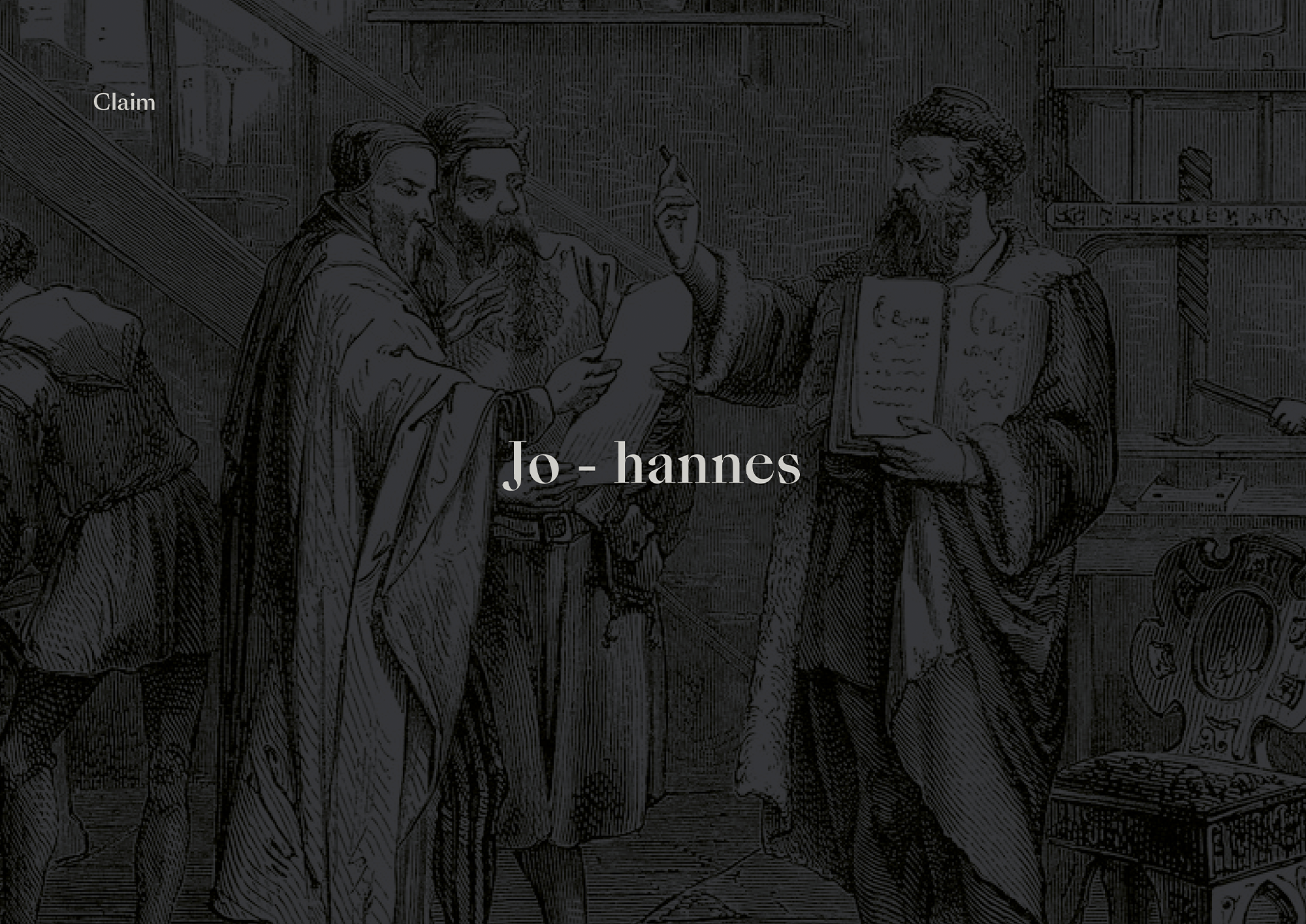
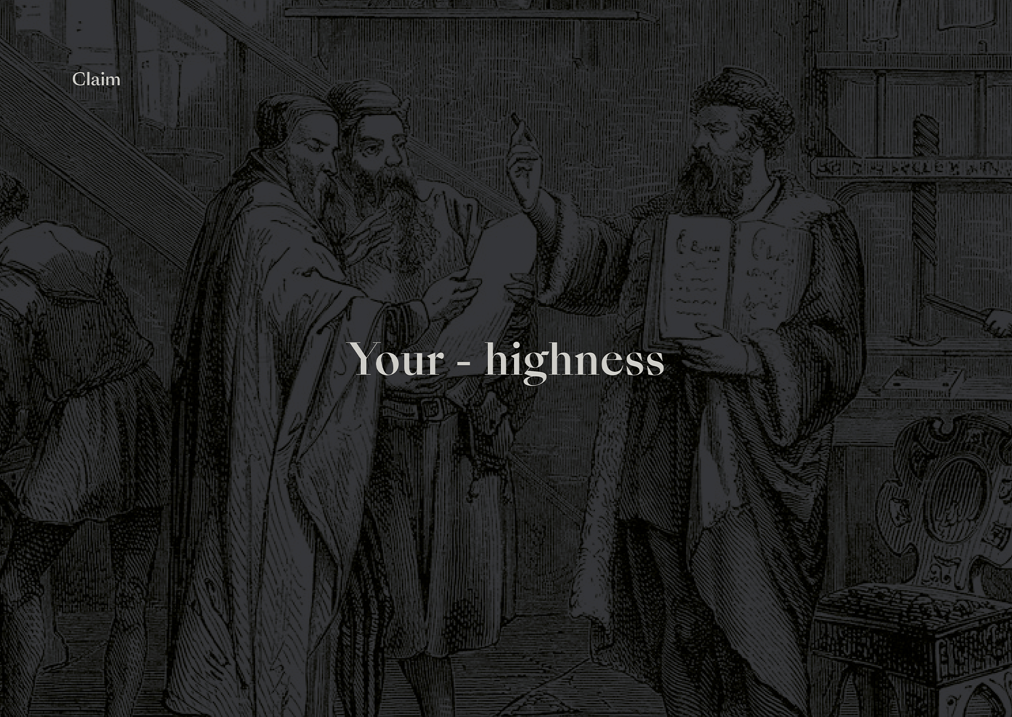
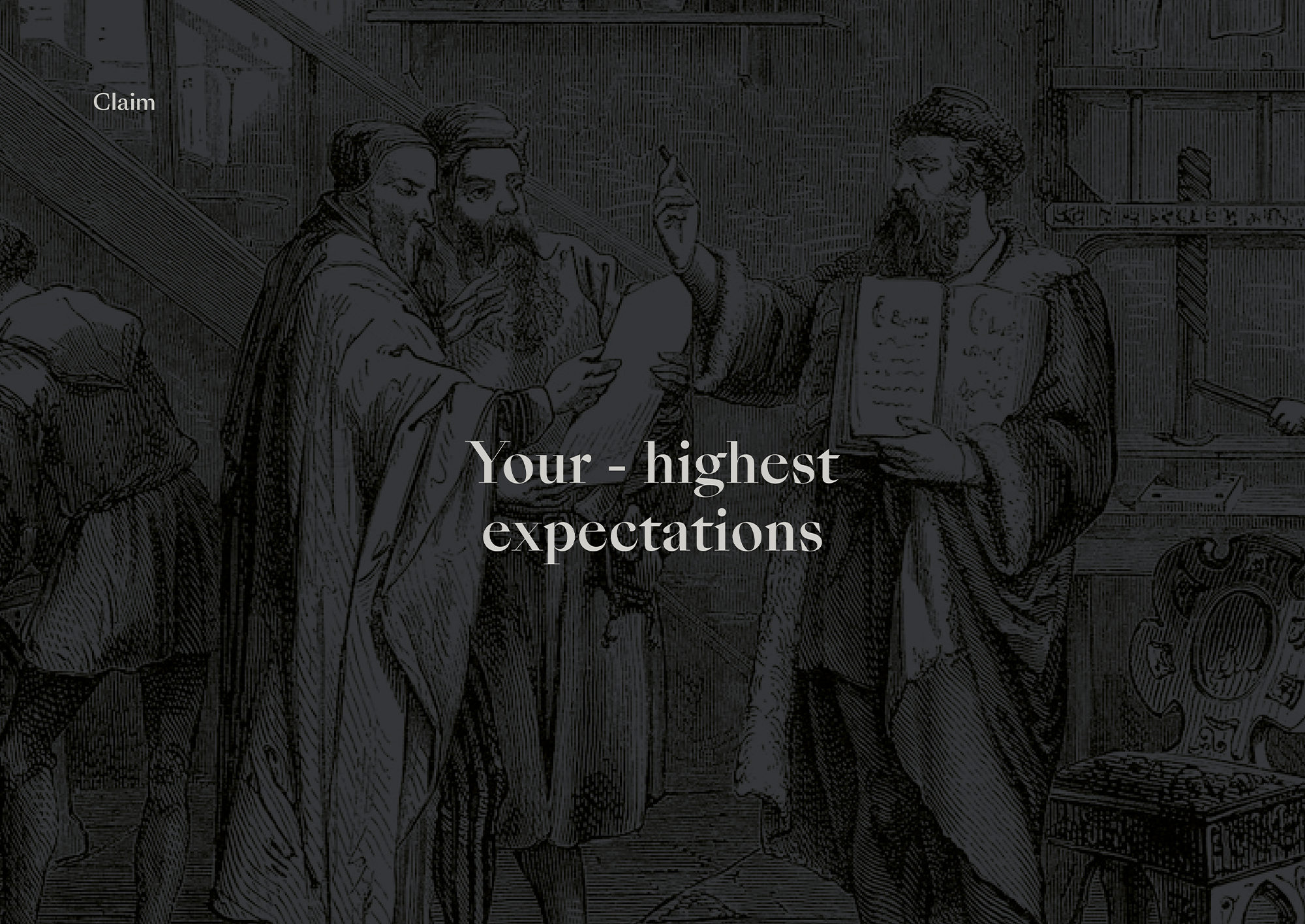
Hotel on Prague's waterfront is housed in a historic building originally used as a printing house. As a result, the new name Johaness was chosen. Johaness was the first name of Johannes Gutenberg, the inventor of mechanical printing technology.
Jo-haness / Your-Highness / Your-Highest Expectations
CREDITS
Creative Concept – Markéta Steinert
Brand Strategy – Little Greta
Concept
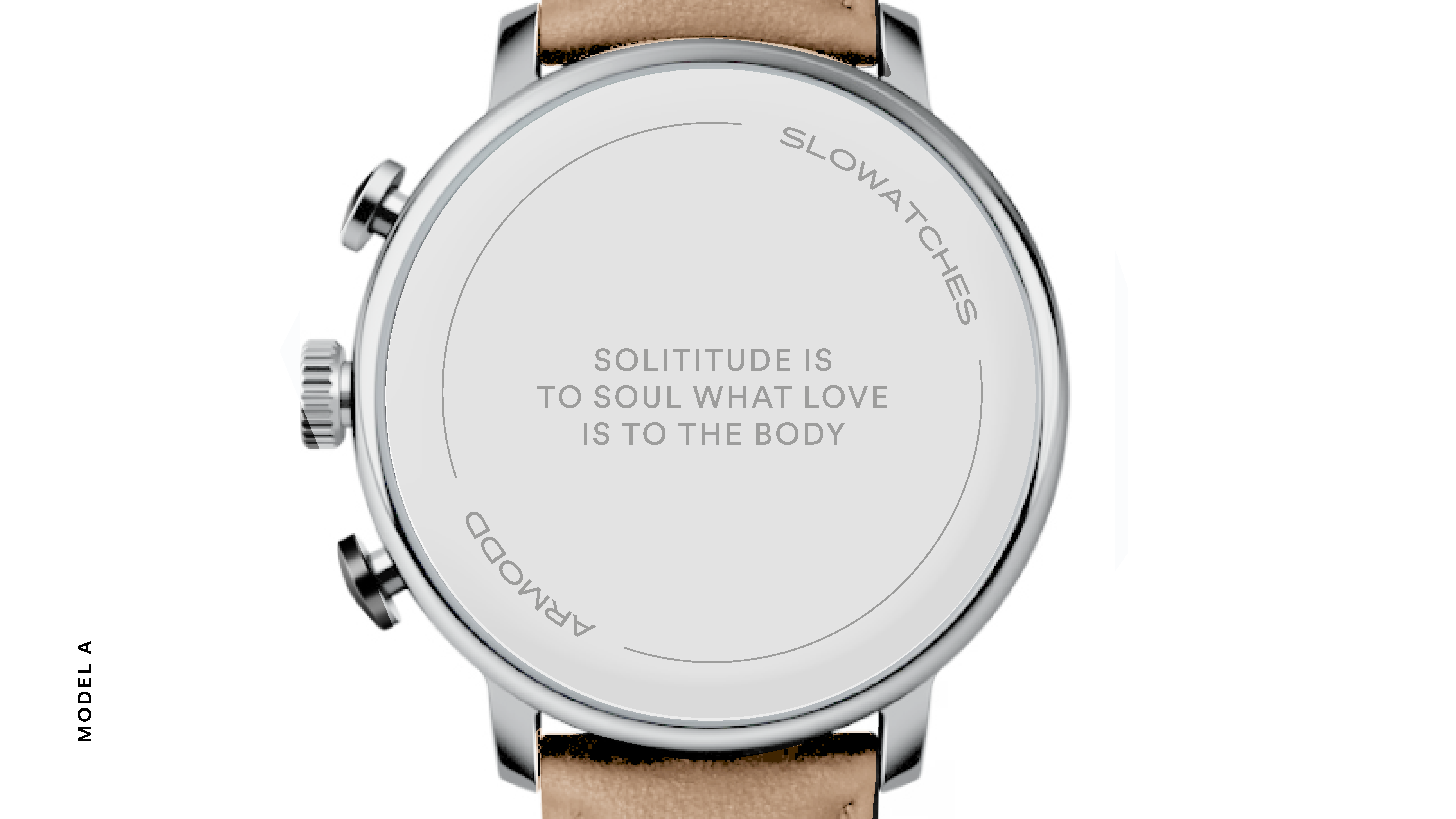
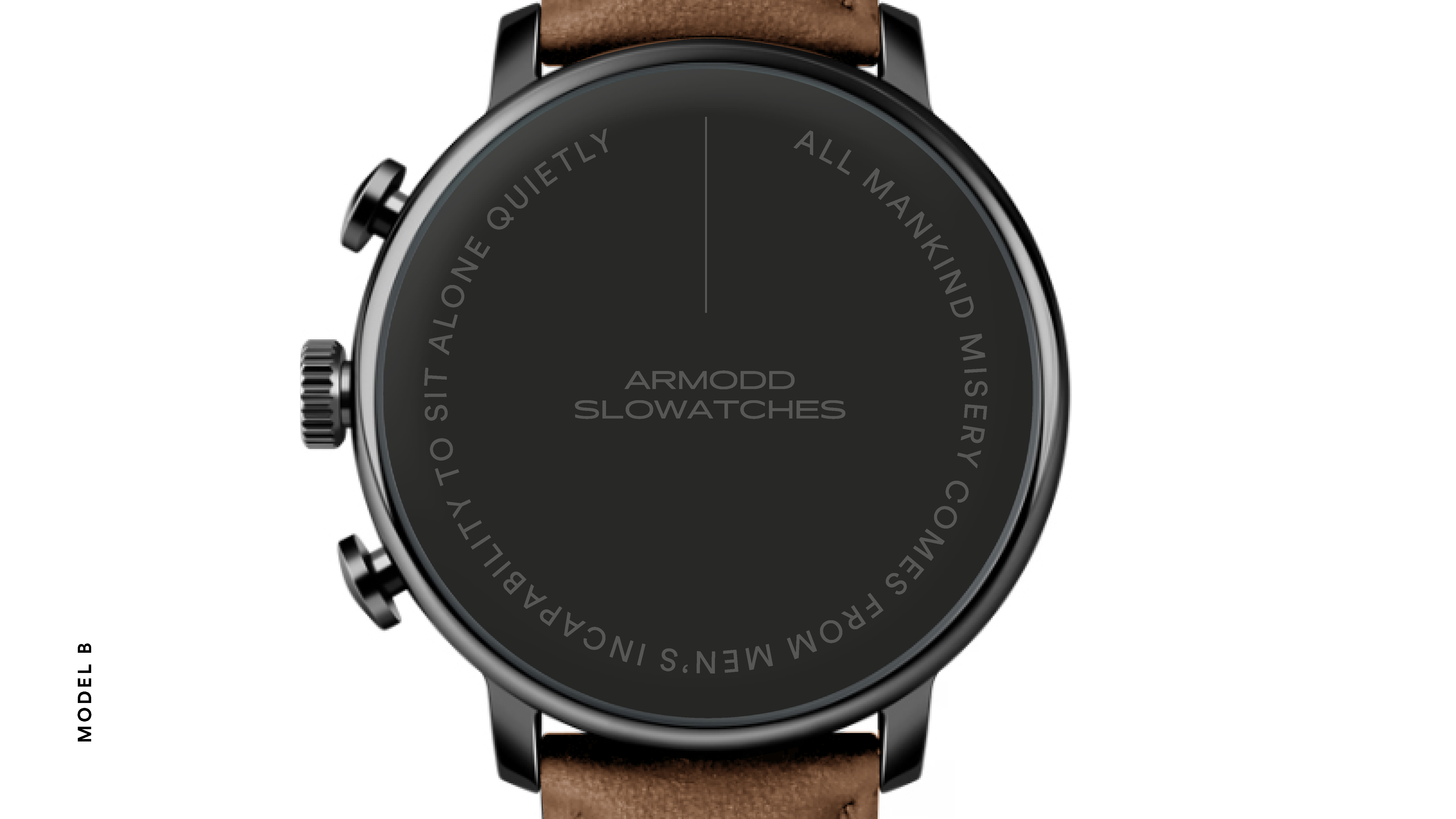
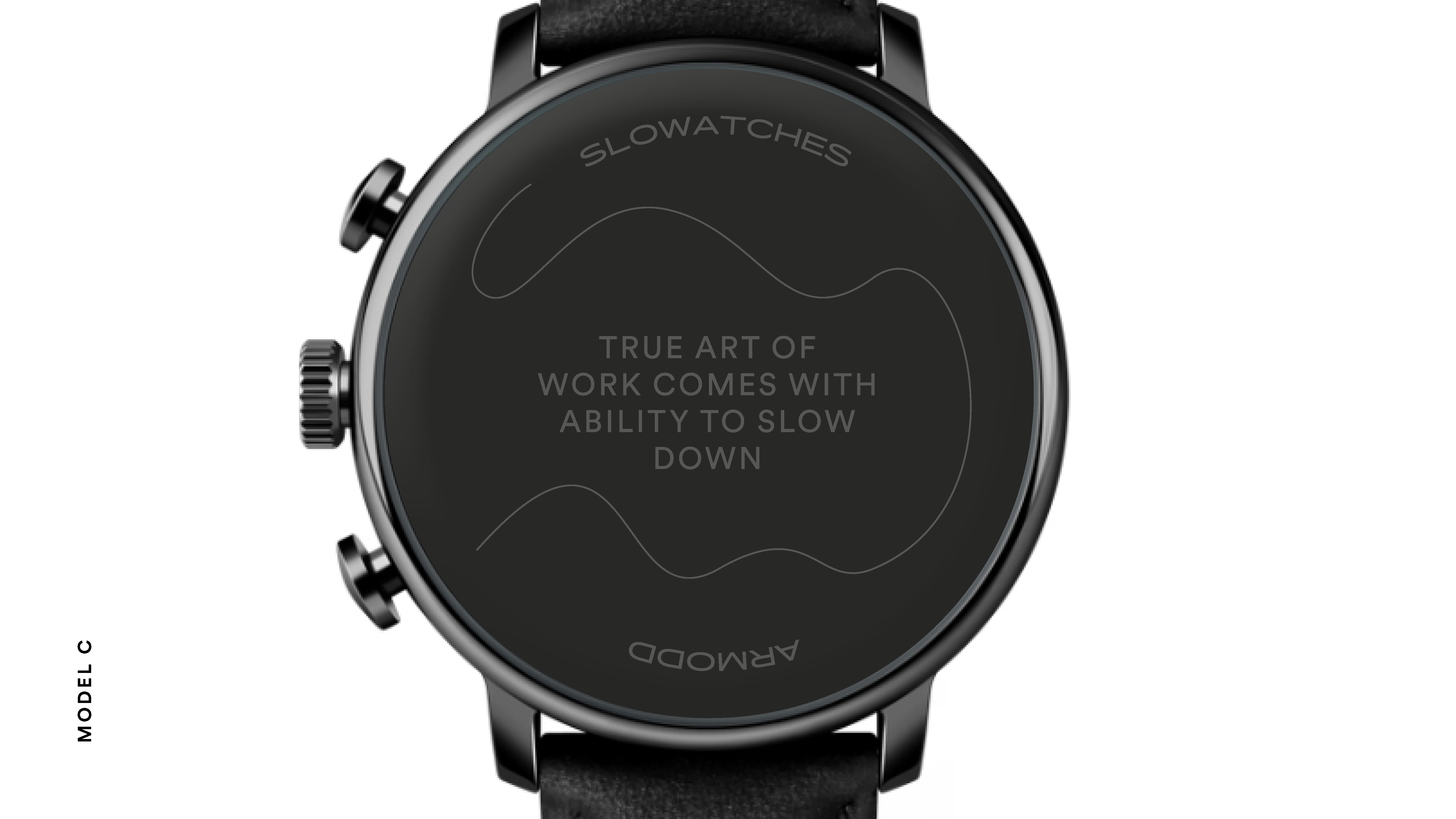
Armodd
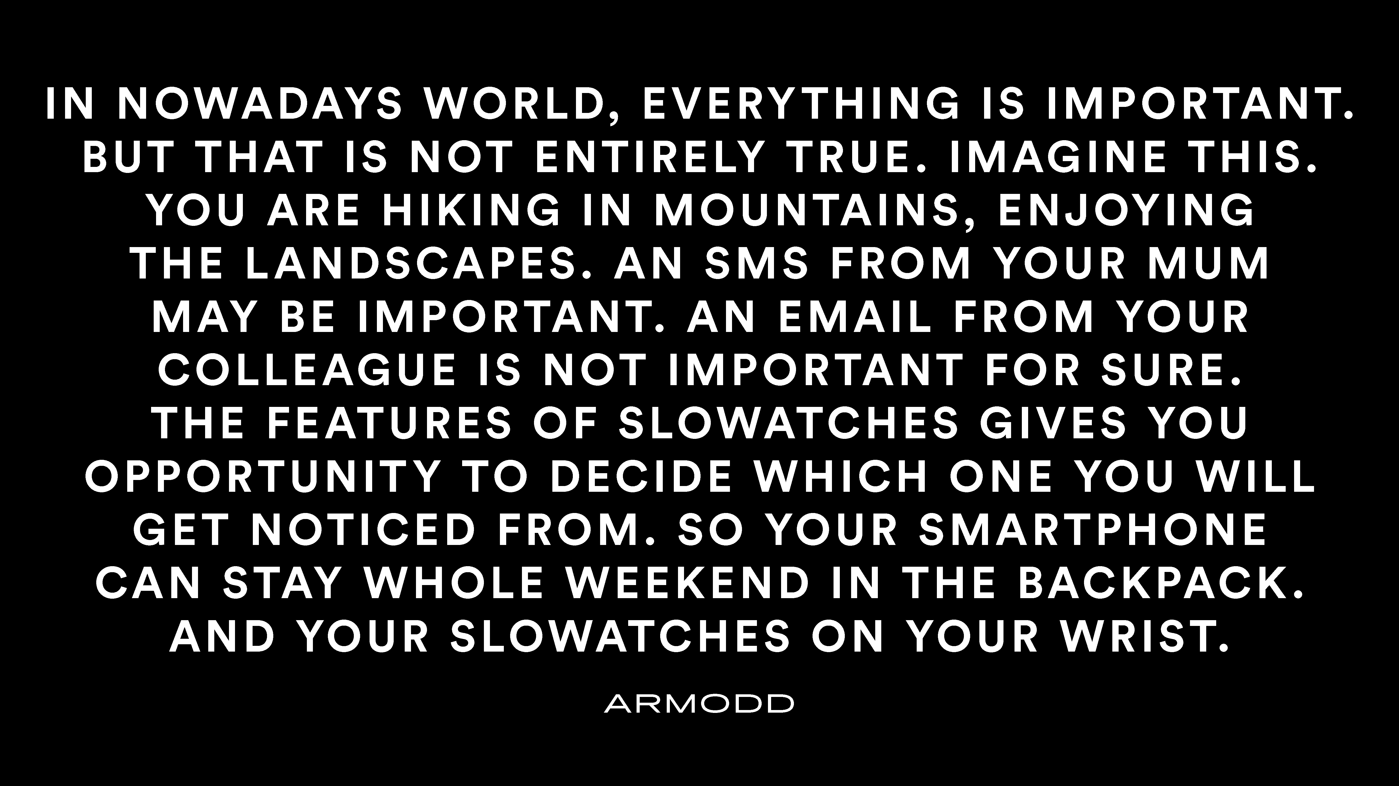
You have time, now. You have time, now.
So use it, because it's the only irreplaceable resource.
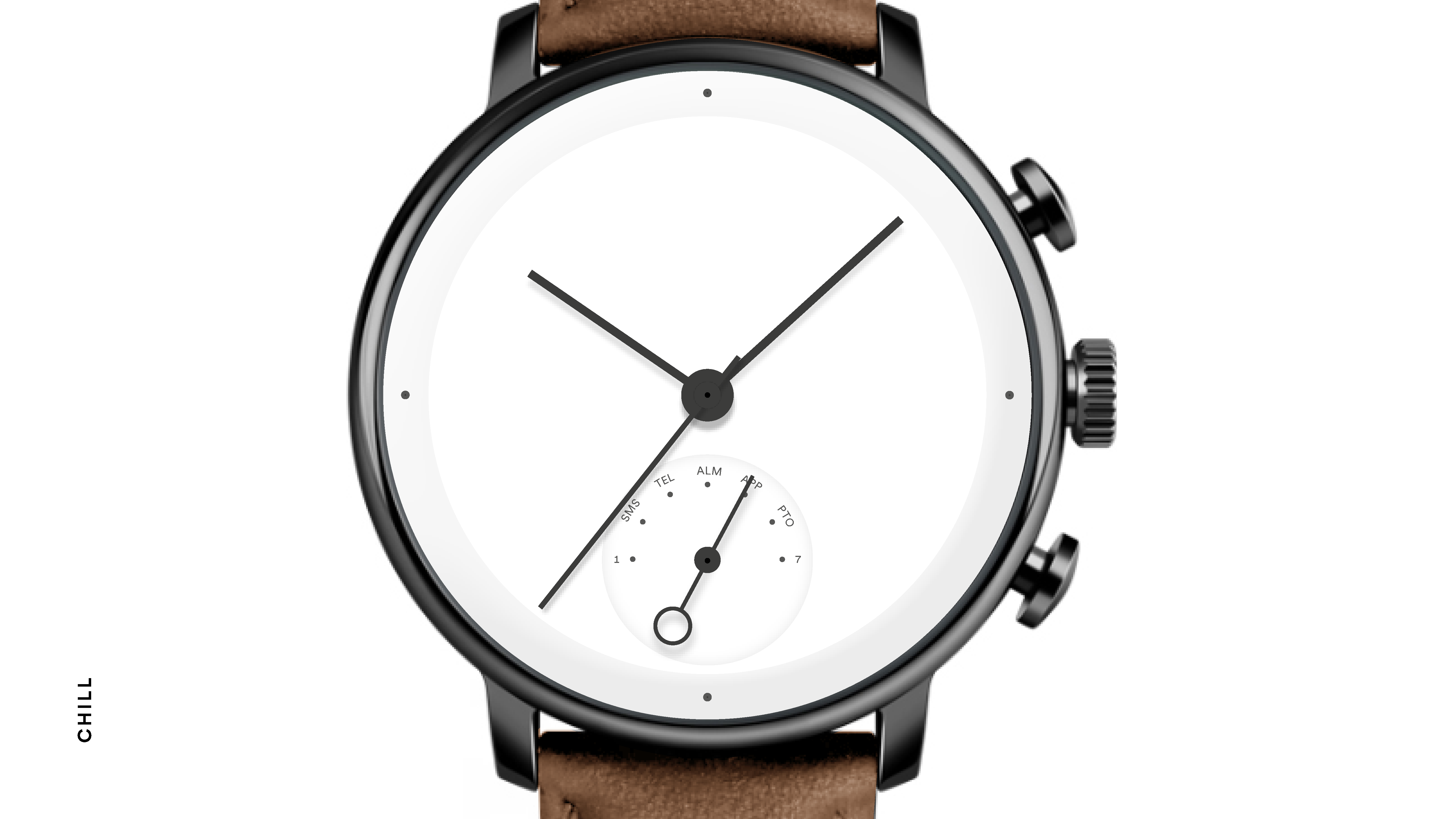
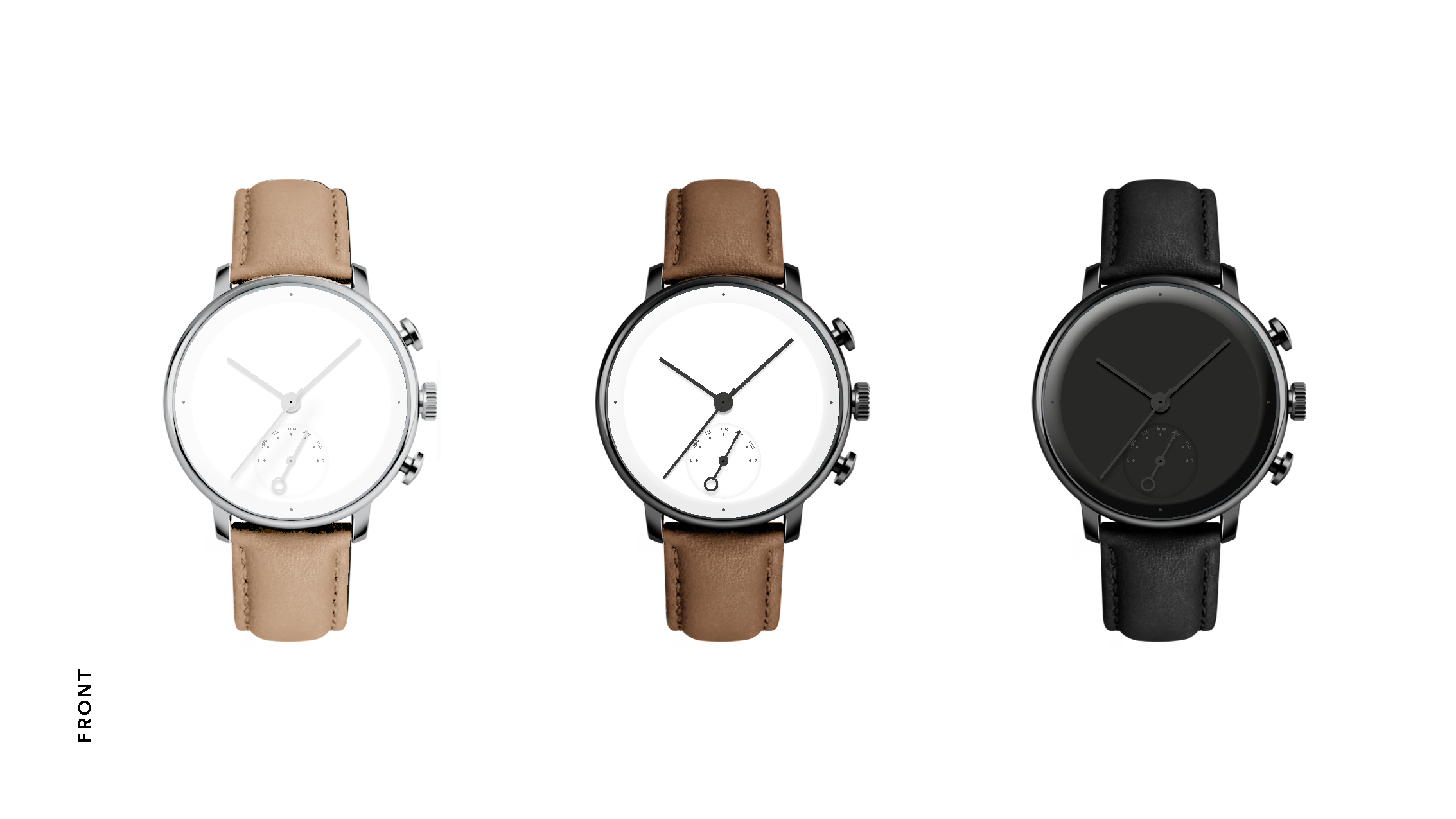
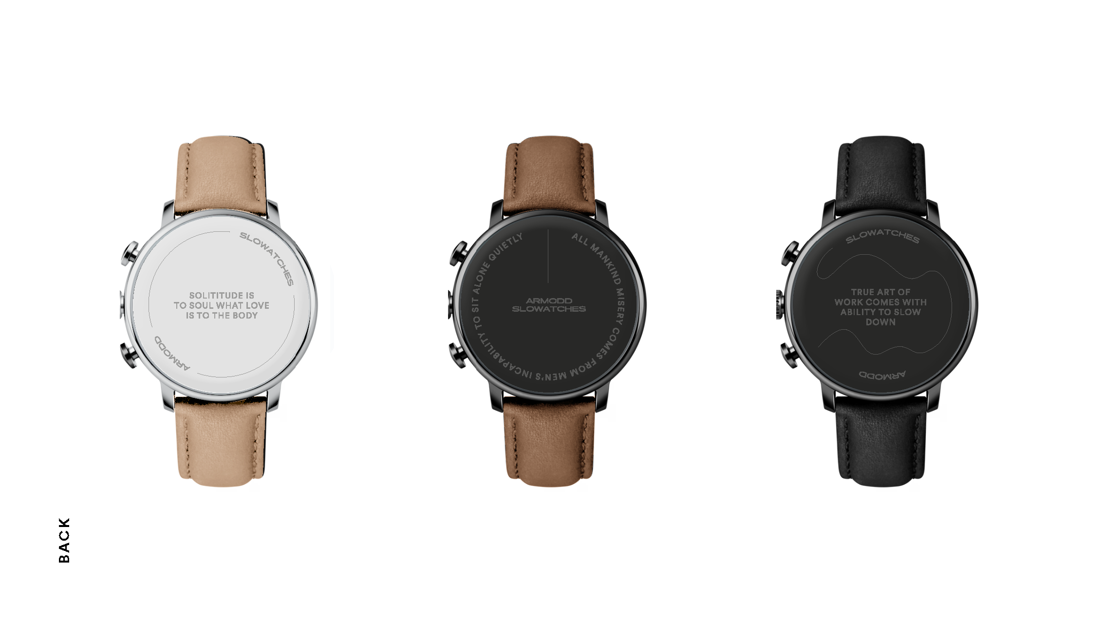
The basic logotype and symbol then emerged from a minimalist approach to the letter A, inverting it and folding it into an hourglass shape. The ultimate symbol for time, which is what the brand is all about.
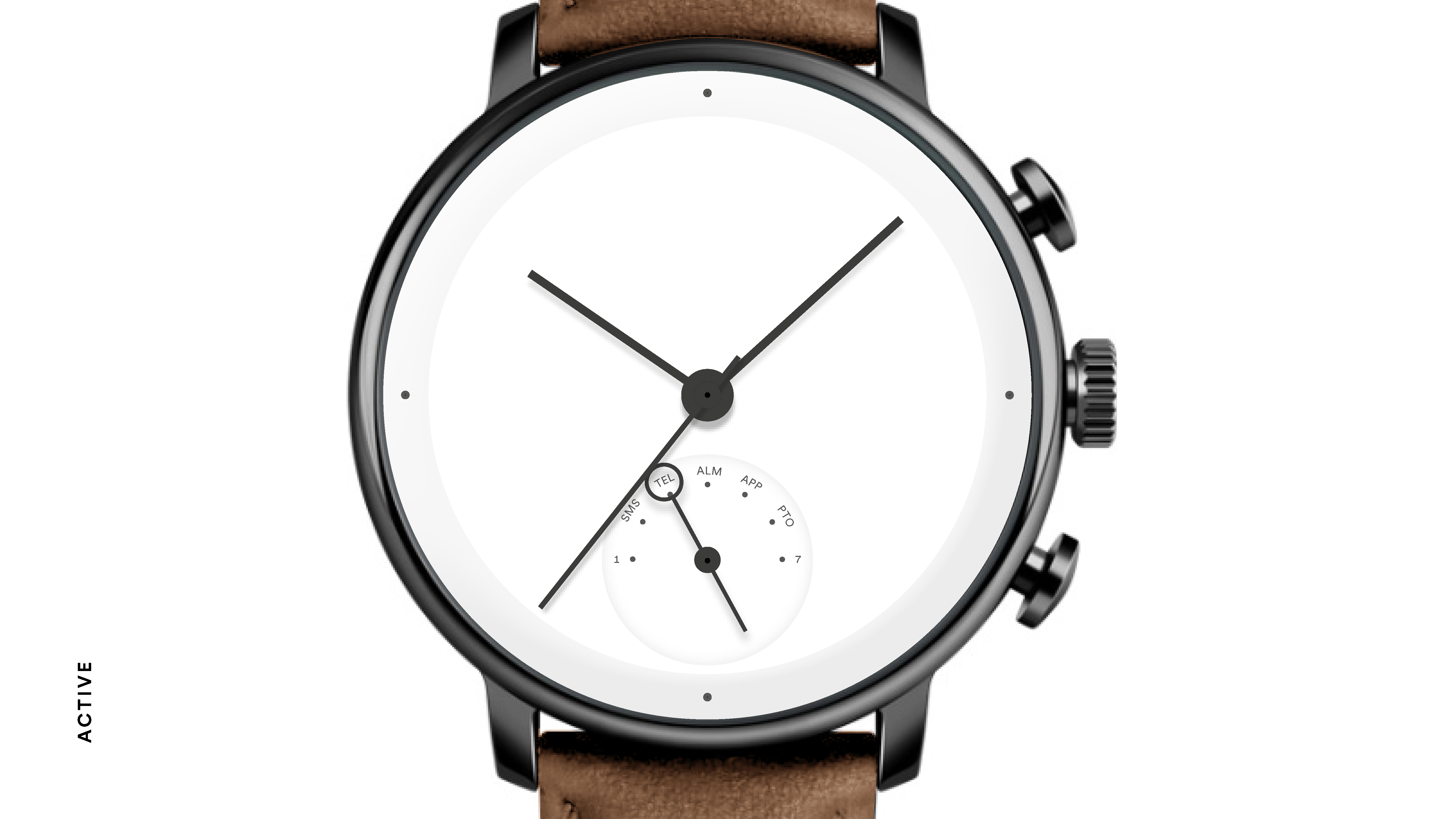
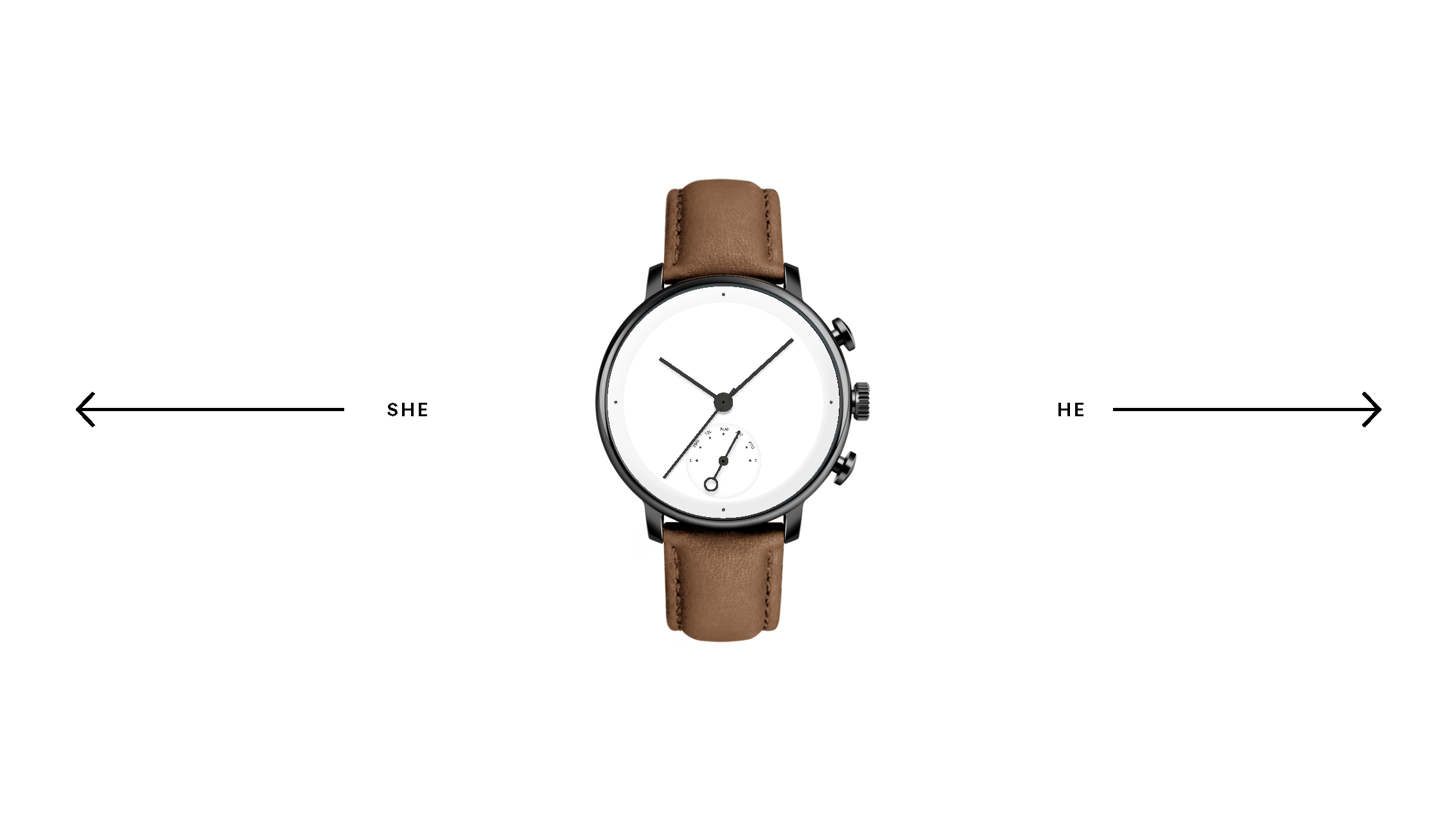
If you look closer, you'll see an even smaller dial on the watch. It actually functions as a notification. But what makes Slowatches unique is the ability to filter notifications by contact type.
CREDITS
Client – Armodd
Creative Concept – Markéta Steinert
Brand Strategy – Kontra
Copy – Adam Ondráček





Museum of Czech Literature
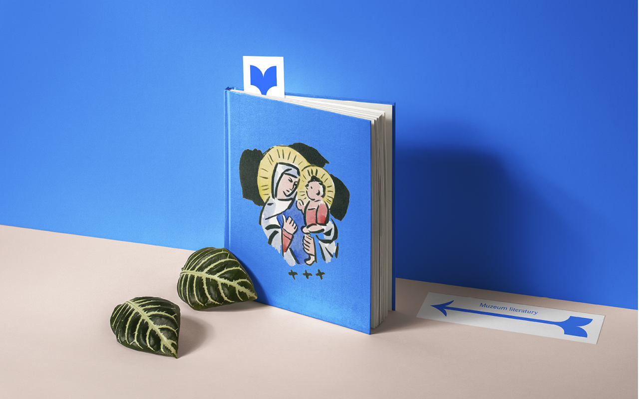
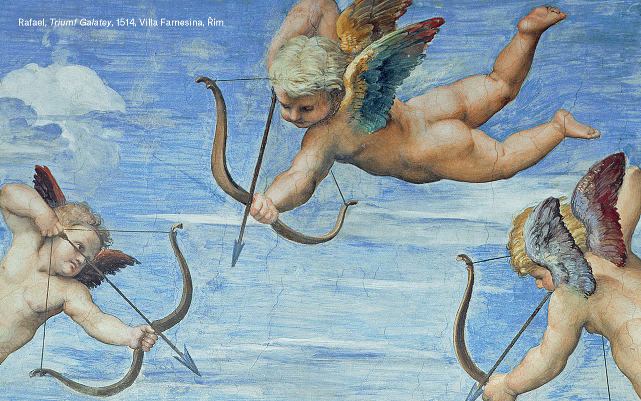
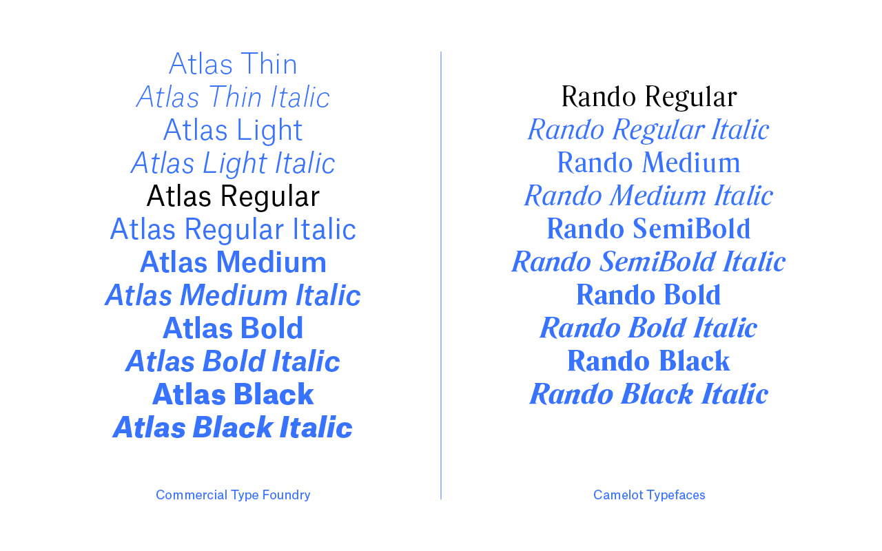
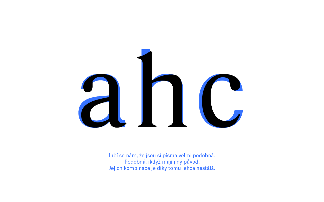
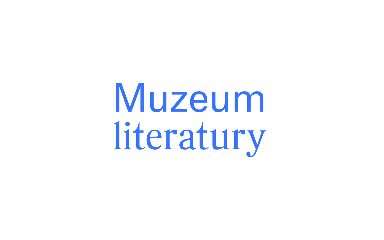
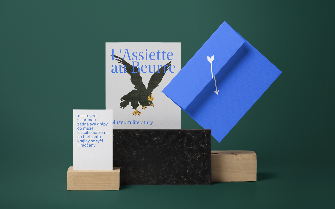
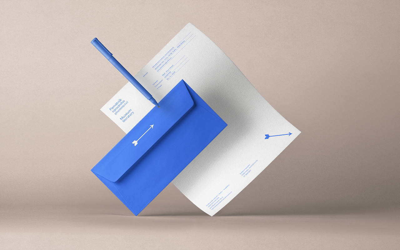
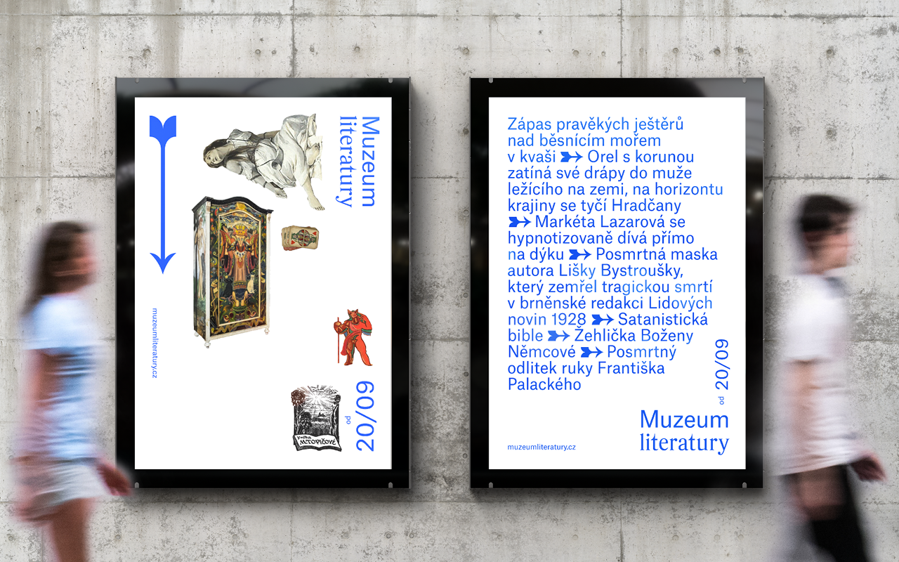
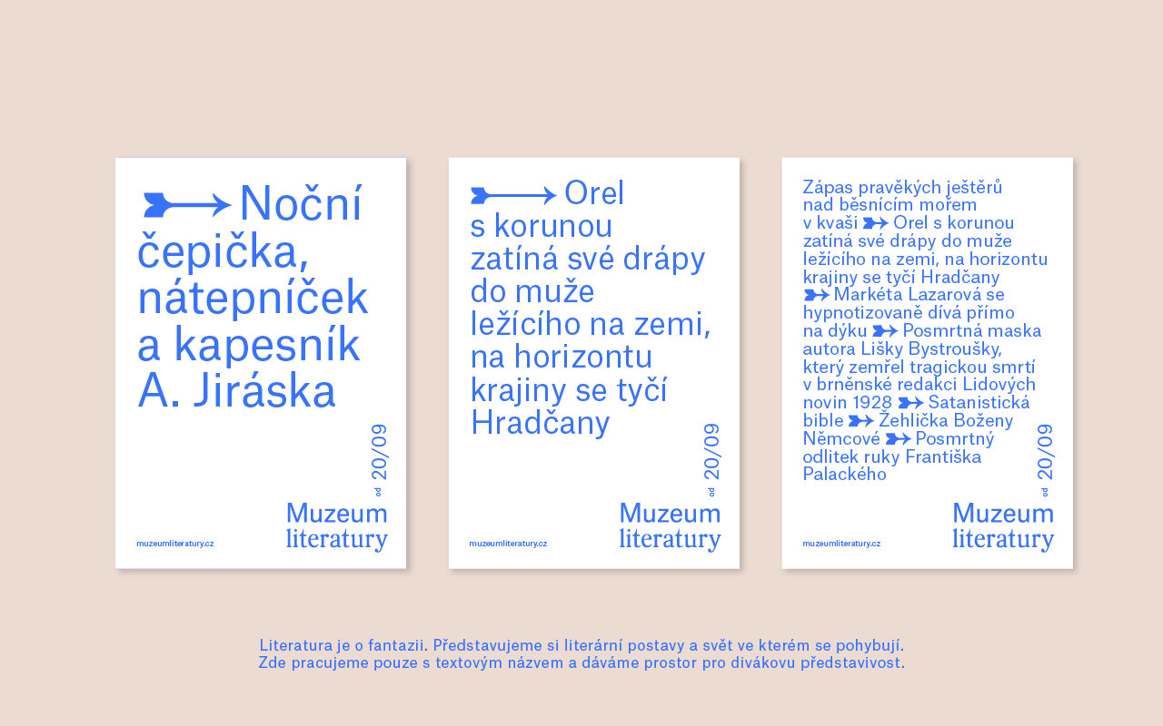
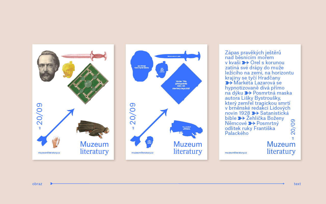
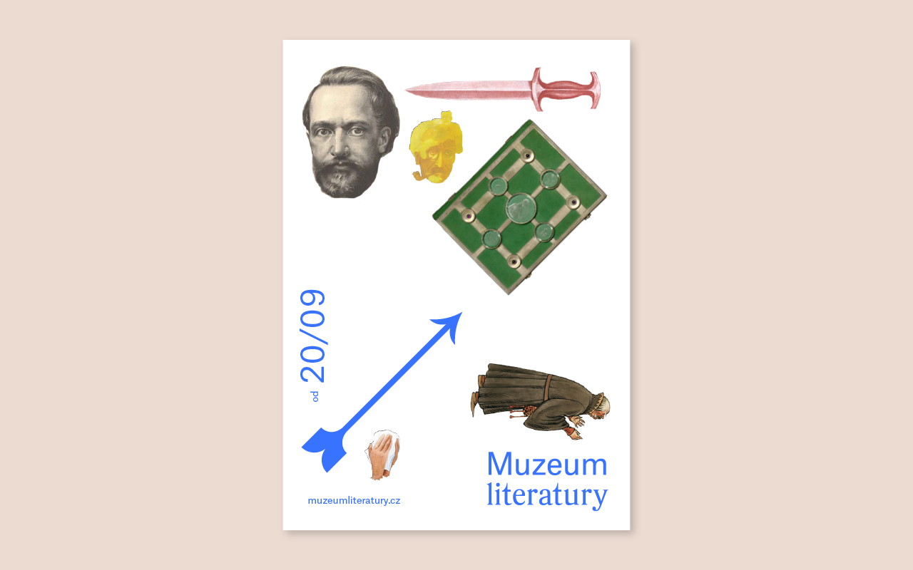
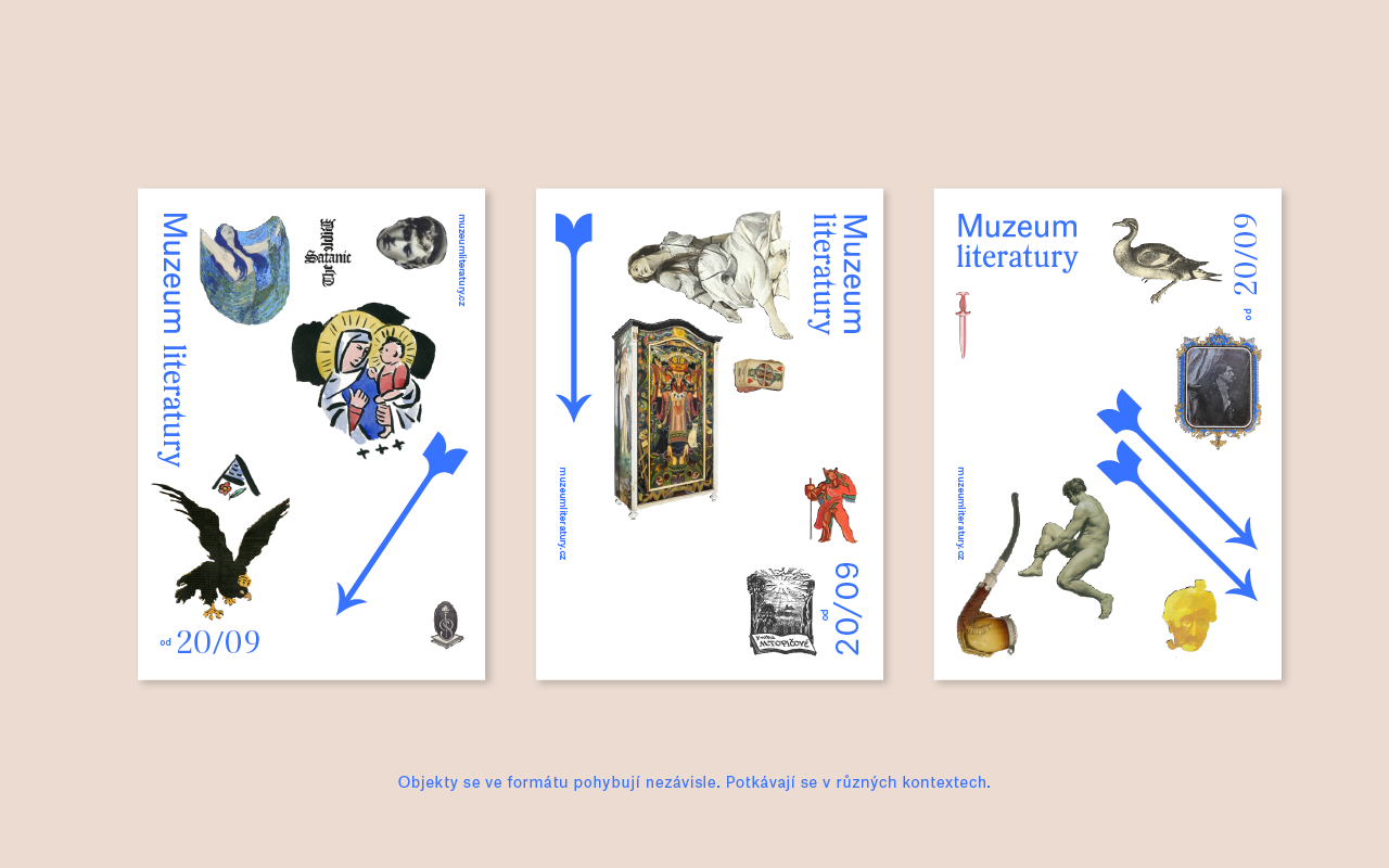
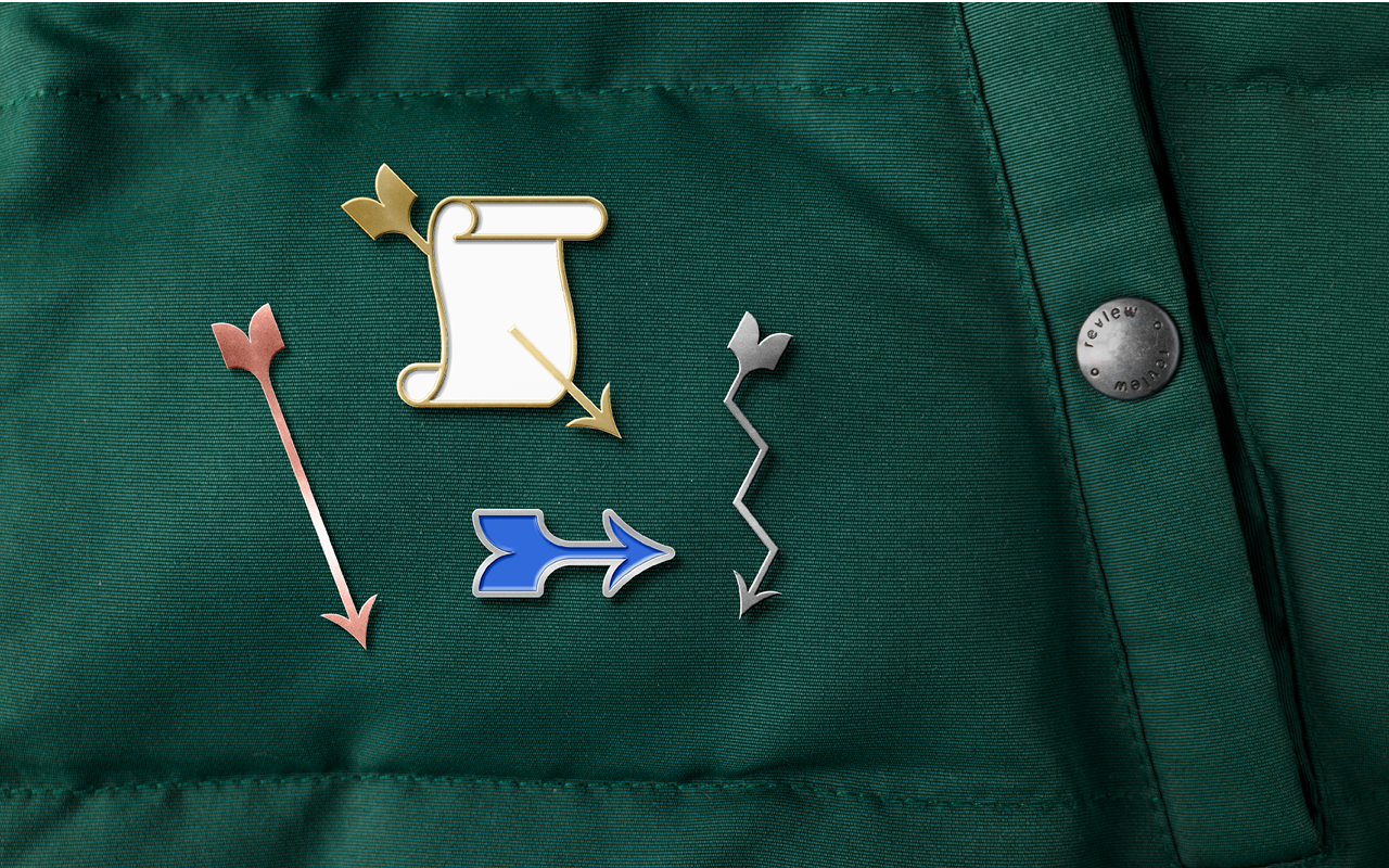
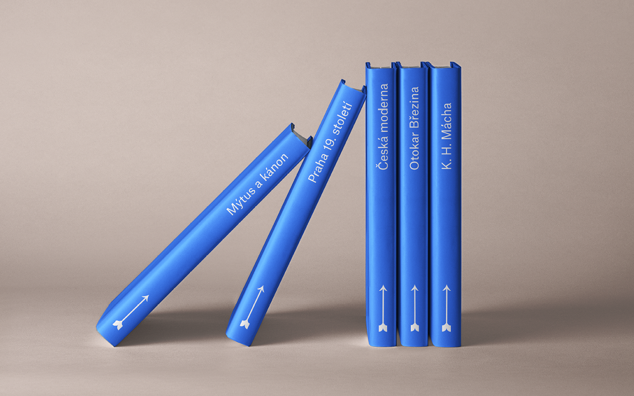
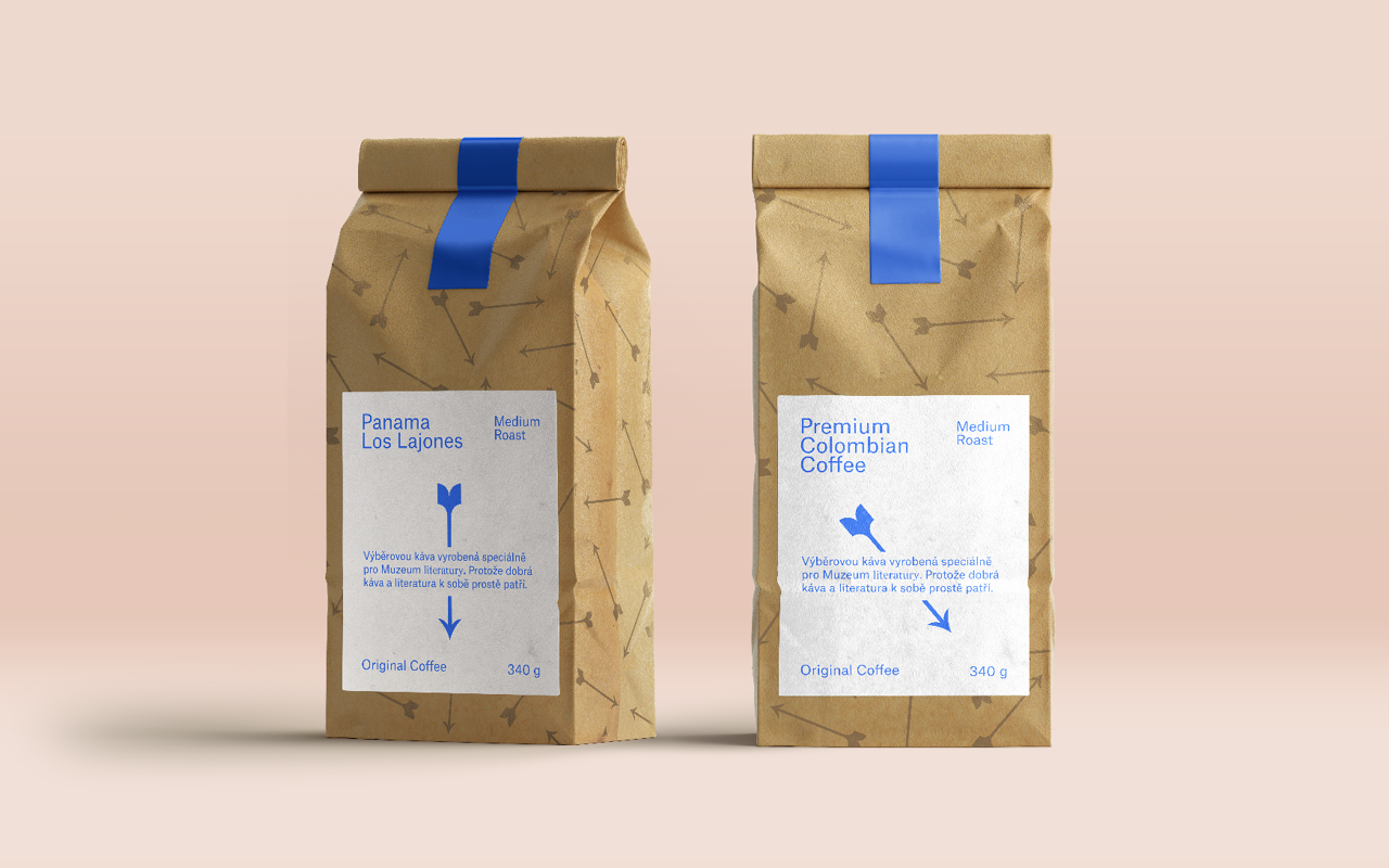
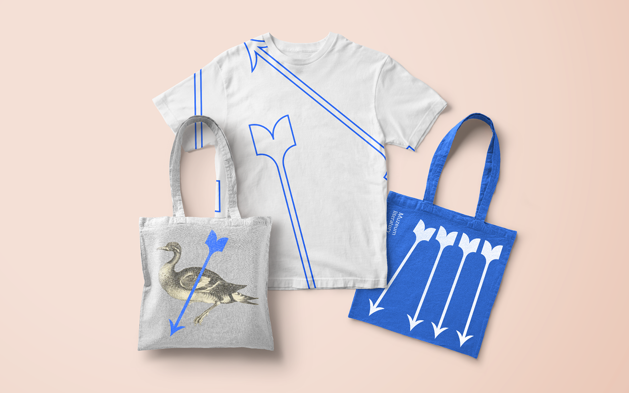
A brand new museum with an unusual exhibition dedicated to Czech literature will open in the first half of 2021 in the Petschek Villa in Bubenec, where it has moved from Strahov. The museum will also include a literary café, a programme hall, a study room, specialist workplaces and a large garden. The architectural design of the exhibition, which promises an interesting visitor experience, will itself be a work of art.
CREDITS
Client – Museum of Czech Literature
Creative Concept – Markéta Steinert, Adam Uchytil, Jakub Korouš
Visual identity – Markéta Steinert, Adam Uchytil, Jakub Korouš
Concept





Výčep
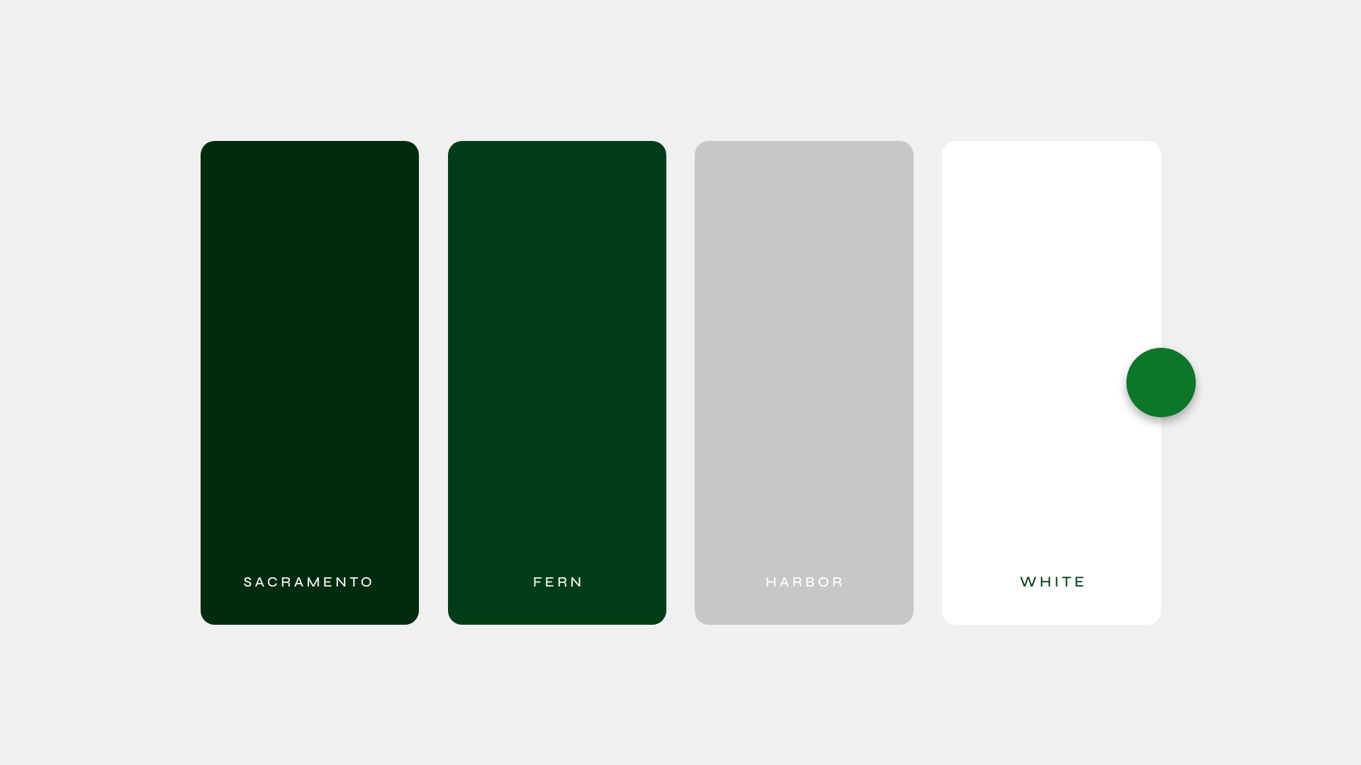
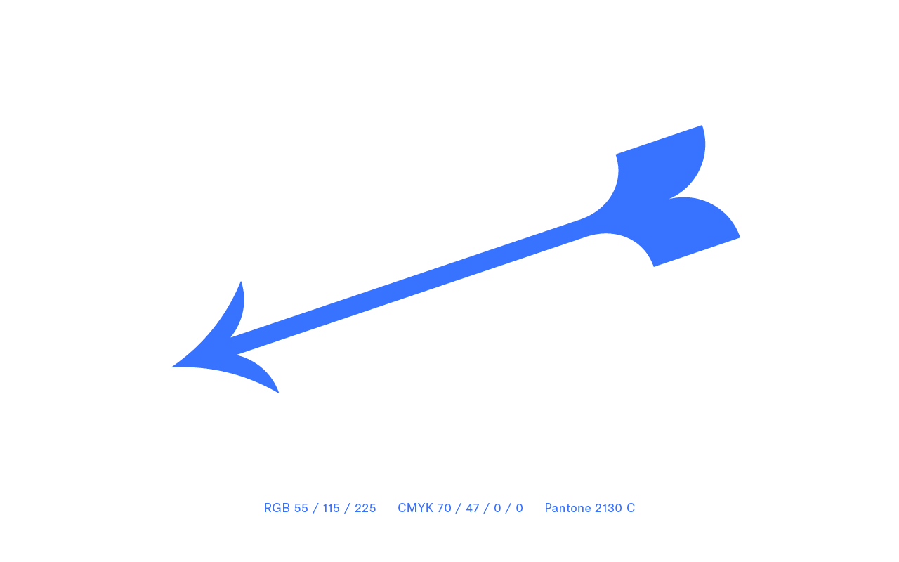
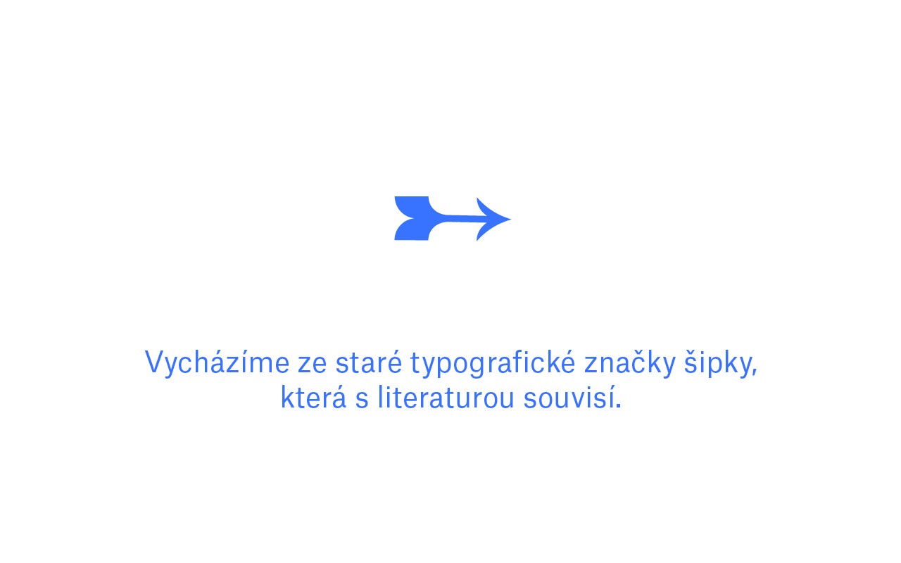
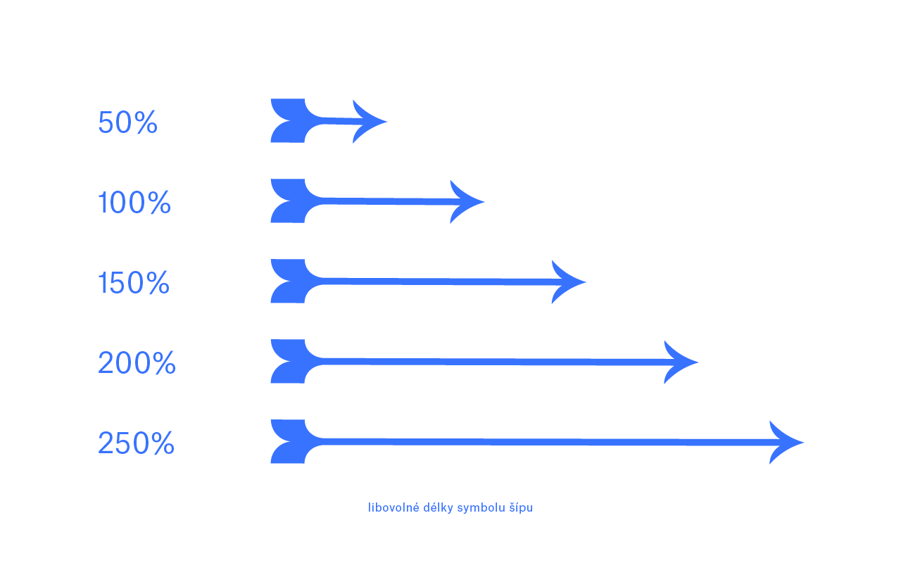
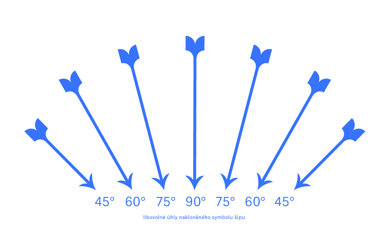
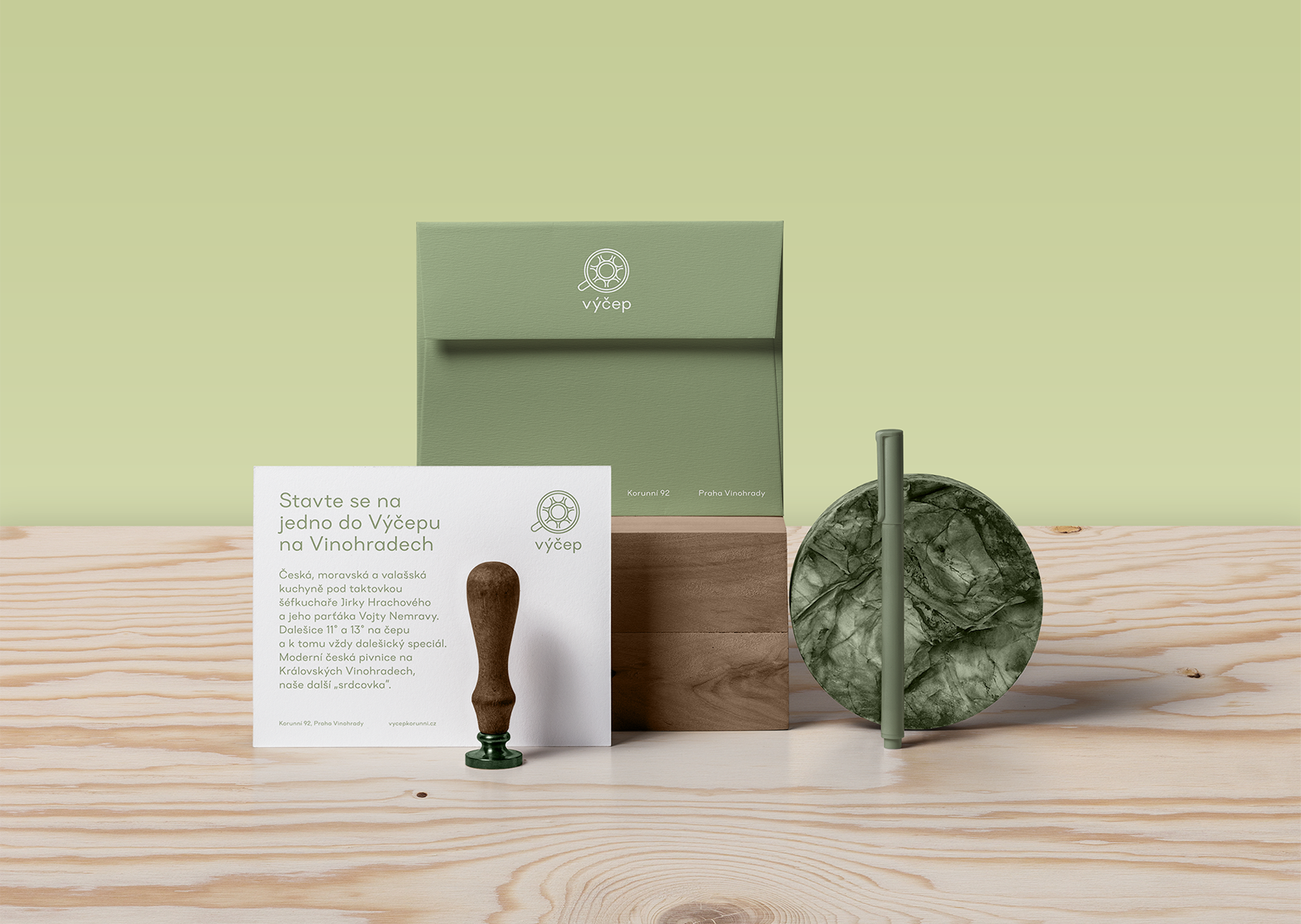
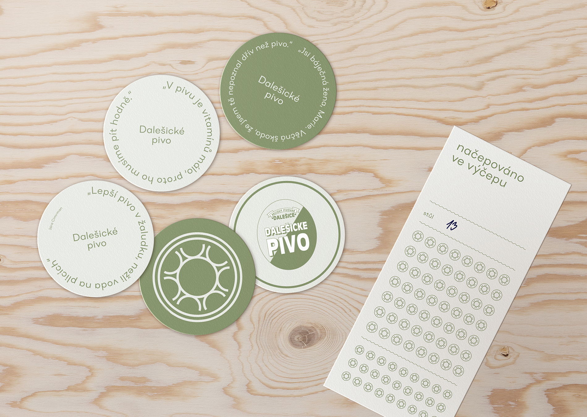
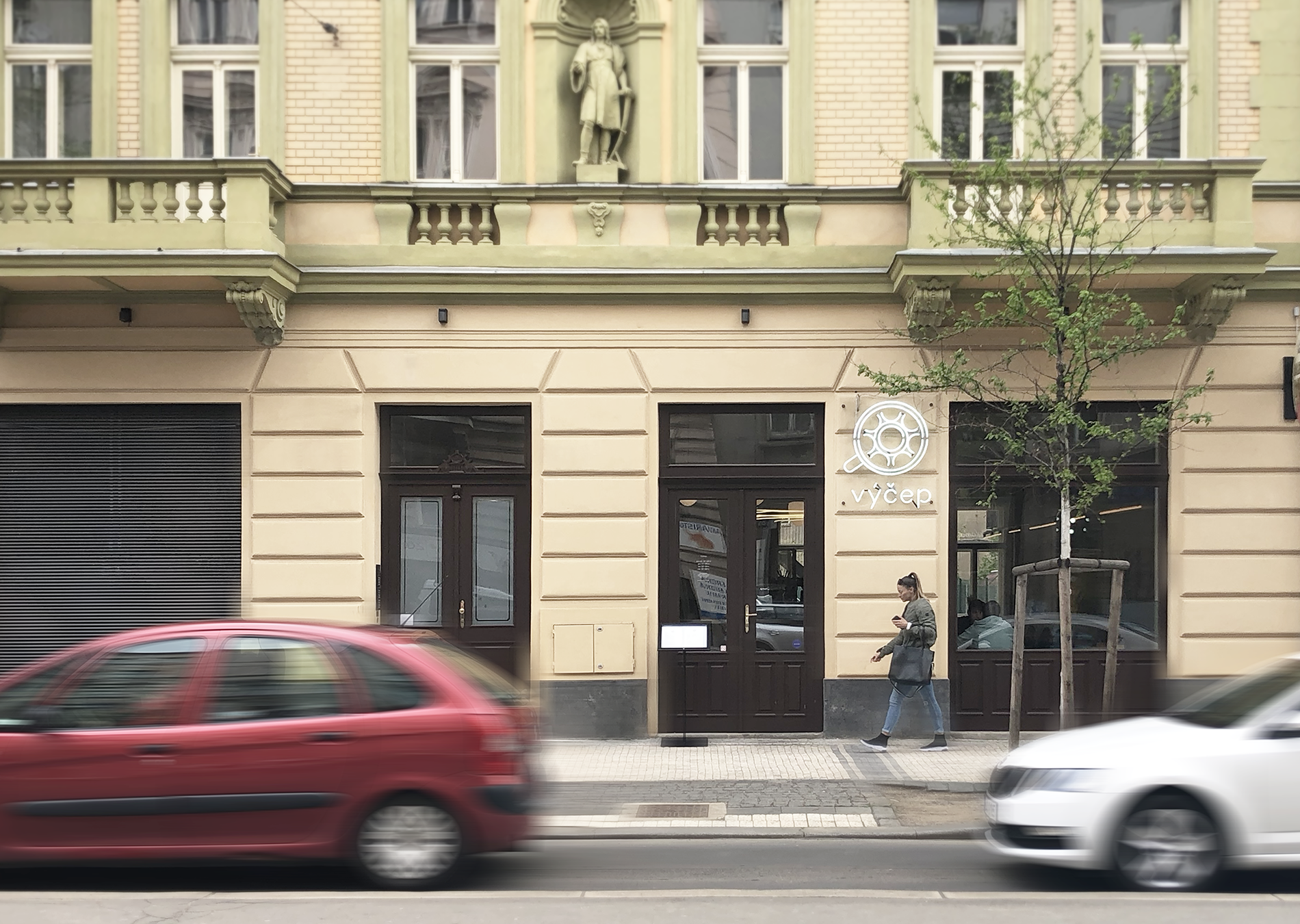
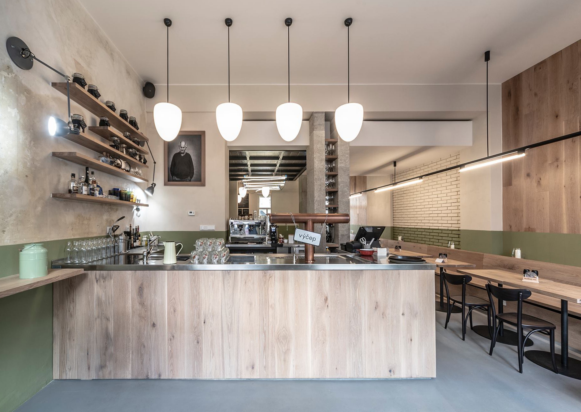
The visual identity is based on the motif of the dimension symbol in architectural plans. Výčep, a modern Czech beer hall in Vinohrady. Dalešice on tap, Czech cuisine with a touch of Wallachia, old recipes with a modern twist. Green as the colour of hops, a logo inspired by the sight of a pint of beer.
CREDITS
Client – Kolektiv
Visual Identity – Markéta Steinert
Architecture – Mar.S Architects
Prague Spring
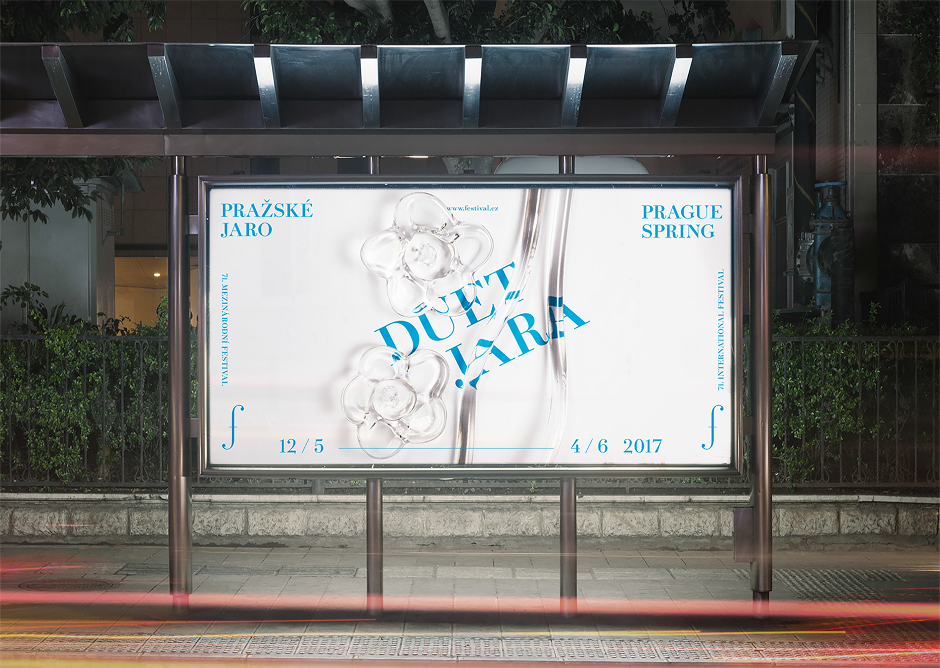
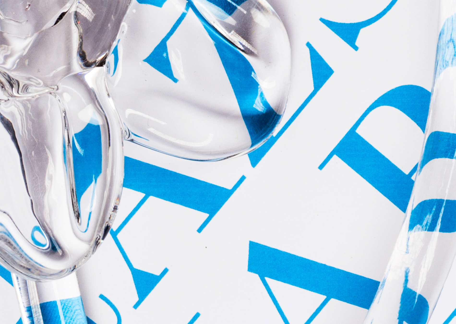
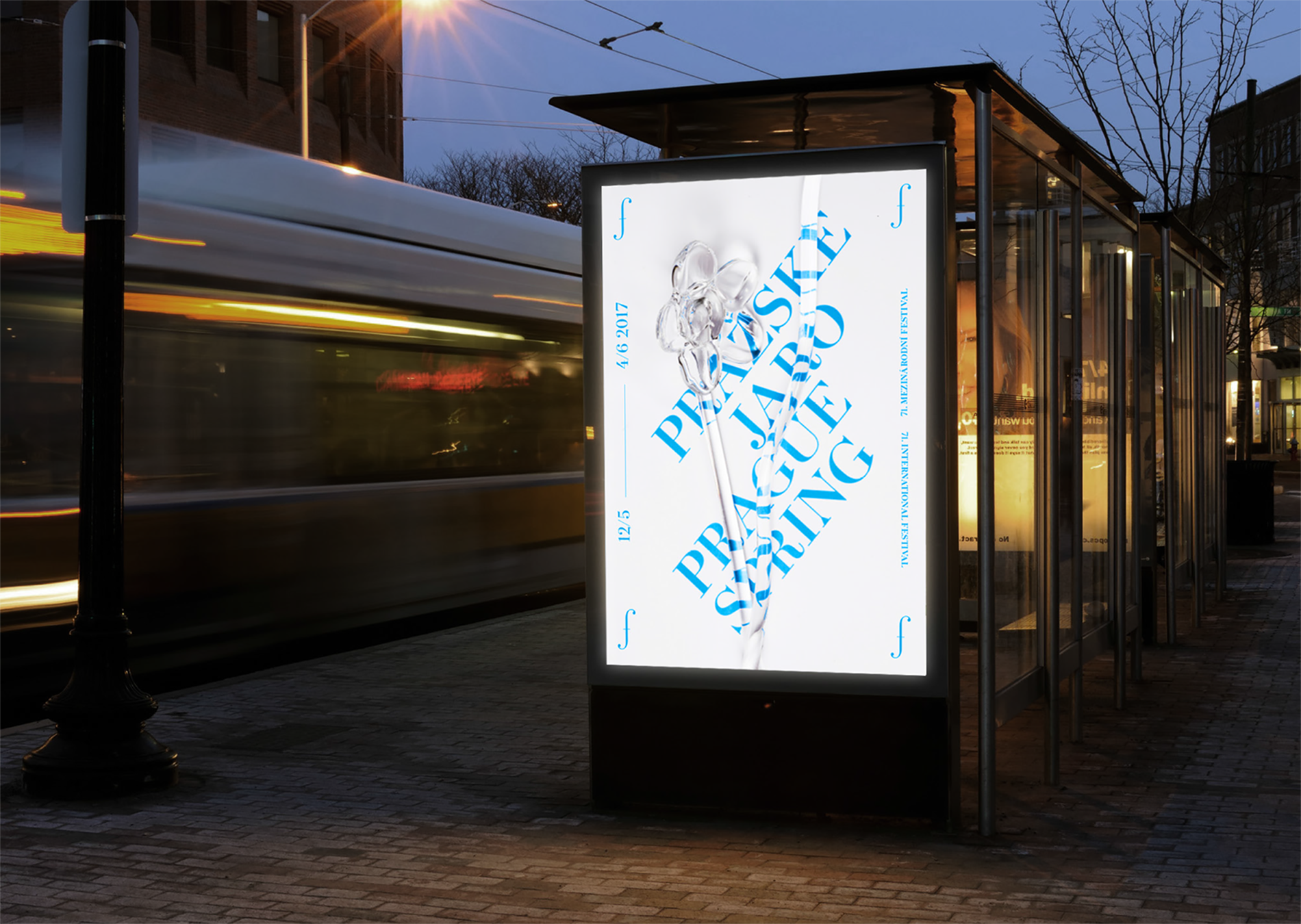
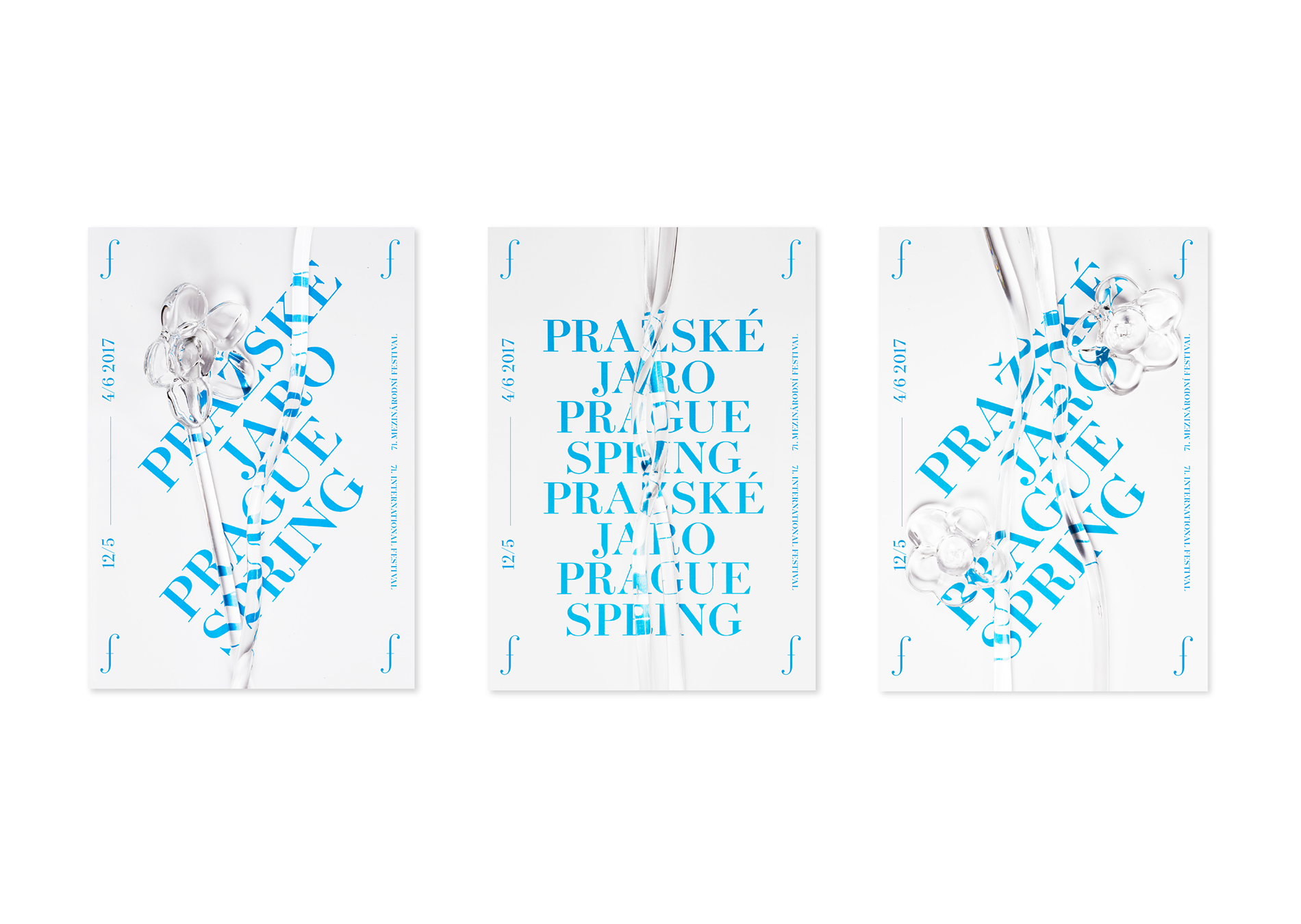
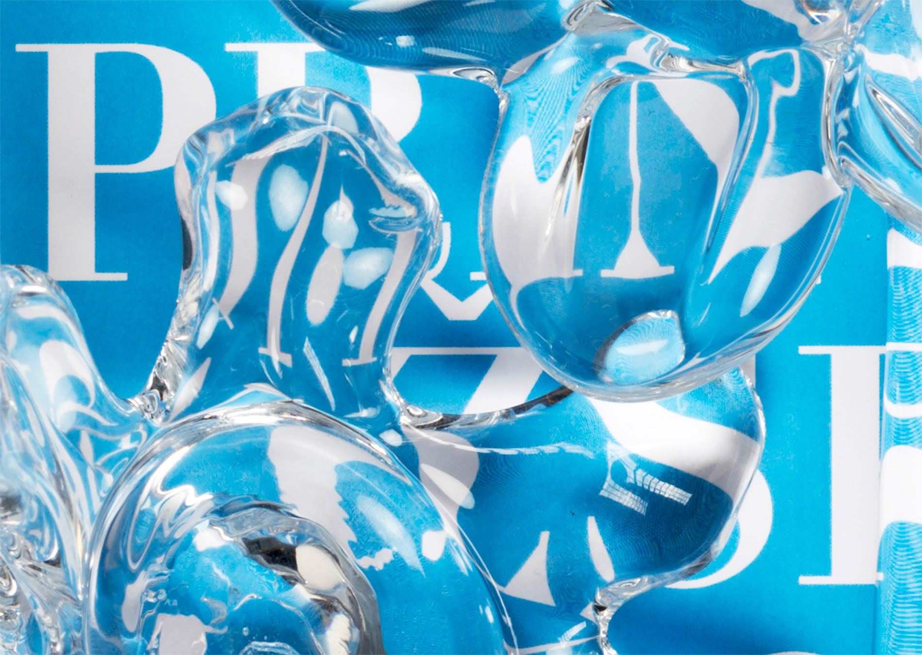
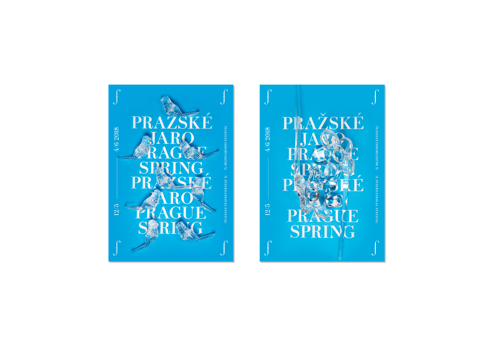
The Prague Spring International Music Festival is a regular showcase of outstanding international artists, symphony orchestras and chamber ensembles. It is held annually in Prague from 12 May (the anniversary of Bedřich Smetana's death) to 4 June. Since its inception, it has been a representative showcase of world music culture and its latest trends. The visual identity highlights the transition from winter to spring – a new beginning.
CREDITS
Client – Pražské Jaro Festival
Creative Concept – Markéta Steinert, Vítek Škop
Visual identity – Markéta Steinert, Vítek Škop
Photos – Tomáš+Patrik (Tomáš Brabec, Patrik Borecký)
for Dynamo Design
Concept
Osada 1932
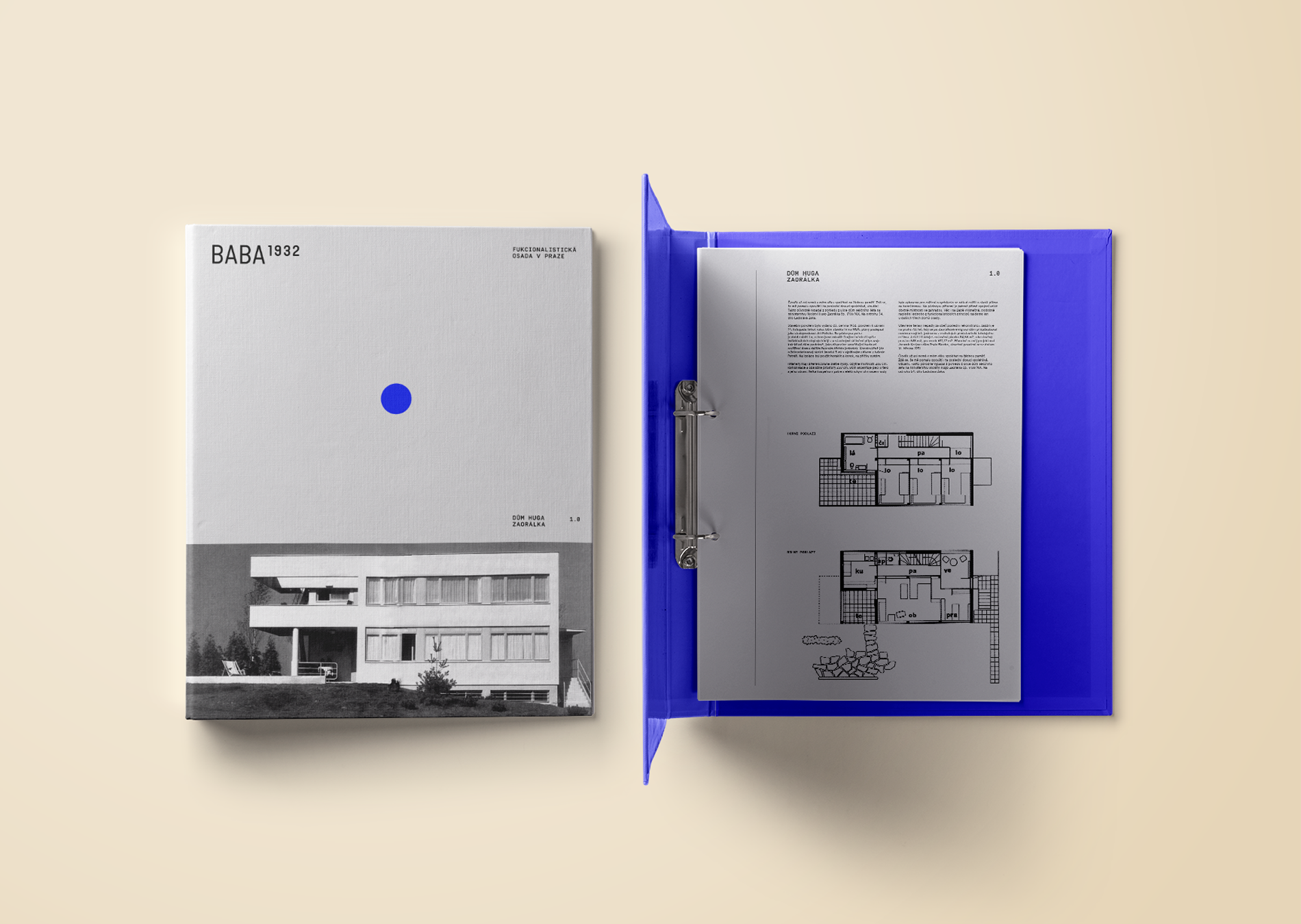
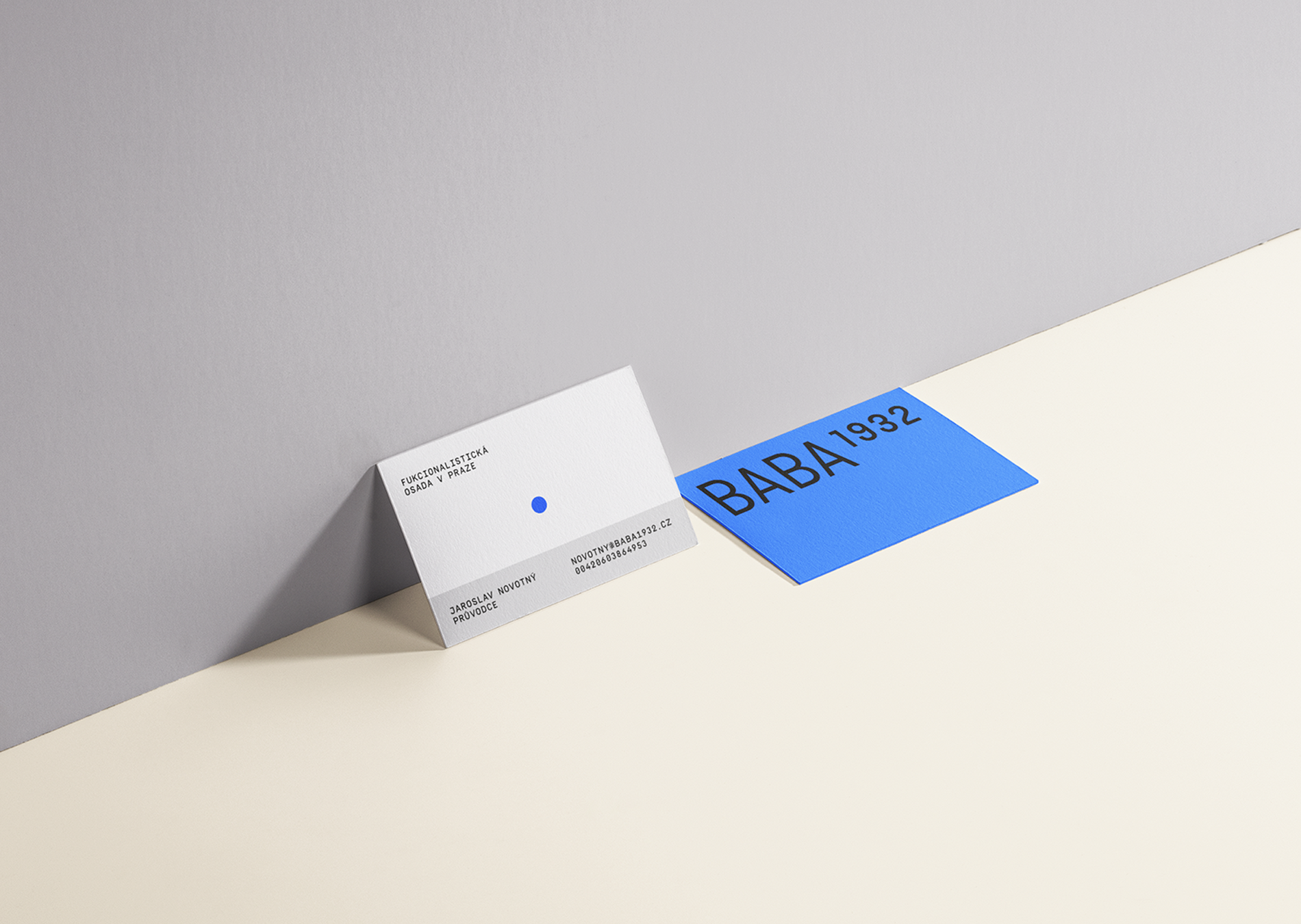
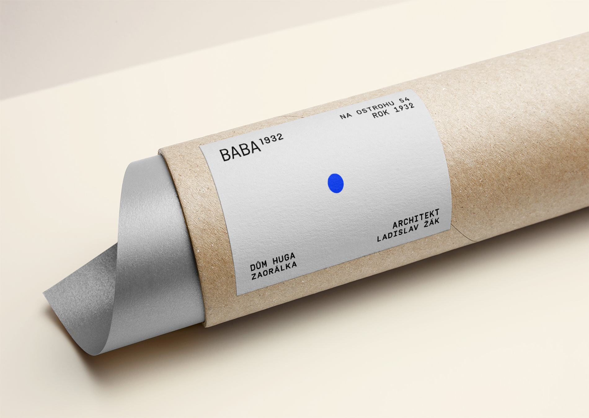
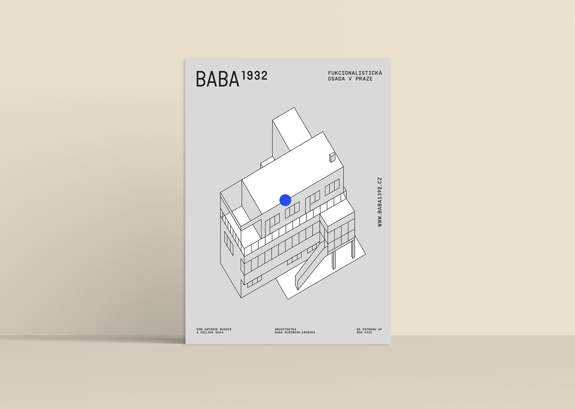
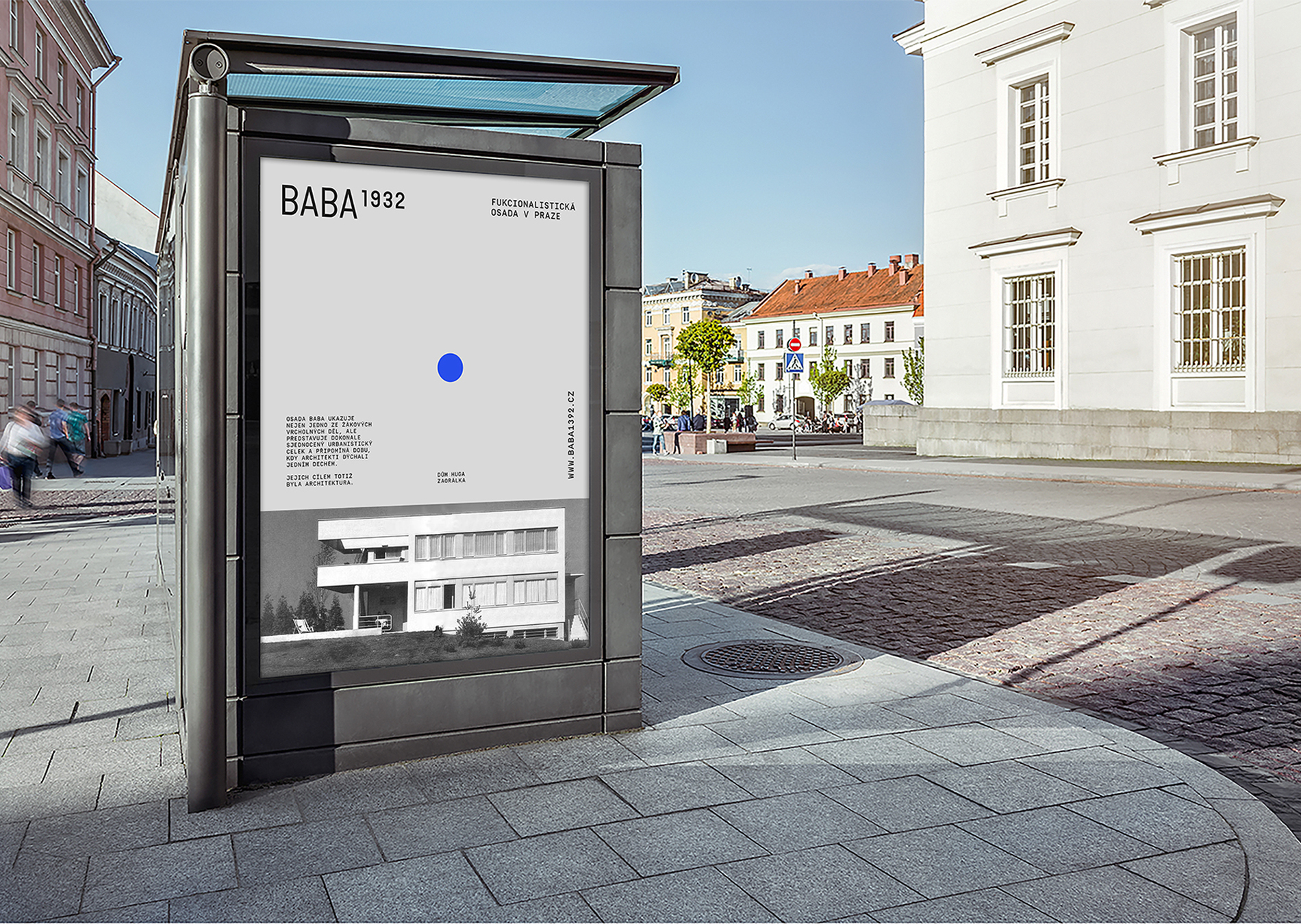
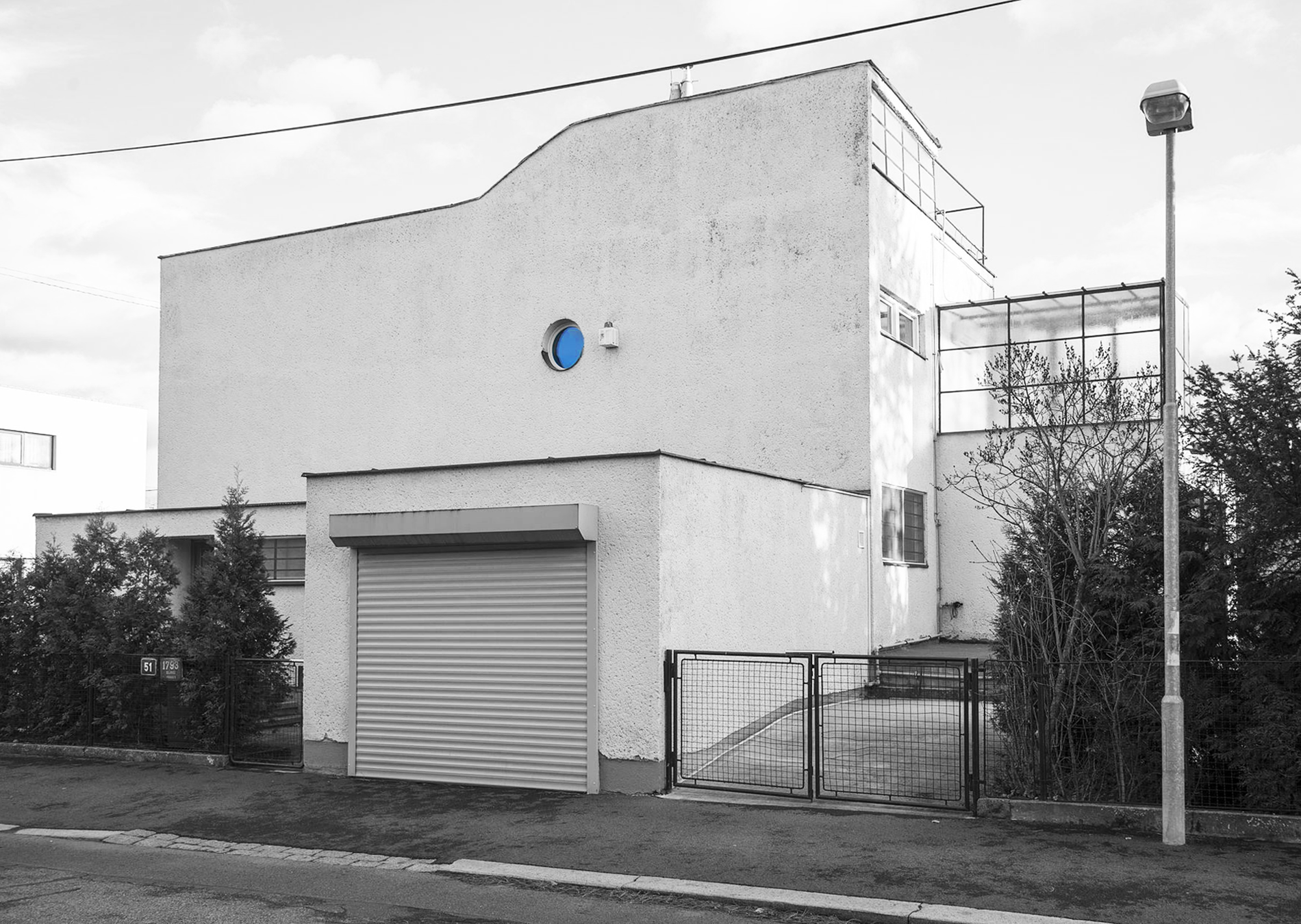
Osada Baba is a First Republic functionalist villa colony in Prague's Dejvice district. It was built as one of six European colonies of modern housing that were initiated by the Werkbund in the late 1920s and early 1930s. These colonies were intended to promote modern functionalist construction that was affordable to the general public. The visual identity for Baba is inspired by a window, the only window on the front façade of Villa Čeněk by architect Ladislav Žák.
CREDITS
Client – Hlavní město Praha, odbor památkové péče
Creative Concept – Markéta Steinert
Concept
Prague Quadriennale
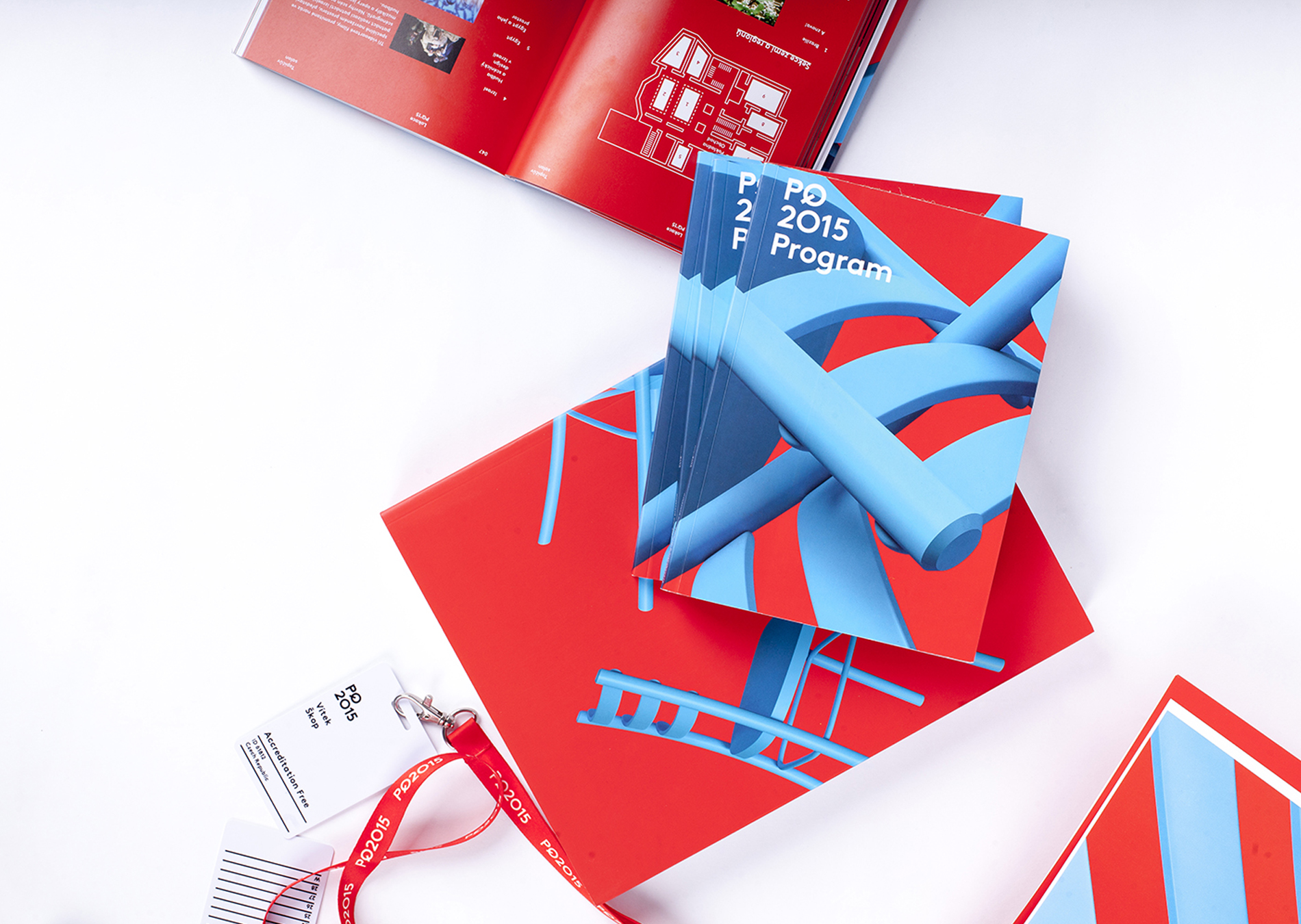
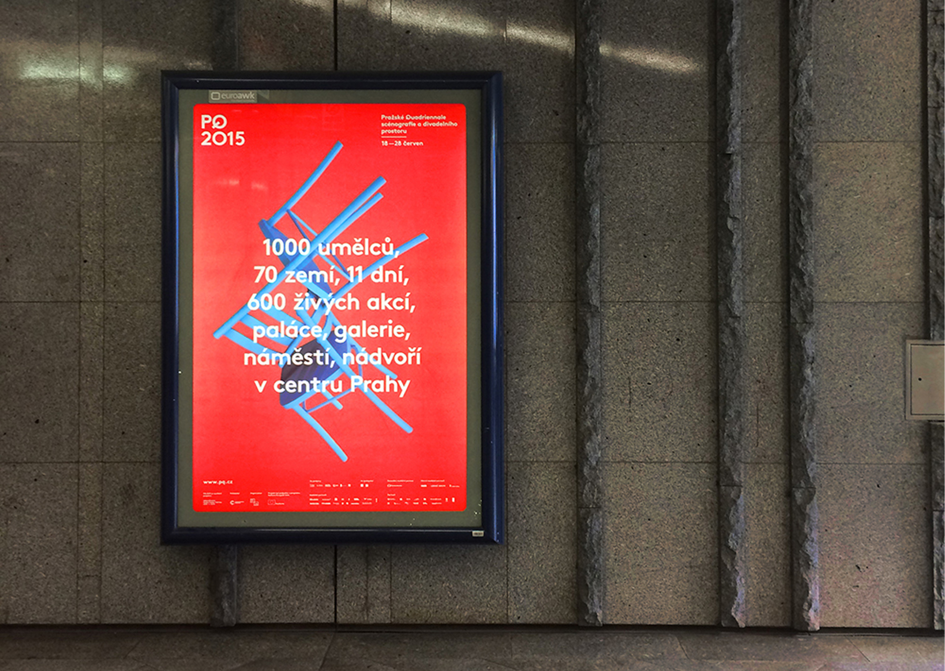
PQ aims to celebrate, empower and highlight the work of set designers, artists and architects while inspiring and educating the audience, who are the most essential element of any live performance.
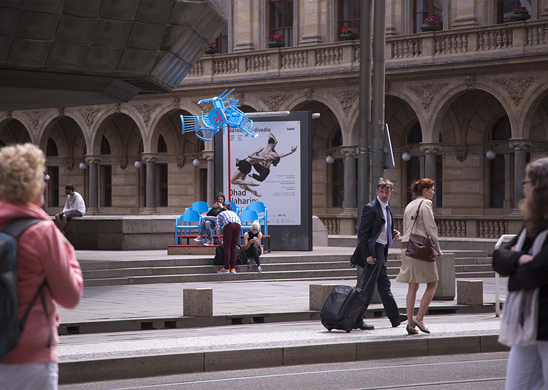
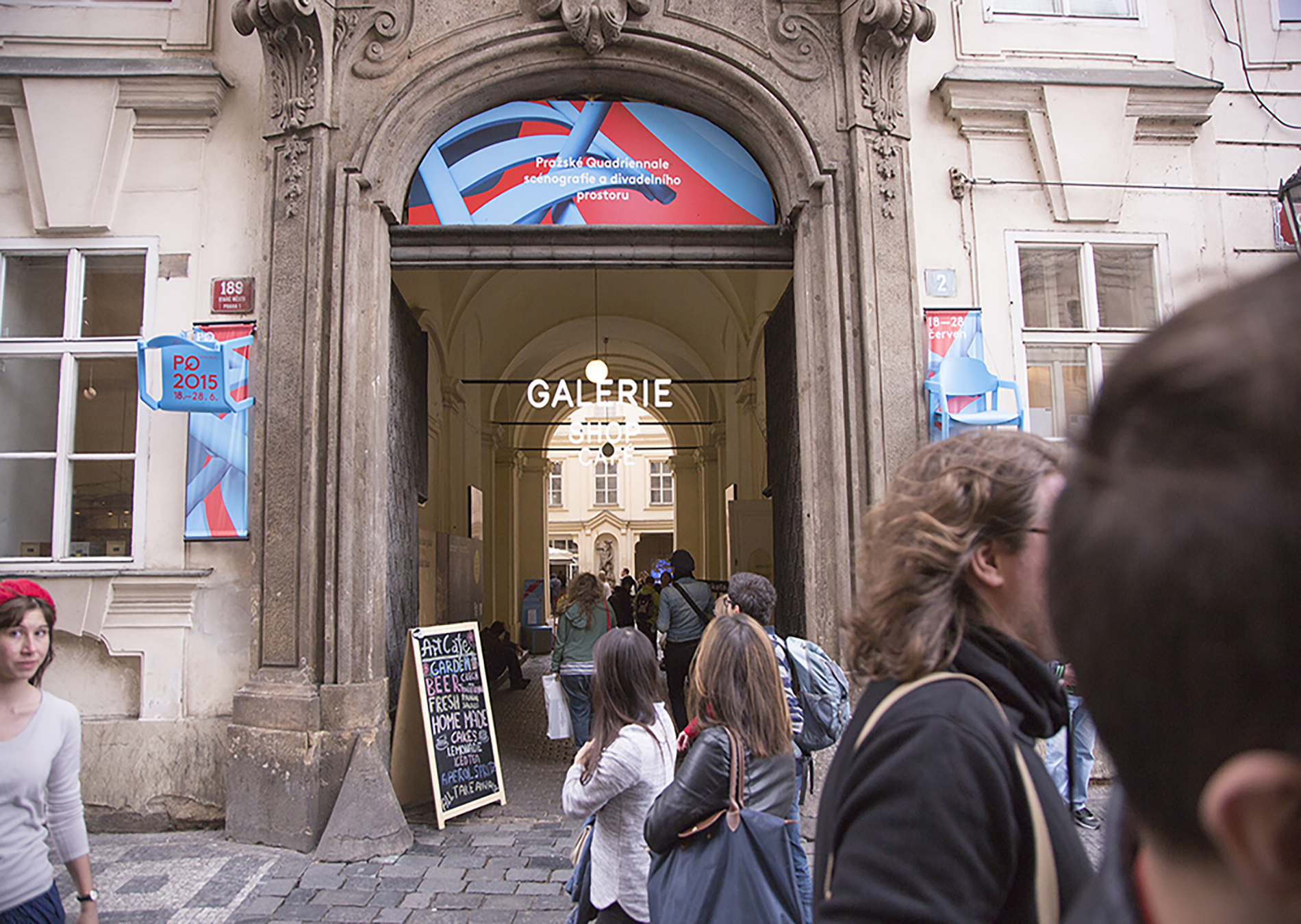
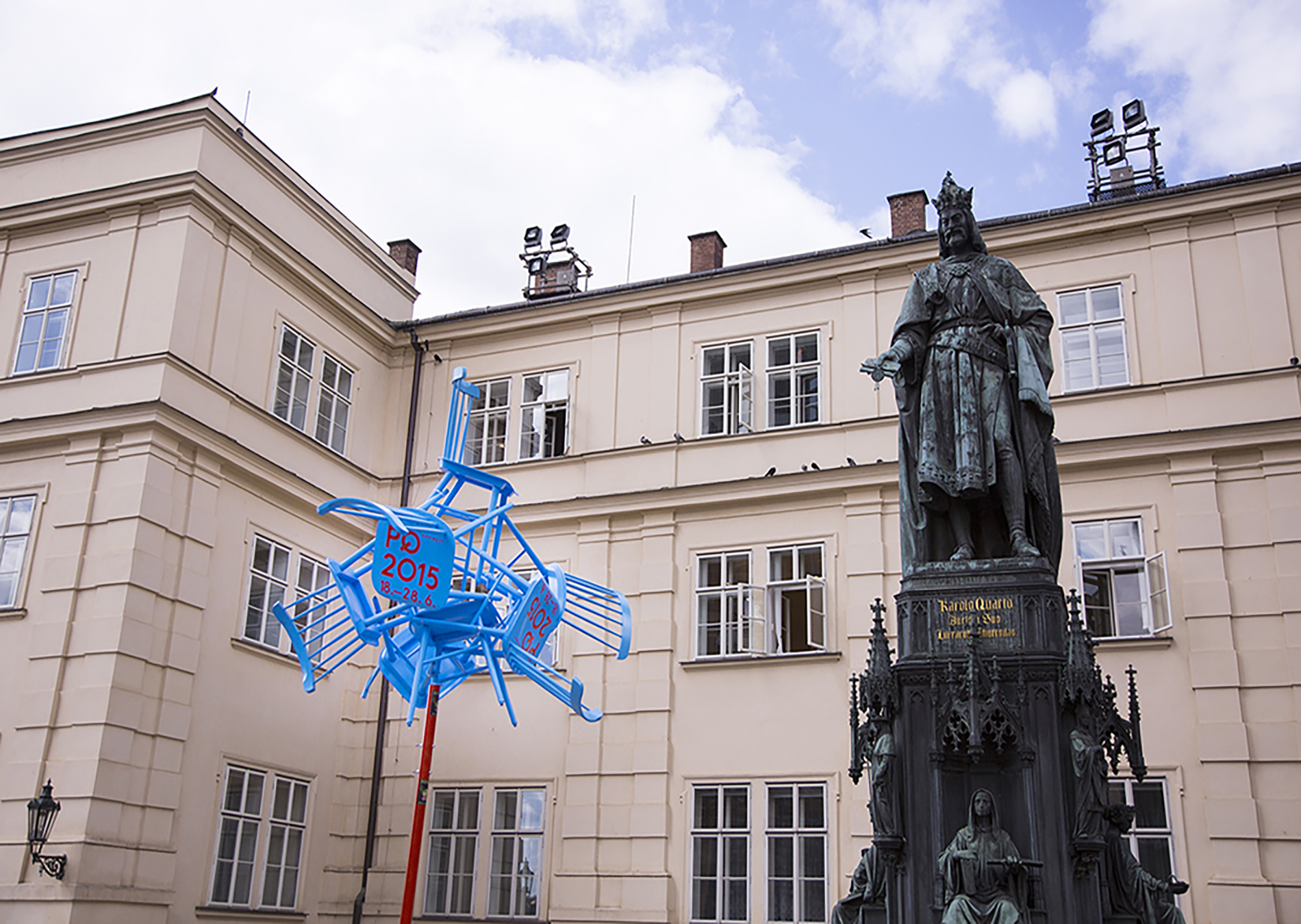
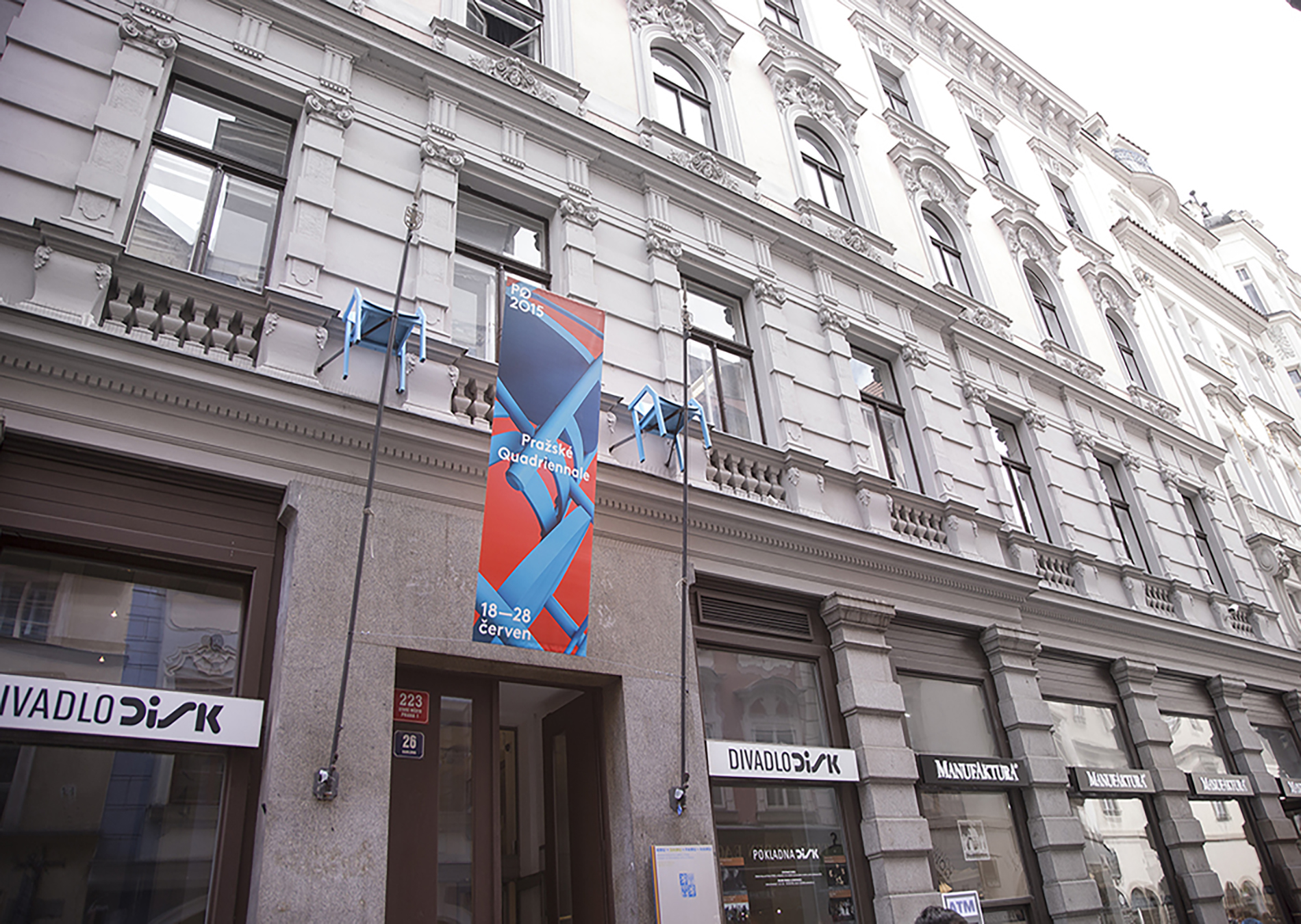
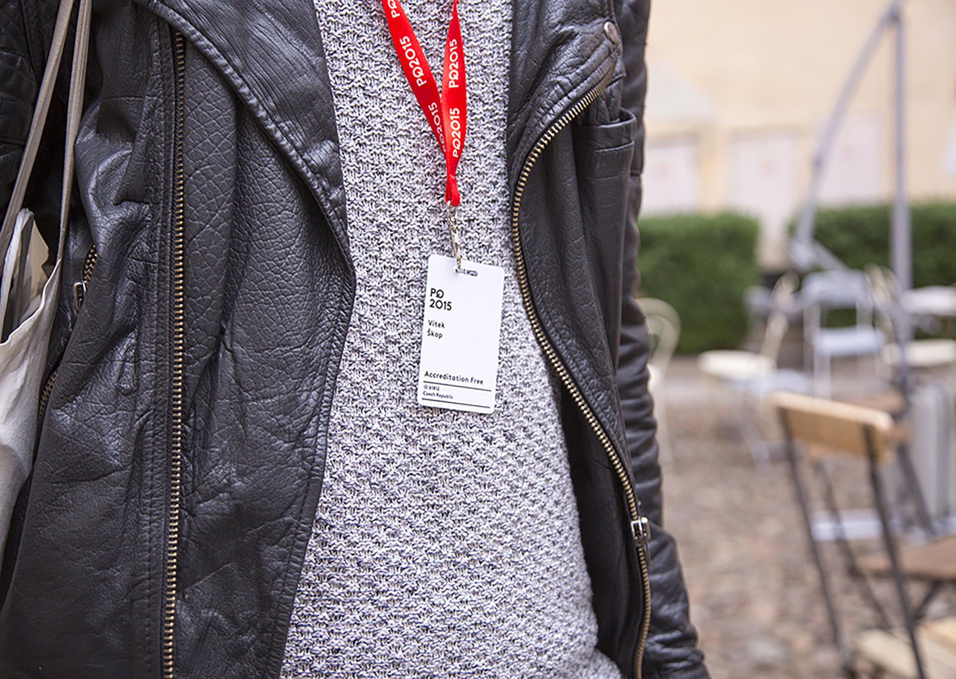
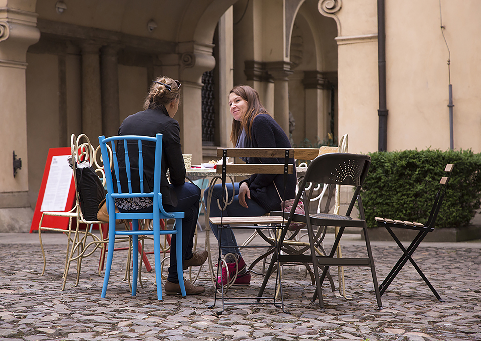
The theme of the year was Shared Space. We chose the chair as a symbol of stability, grounding in time and space, calming and focused perception. It is also an important means of sharing. It refers to the seats in the auditorium, as well as to the furnishings of the theatre stage. As an internationally intelligible element, the chair can imaginatively find itself in the role of spectator or actor. In addition to printed materials, the blue chairs also appeared physically at the festival venues, serving as landmarks in the centre of Prague and as a place to relax on hot summer days.
CREDITS
Creative Concept – Markéta Steinert, Vítek Škop
Visual Identity – Markéta Steinert, Vítek Škop
DTP – Dynamo Design
for Dynamo Design
National Museum Wayfinding
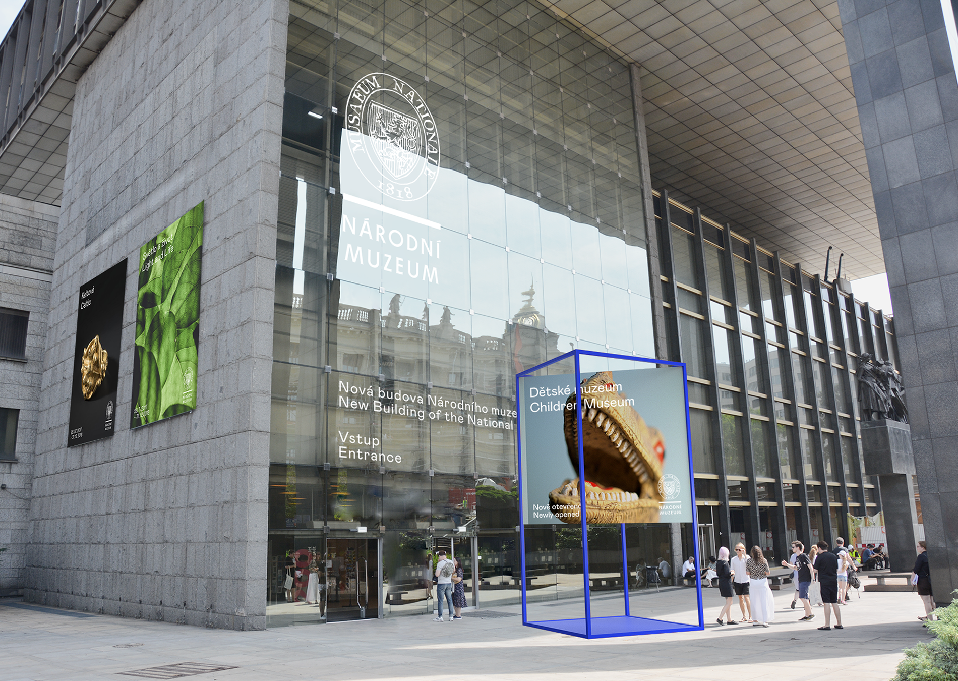
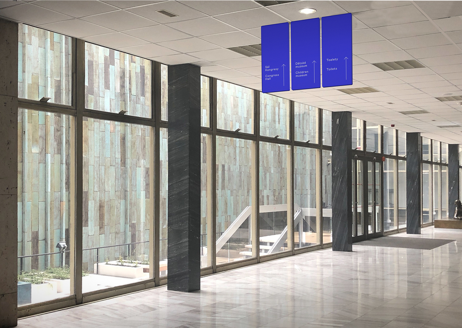
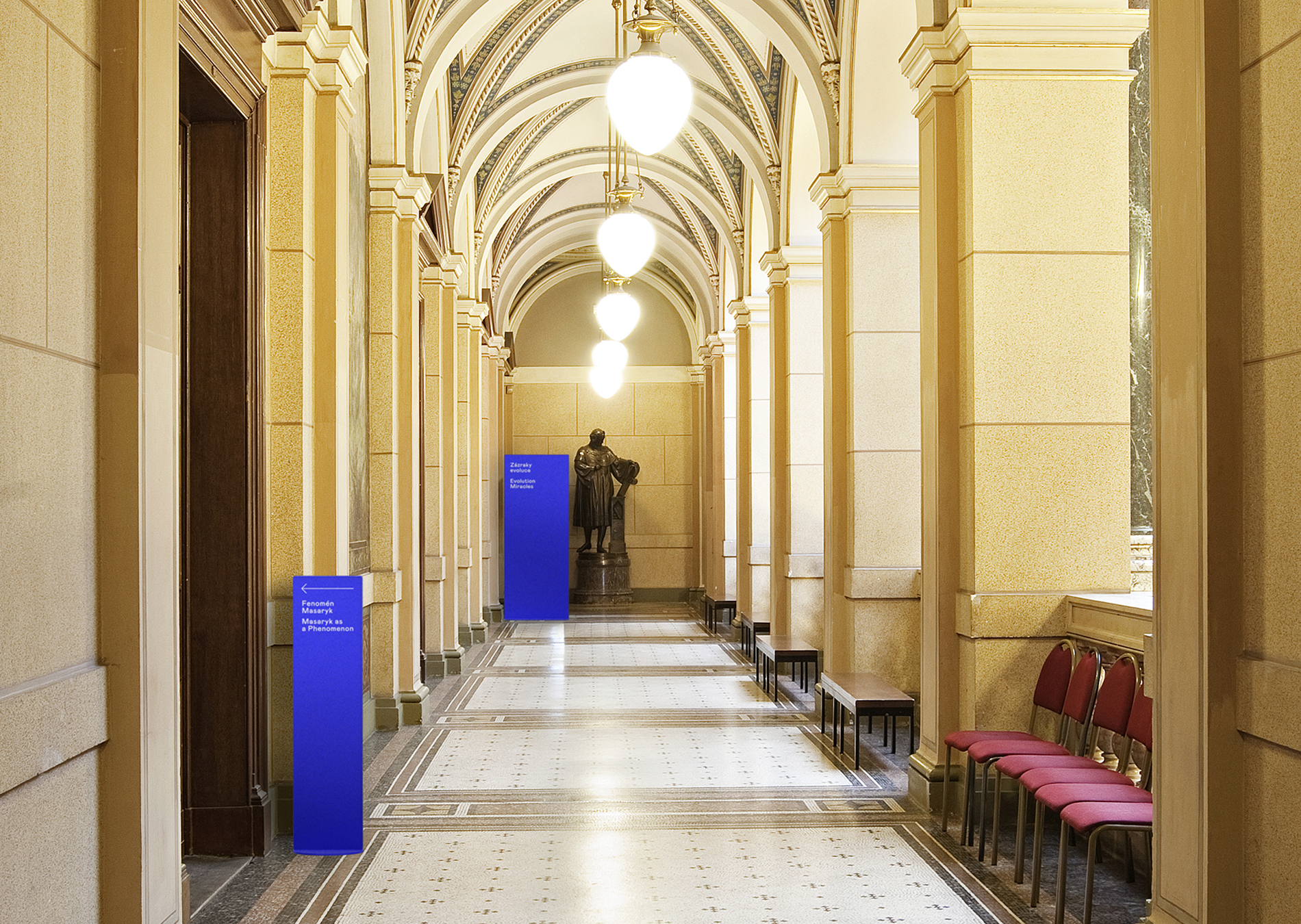
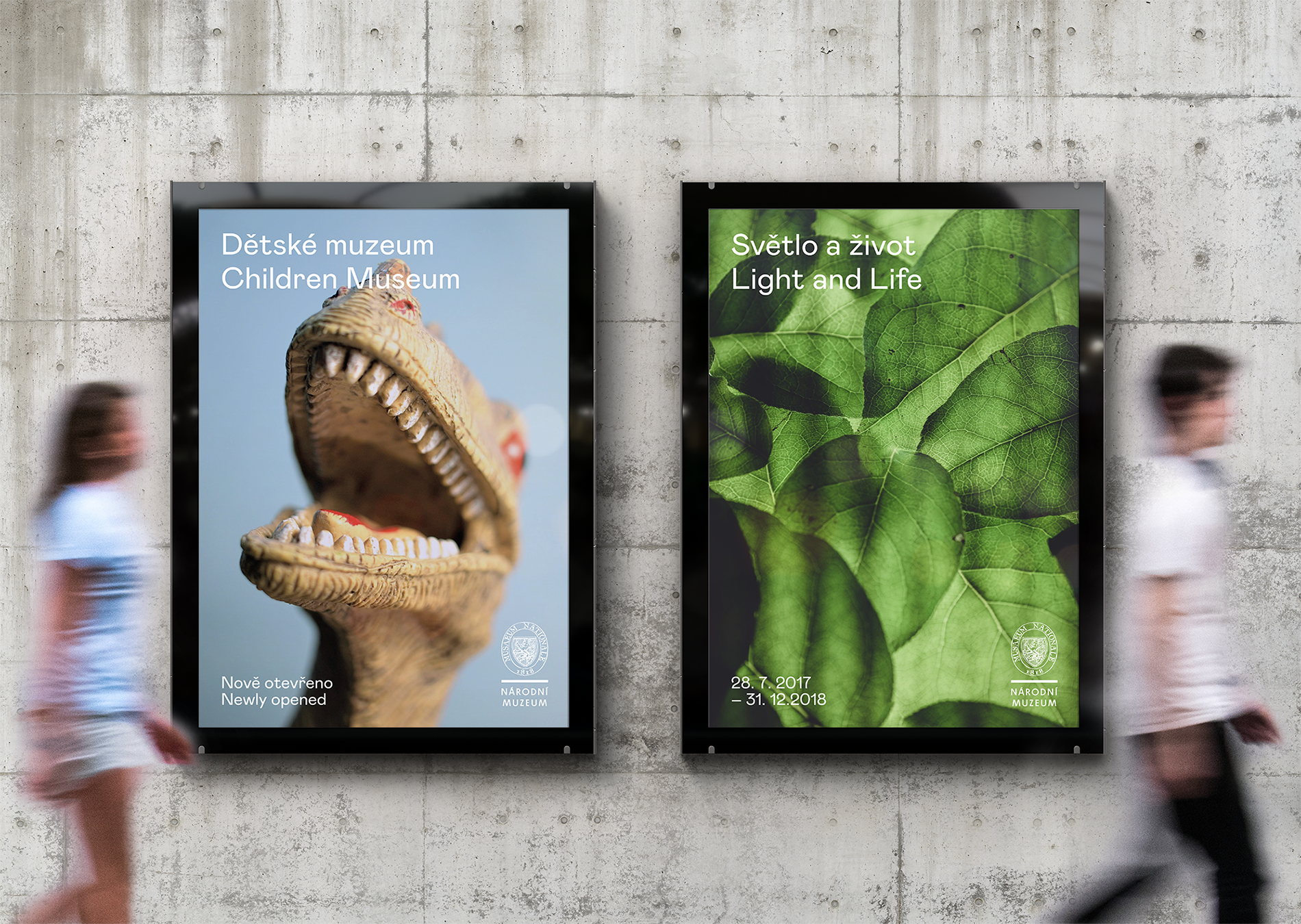
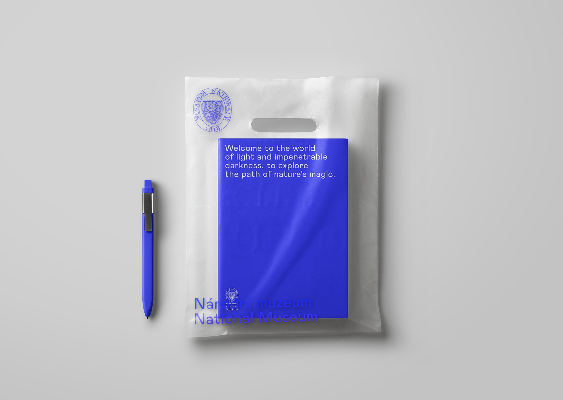
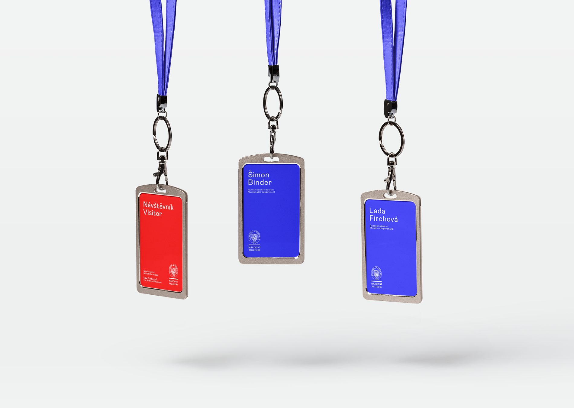
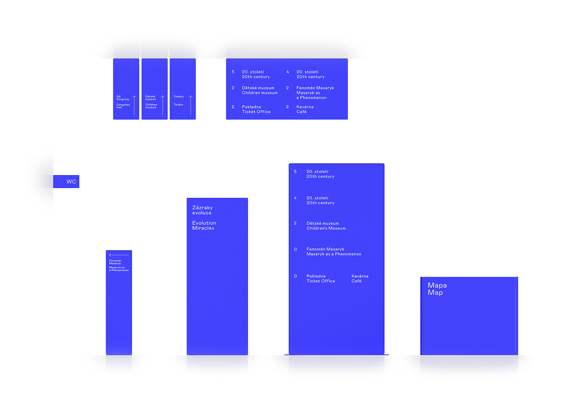
2018 was a year of great changes for the National Museum. In addition to the extensive reconstruction of the historic building, they also got a new wayfinding system and new visuals for permanent exhibitions. The system was designed to connect the two stylistically very different buildings of the new complex with a contemporary, functional and user-friendly system while respecting the architectural styles of both buildings. The project included the graphic design of the system and the conceptual design of its passive elements (stands, signs).
CREDITS
Client – Národní muzeum v Praze
Wayfinding Concept – Markéta Steinert
Architecture – Herrmann & Coufal
Concept

Asociace ekonomů měst
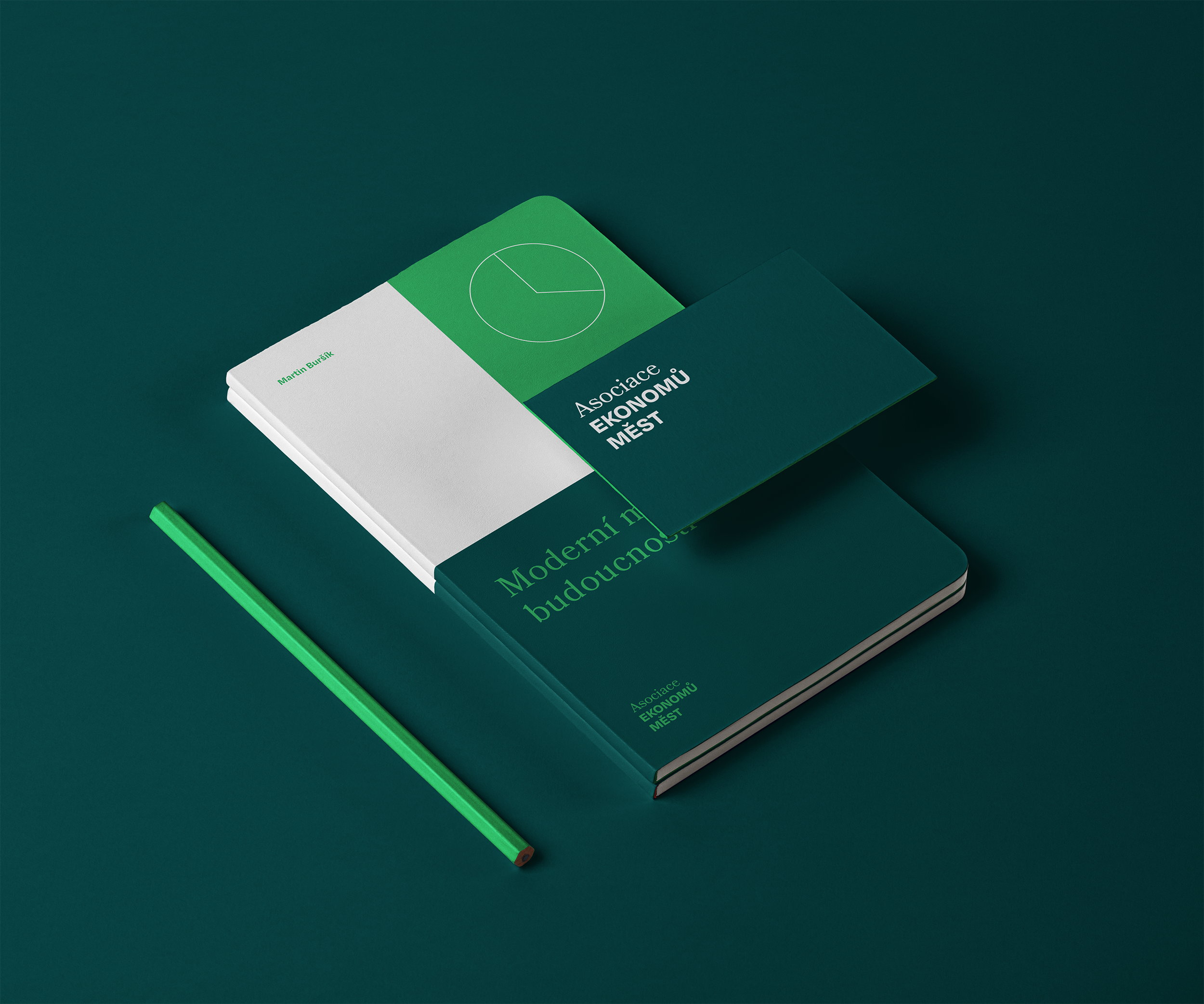
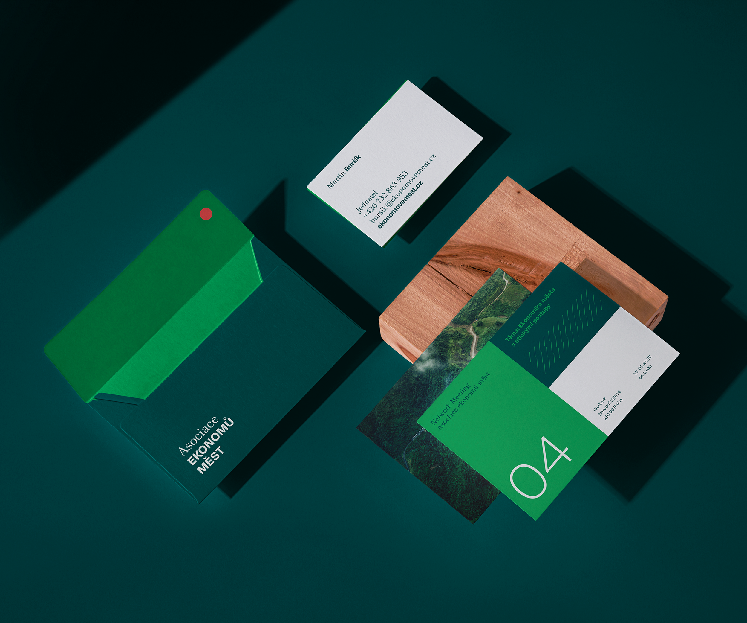
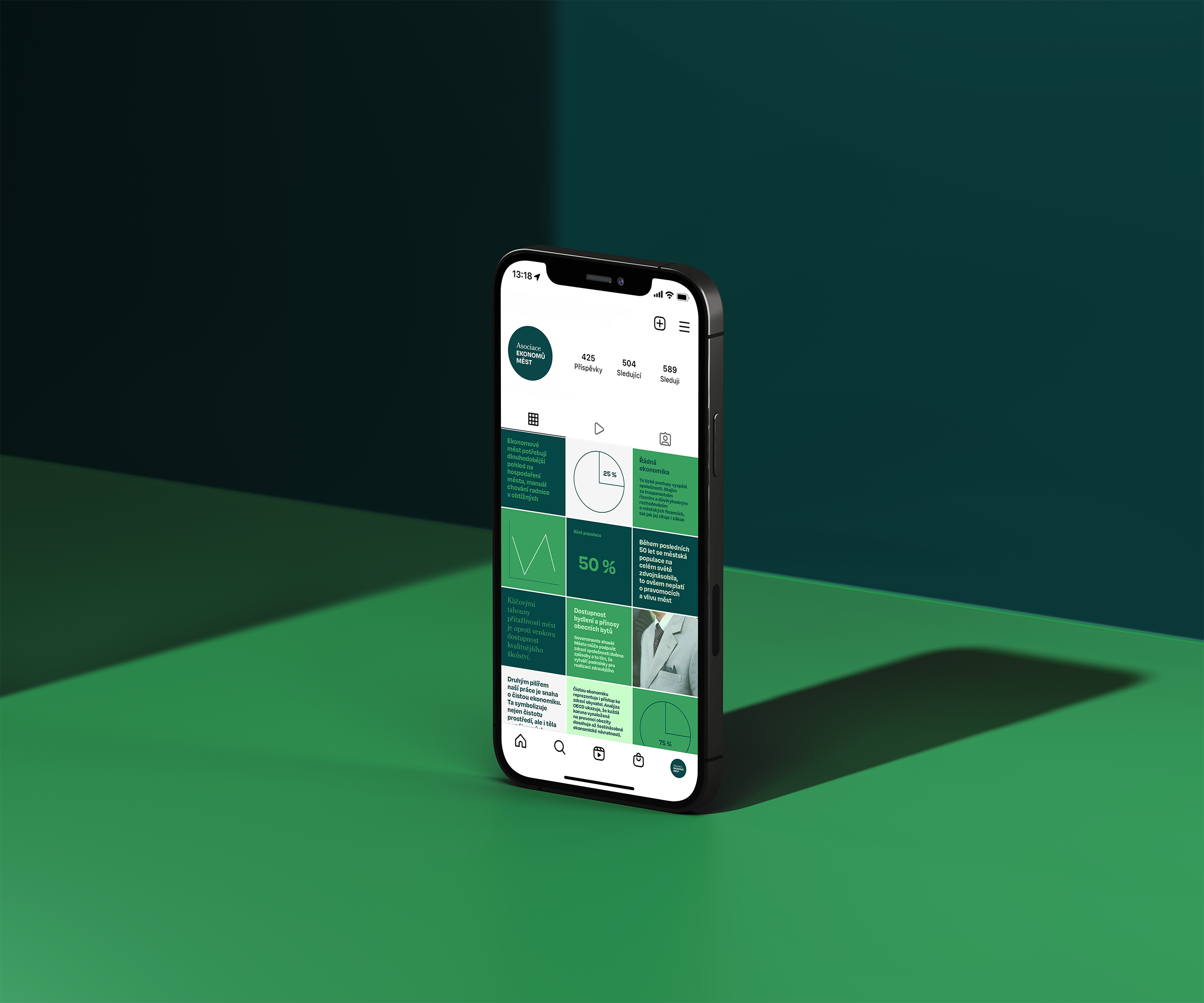
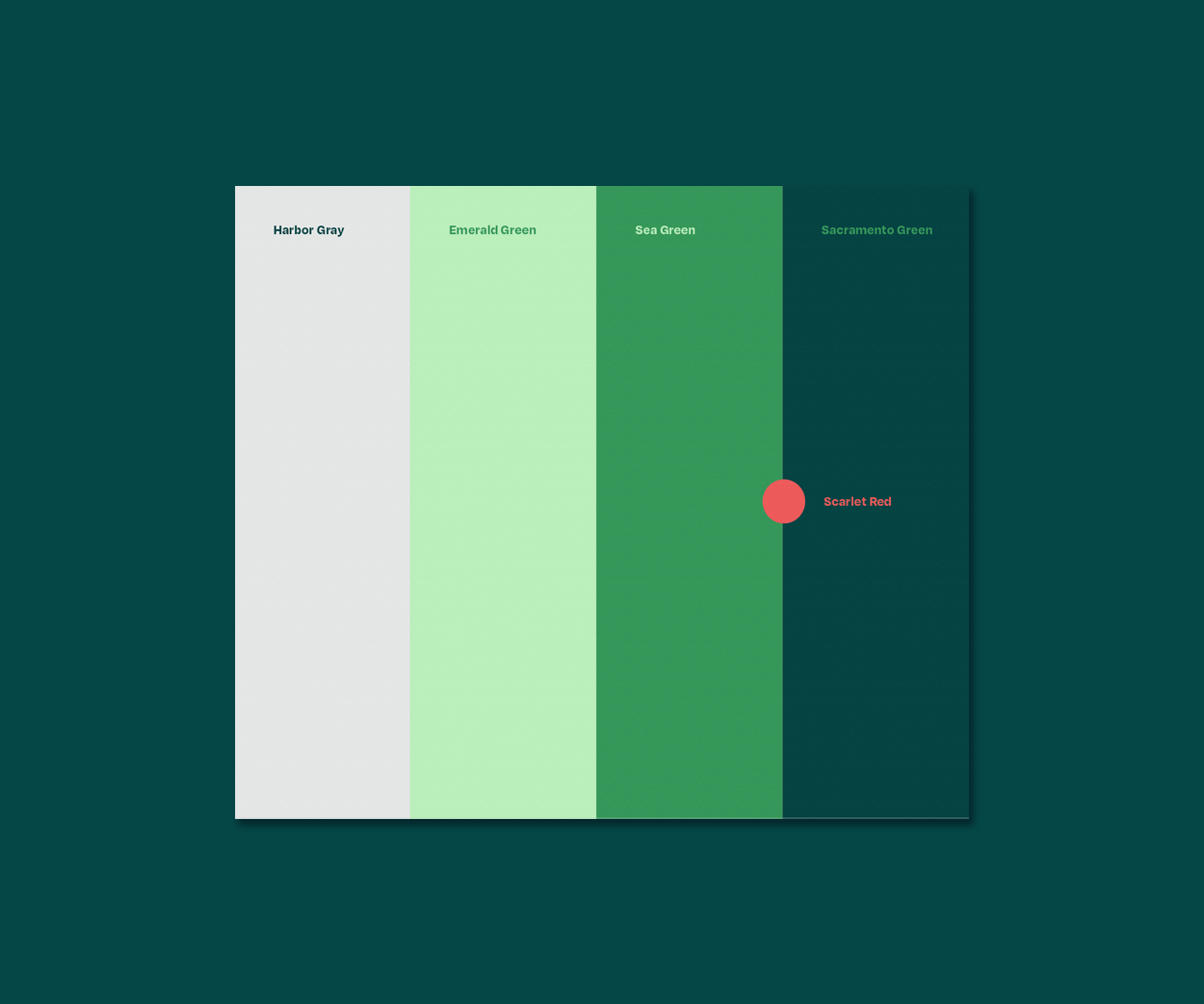
The Association of City Economists is an association whose goal is to achieve sustainable prosperity for urban areas through the education of people in city management. But what really distinguishes poor and rich cities? It is the happiness of their inhabitants.
CREDITS
Creative Concept – Markéta Steinert
Strategy – Kontra

Pillsulin
GameChange for people with diabetes - Pillsulin.
Insulin in a pill.
CREDITS
Creative Director, Branding – Marketa Steinert
Creative concept – Martin Kermes
Copywriting – Matúš Kmec
Illustration – Martin Jedlička
Video edit – Matěj Ligač
Motion design – Martin Egrt
Project leader – Kateřina Černá
for NMDS
CONTACT
Markéta Steinert
marketa@mrsteinert.com
00420 731 154 774
STUDIO
Markéta Steinert Studio
Kamenická 5
Letná, Praha 7
COMPANY
Mr. Steinert s.r.o.
Pražského 636/34, Praha
IČO 04873084